|
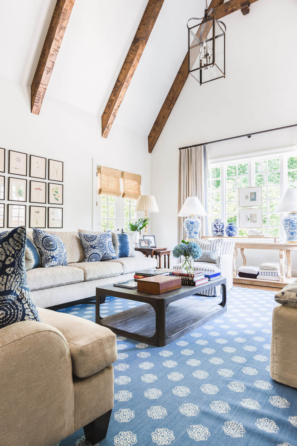
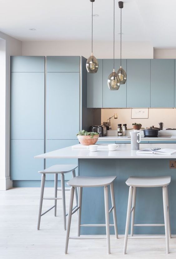
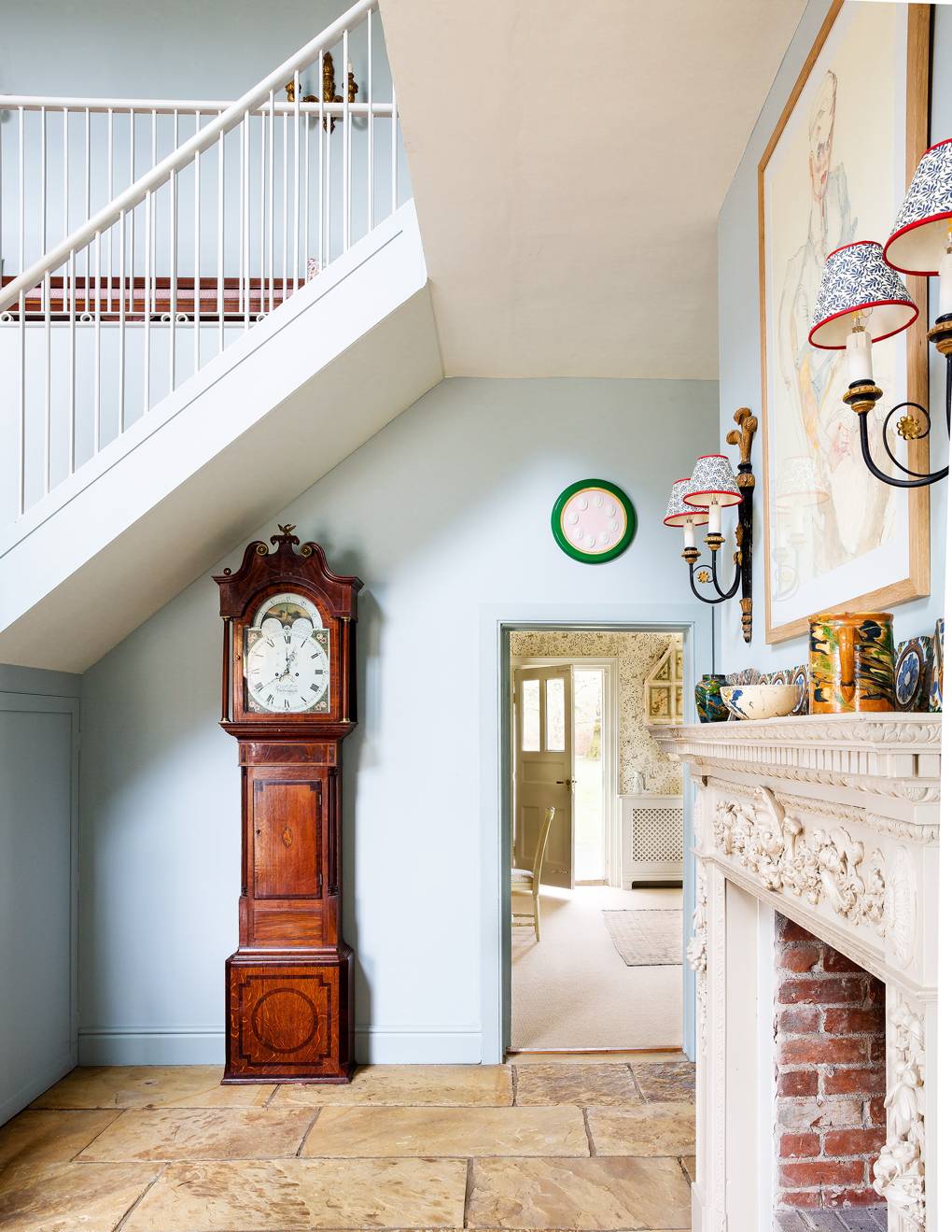
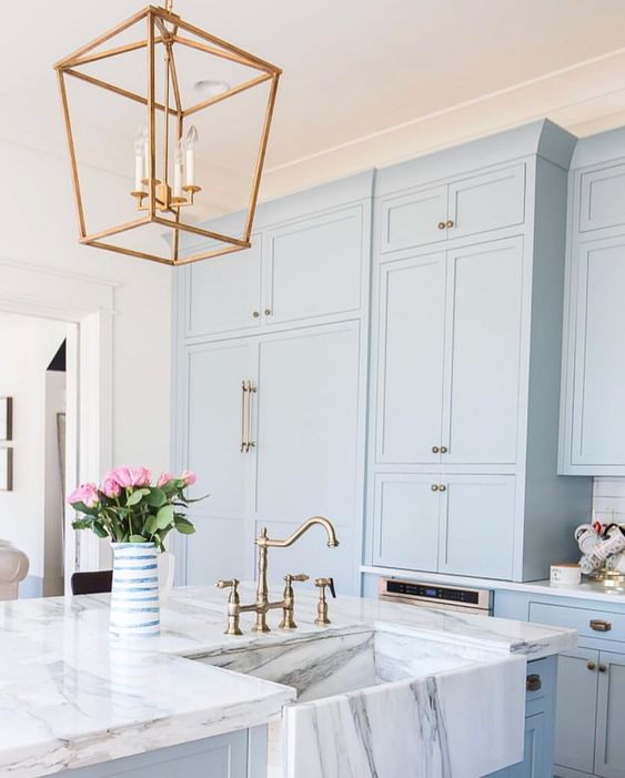
Next up in the colour series I am going to be showcasing Blue! Its a gentle transition from the indigo we just discussed but if you missed it head to the Indigo journal entry now. As with all other colours blue comes in a range of saturation, hues and intensities. It is considered a cold colour on the spectrum so using it in the northern hemisphere, I would advise caution - that being said its a fantastic colour and a clear favourite in costal and Blue and white schemes.
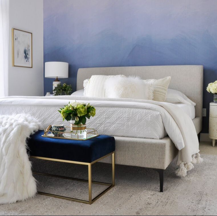
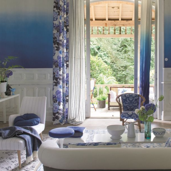
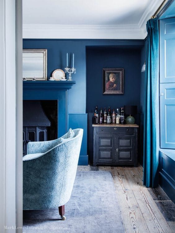
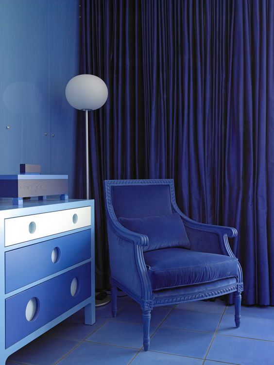
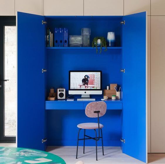
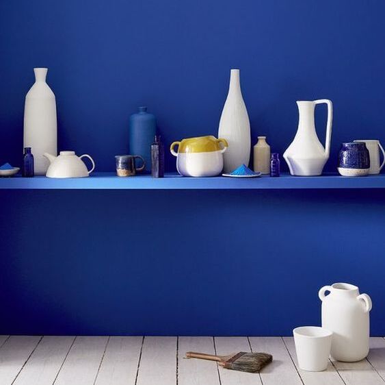
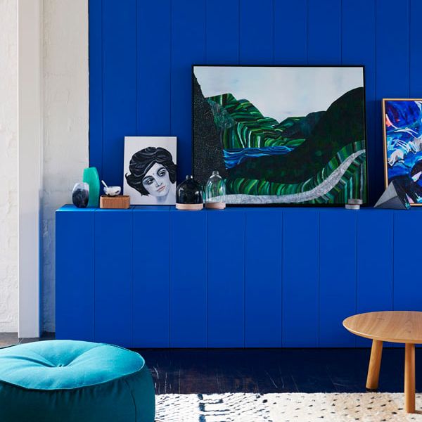
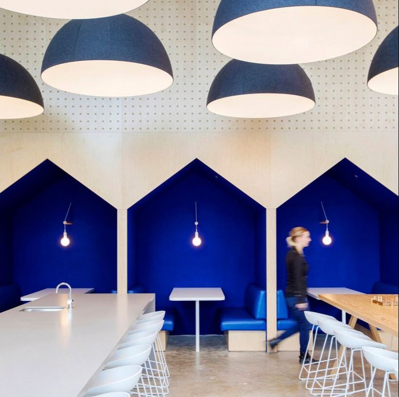
If you like the pale blue look but are afraid of it looking too cold, I always advise to add warm metallics, darker wood tones and upping the texture. If you want to go for something a bit bolder why not try an ombre wall? This can be a cheap and effective way of introducing bolder colours but in a graduated way. It also allows the feature wall to be slightly softened. If you do not fancy doing the ombre paint effect yourself, designers guild have a wallpaper that does the trick brilliantly. If you are feeling a little bolder, go for a gorgeous blue on blue effect. Mixing different hues and textures gives a space a very curated feel but allows you to really delve into the colour. Remember to focus on texture to ensure its still an interesting space to be in. For a more modern take - try this gorgeous azzul Yves Klein blue which has such energy in it. Favoured by the designers Sophie Robinson and 2LG studio. If you want to be inspired further head to the rest of the articles in my colour series and sign up to my newsletter to never miss a beat.
0 Comments
Leave a Reply. |
Categories
All
|
Award winning Interior Design & Styling - Cheshire, UK
Copyright © 2022

 RSS Feed


