
|
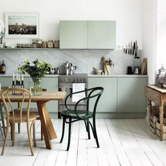
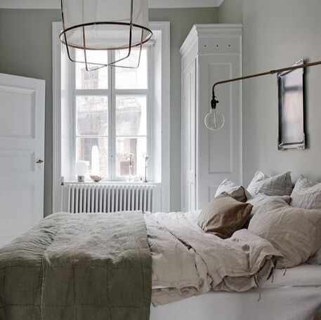
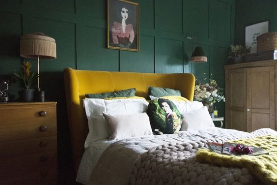
Last one in my colour series but most definitely not the last. I adore Green and think its resurgence in design has come about with the love of Mid-century modern and biophillic design. I think the reason I love green is that it is such a calming colour and depending on the tone can evoke totally different feelings. I must admit my favourite greens are emerald to teal greens and then the sage greens. Anything too minty puts me off but that is just personal taste I guess. Here are some incredible spaces that I hope can inspire you to use more green in your interiors. If you don't feel that you are "a green person" - (I have had clients say this to me!). Try edging sideways into it from blue and consider teal. 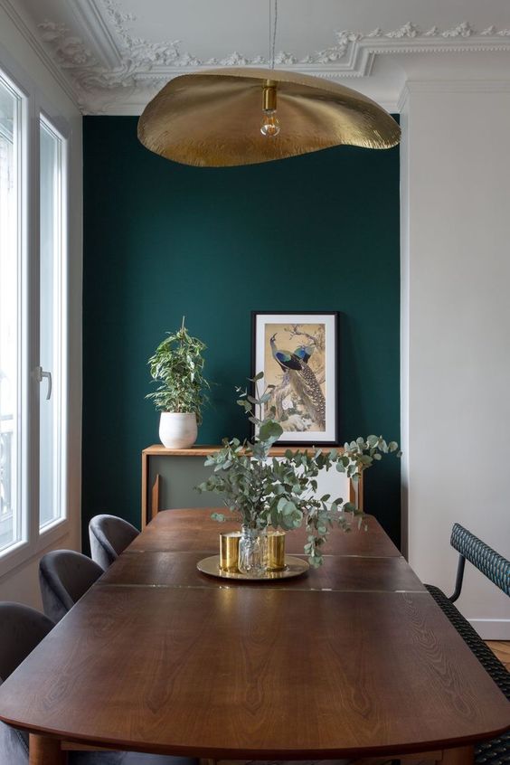 Love this brass light by Paola Navone against the green background! Teal is the mid step between green and blue - so you get these really deep lush colours that remind you of the sea and nature. I adore this gorgeous green used as a backdrop to my favourite chandelier currently - designed by Paola Navone. And this bedroom by Katerina Shamanova is super luxe and playful - did you spot the bird light? 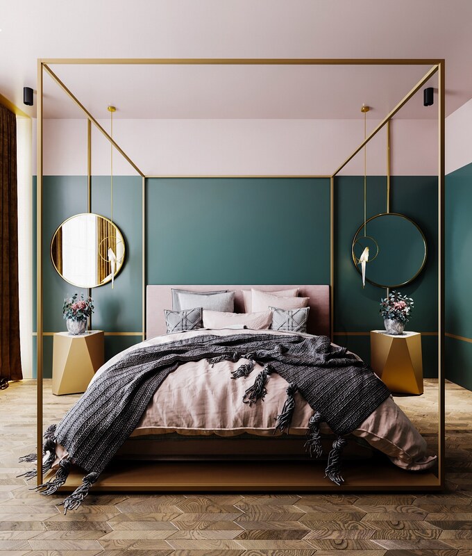 Playful luxury bedroom by Katerina Shamanova Now I know I said that I am more partial to deep greens and not so much into minty ones, but I just want to share some things that I think do work and I would consider using in my interiors. Here these pale sage greens work really beautifully in a relatively minimal interior. They are paired with lighter woods and greys to create a contemporary and fresh feel.
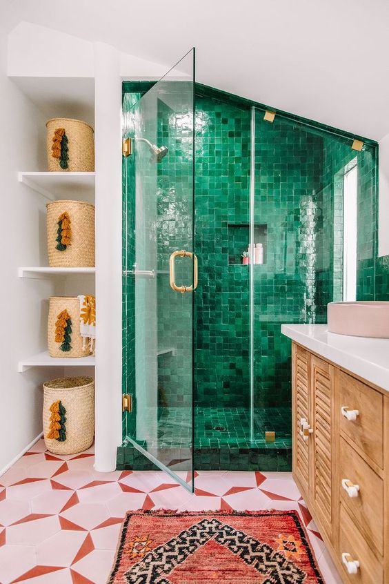
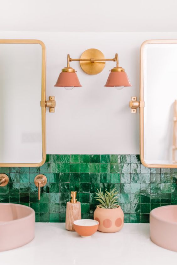
If you want it to be a little moodier, more sophisticated maybe - try a slightly more saturated tone and pair it with similar darker colours for a more umptuous feel.  Brilliant styling by Ikea showcasing this beautiful green colour For more playful and jewel lovers - steer yourselves towards the emeralds. Especially if you can get your hands on some gorgeous tile! I mean look at the high gloss lustre on this family bathroom by Kelly Mindell.
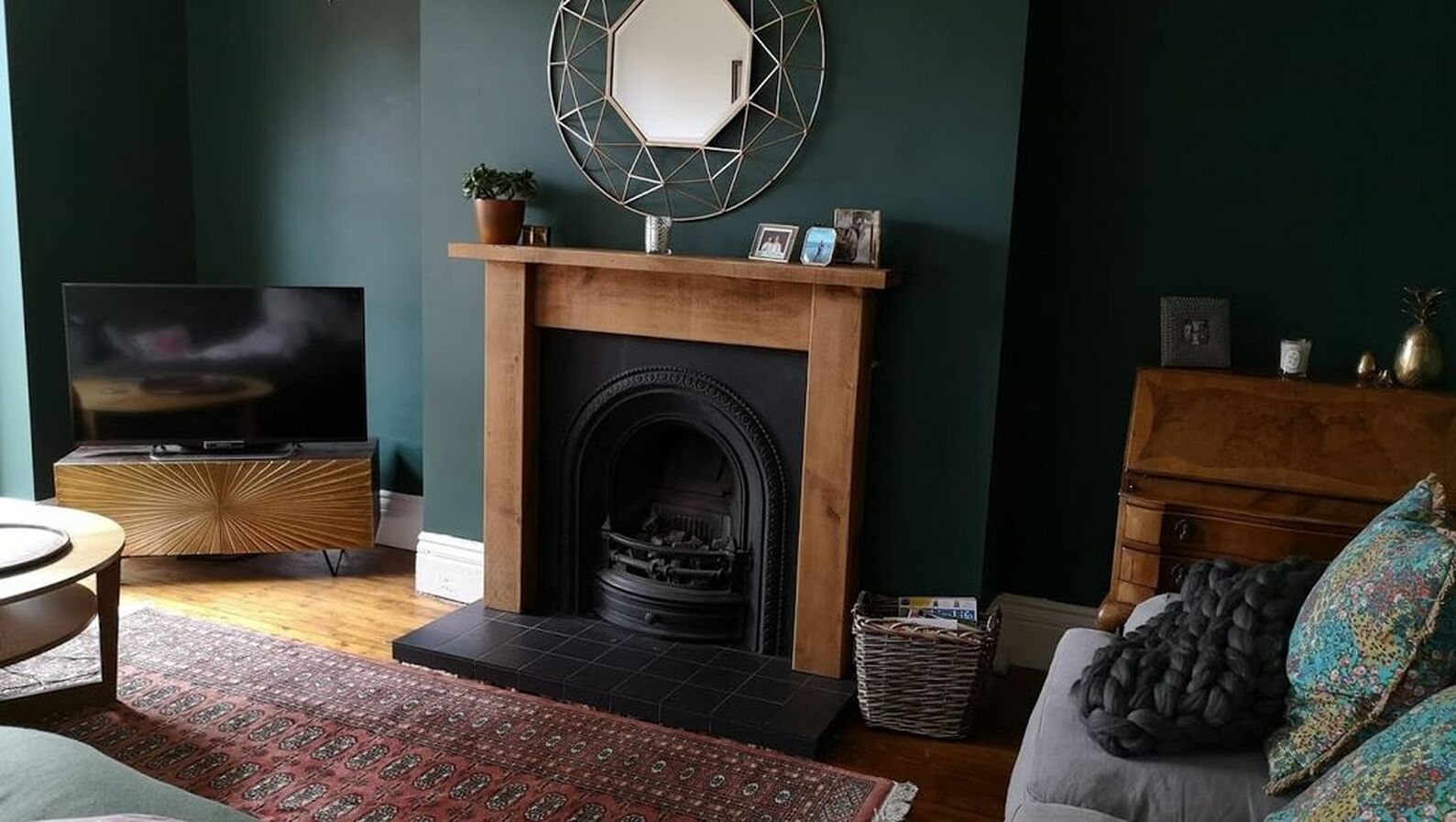
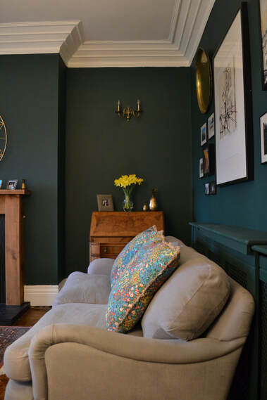
 Isnt this use of green in this bedroom by Mark Sikes incredible! It was in a show home on Kips Bay If you are really brave keep the emerald but go everywhere with it - like in this private dining room at a social club in San Francisco. 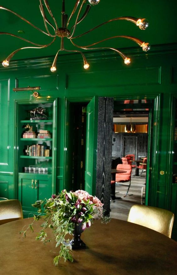 This private members club has gone all out with the emerald green! Now for the brave few, come with me to a darker side. Its gorgeous and comforting. Painting a large proportion of your walls dark green has this incredible immersive experience - it makes the space feel like a jungle or a forest. It reminds me of the brilliant Japanese practice of Shinrin-Yoku which is Forest bathing - this is where you spend time in a forest to reduce your stress and improve your well being! If you can achieve that feeling in your home - SCORE!
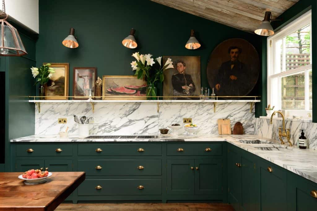
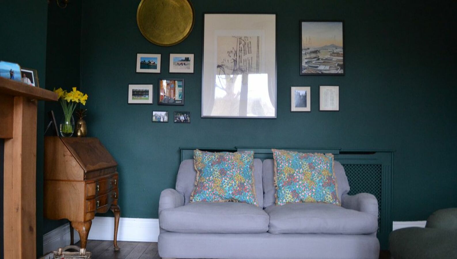
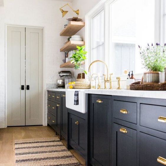
So get a load of these gorgeous spaces. We start with the stunning bedroom created by Nicola Broughton (aka The Girl With The Green Sofa). Or look at that incredible kitchen by deVOL. I love green so much I even used it in my living room.
0 Comments
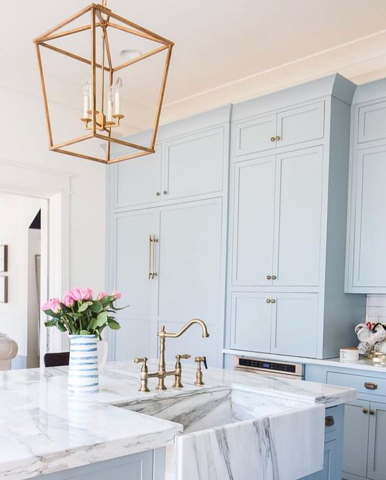
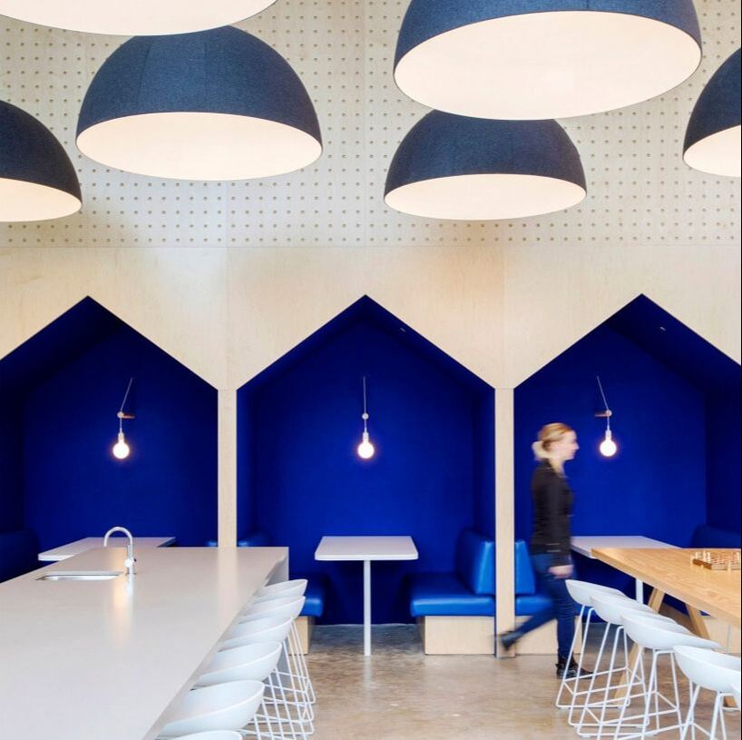
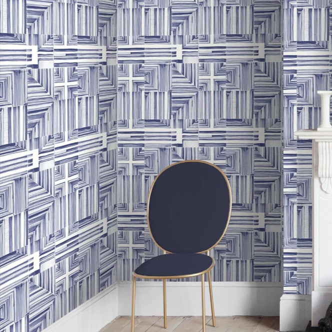
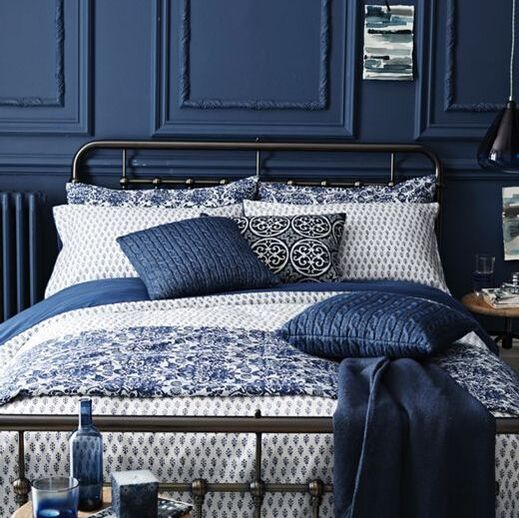
Next up in the colour series I am going to be showcasing Blue! Its a gentle transition from the indigo we just discussed but if you missed it head to the Indigo journal entry now. As with all other colours blue comes in a range of saturation, hues and intensities. It is considered a cold colour on the spectrum so using it in the northern hemisphere, I would advise caution - that being said its a fantastic colour and a clear favourite in costal and Blue and white schemes. 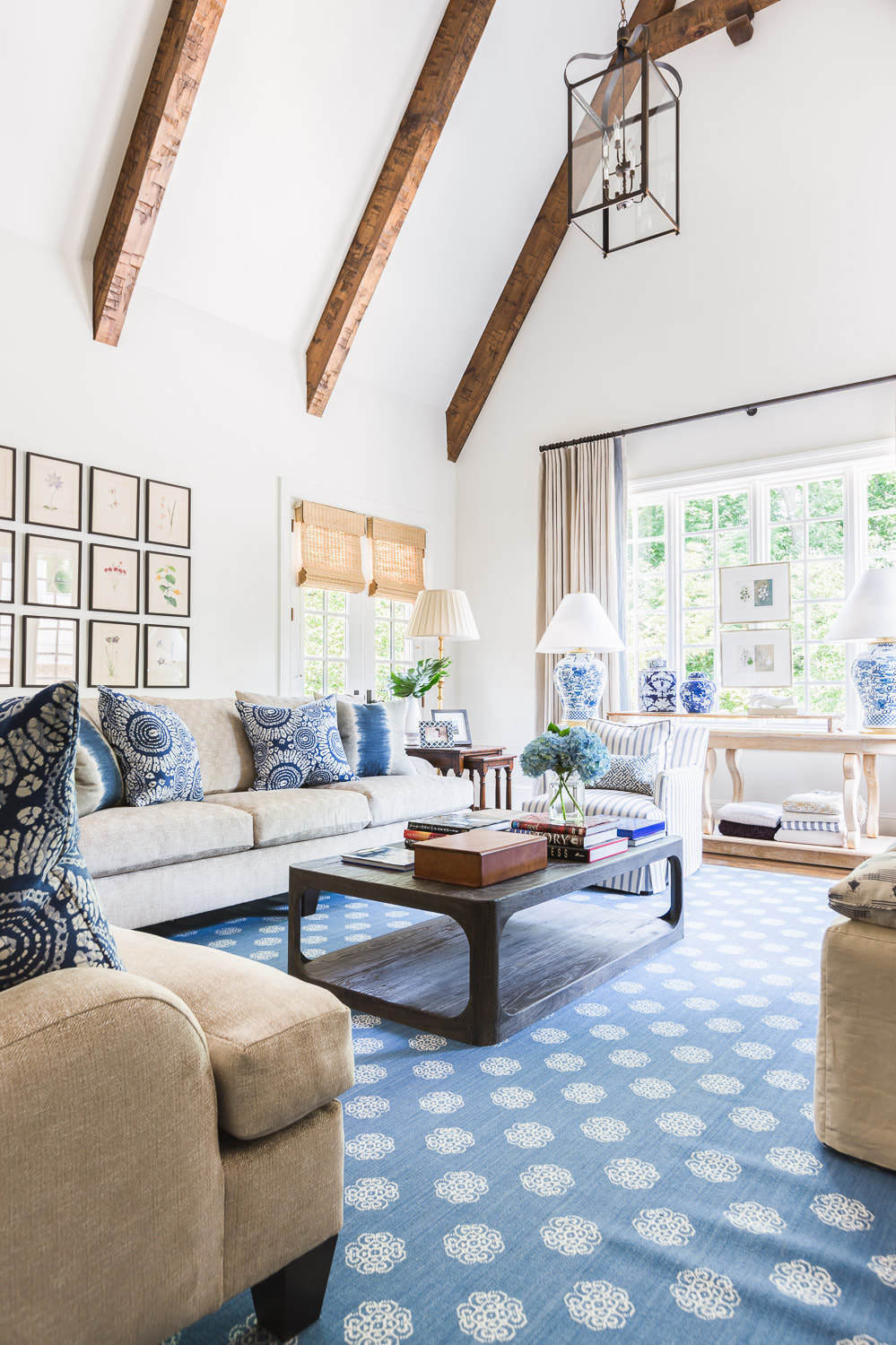 Elegant yet relaxed look of blue, white and neutral by Chad James Group
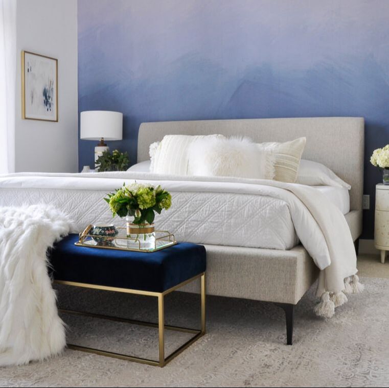
If you like the pale blue look but are afraid of it looking too cold, I always advise to add warm metallics, darker wood tones and upping the texture. If you want to go for something a bit bolder why not try an ombre wall? This can be a cheap and effective way of introducing bolder colours but in a graduated way. It also allows the feature wall to be slightly softened. If you do not fancy doing the ombre paint effect yourself, designers guild have a wallpaper that does the trick brilliantly.
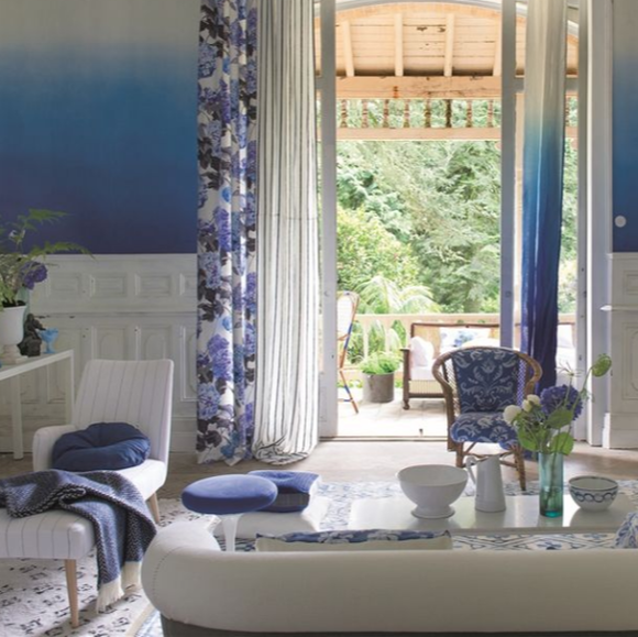
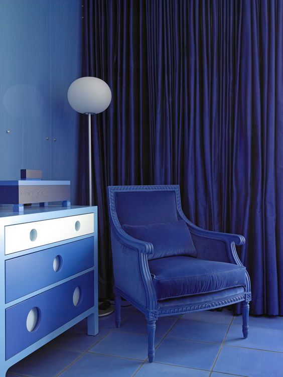
If you are feeling a little bolder, go for a gorgeous blue on blue effect. Mixing different hues and textures gives a space a very curated feel but allows you to really delve into the colour. Remember to focus on texture to ensure its still an interesting space to be in.
For a more modern take - try this gorgeous azzul Yves Klein blue which has such energy in it. Favoured by the designers Sophie Robinson and 2LG studio.
If you want to be inspired further head to the rest of the articles in my colour series and sign up to my newsletter to never miss a beat.
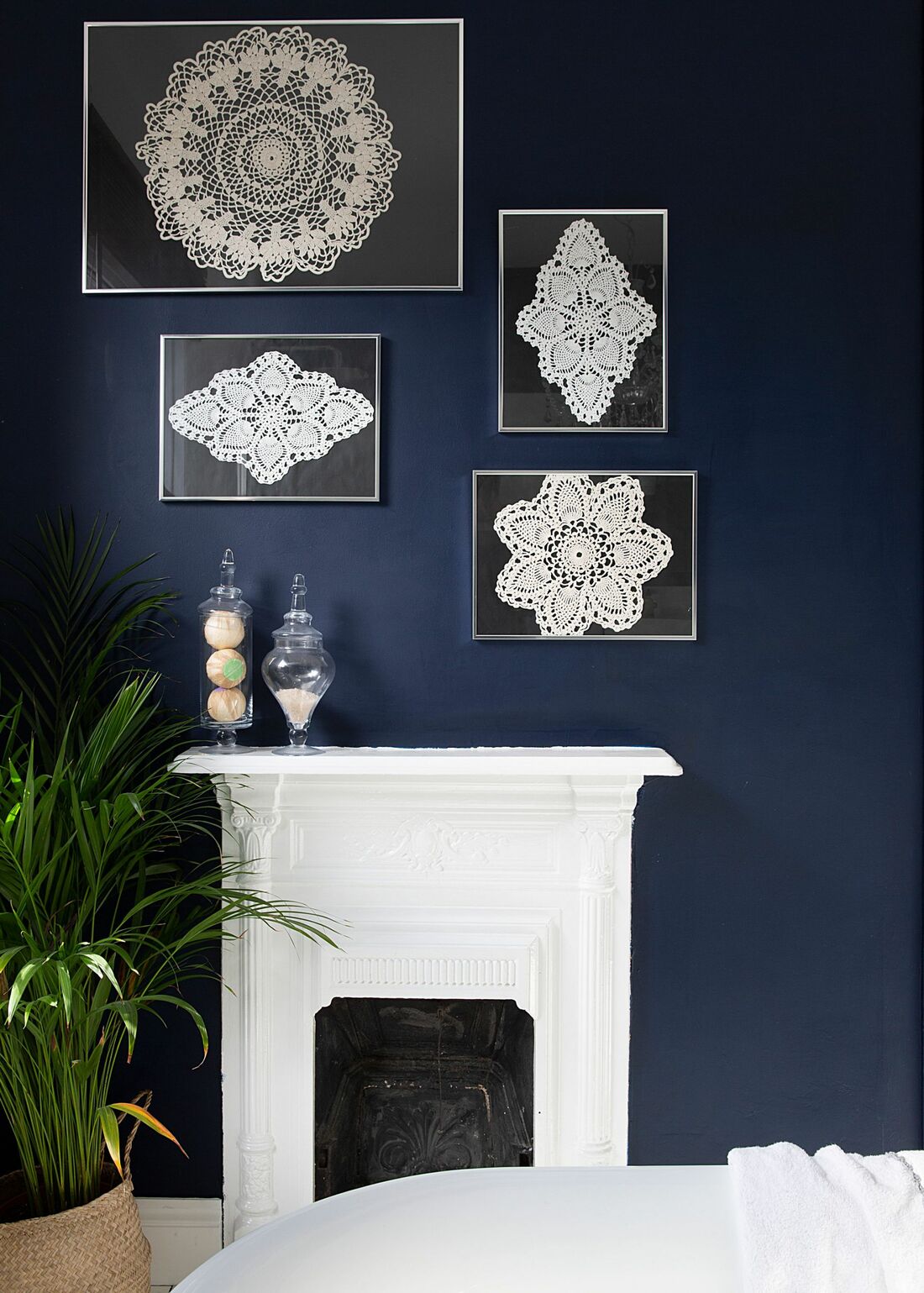
Some people will ask - what is the difference between indigo and blue?! Well technically indigo is a pigment extracted from a plant called Indigofera and has been in use since antiquity. The colour has a very saturated hue and is a blue with quite a bit of red purple undertones - if you see where it lies in the colour spectrum this makes a lot of sense. So now how should one use it in their interiors. In its essence it is a dark saturated colour so I want to show you the best ways I think it can be used ranging from lighter interiors to darker spaces. You can have it faded or bleached or with greyer undertones added to soften the colour.
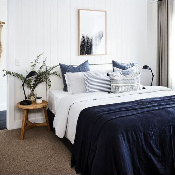
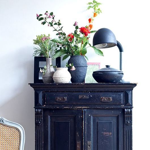
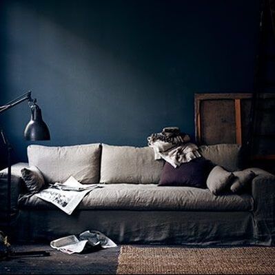
So first and foremost - using indigo as an accent colour is brilliant. It immediately adds drama and depth to any interior. Its so easy to combine it with neutrals and it fits in easily in classic and modern interiors equally. Using light and airy neutrals with such a deep colour has a nice grounding effect and keeps the space balanced between the light and darker colours. See how it is used above, sparingly on soft furnishings to add interest or as an accent colour piece of furniture. A really smart tool used here is keeping the same colour but implementing it in different patterns and textures such as the block indigo as the throw but different prints in the cushions. Equally on the cupboard, the black pieces above it have blue undertones that really tie in neatly.
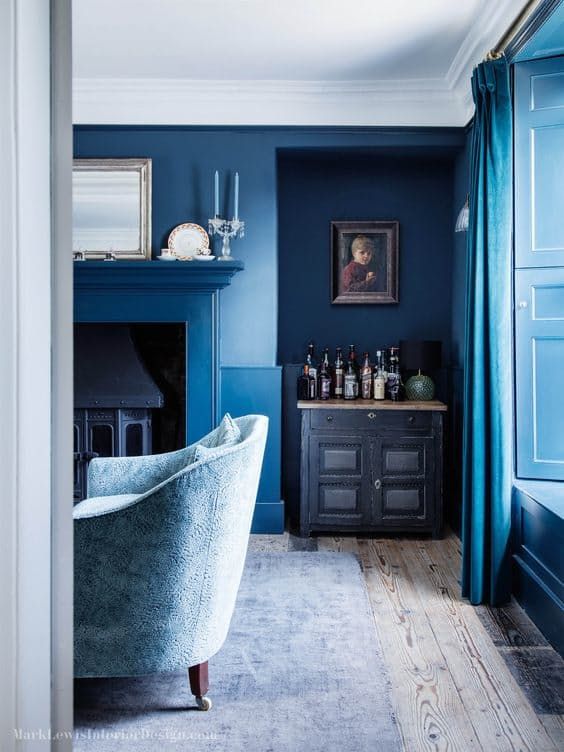
For more drama, go crazy with indigo. Paint nearly everything in it to create a moody sophisticated look, or add even more depth with panelling. Always add some neutrals and warm woods to contrast.
I absolutely love this colour! I could go on and on, but let me know how you would use it by commenting below. Or if you want to find out more about what we are up to follow us on social media (buttons below) and subscribe to my newsletter.
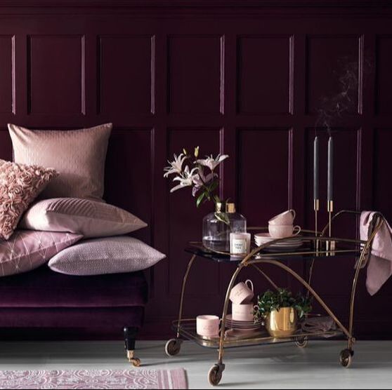
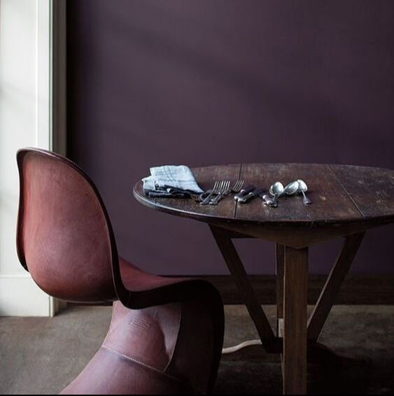
Slipping into these deep gorgeous colours now with violets. It can be a bit of a marmite colour but its a strong favourite with some brands and reflects stability and nobility. Think of a chocolate bar with the purple wrapper - you know exactly what I'm talking about. This colour was quite popular to use historically and also in the 80s and has fallen out of favour in mainstream interiors but I know there are a few of you out there who absolutely love this colour, and why not its deep and luscious and feels like a big hug, no wonder it was the Pantone colour of the year 2018. So here are a few examples of some great purple rooms.
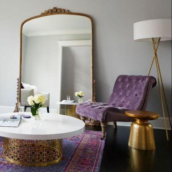
If you are braver and want to have a more saturated hue, but dont want the room to be violet dominant - use it as an accent. Such as in a beautiful chair - remember that the different fabric qualities also contribute to how the colour will look. Therefore a velvet is more likely to look very saturated as opposed to a linen. Its a great way to highlight a favourite reading spot. You can also use it in temporary soft furnishings, such as a beautiful throw that injects some colour into an otherwise monochrome room.
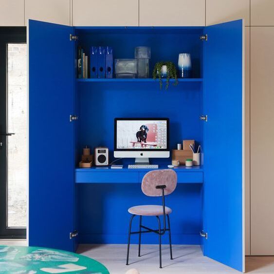
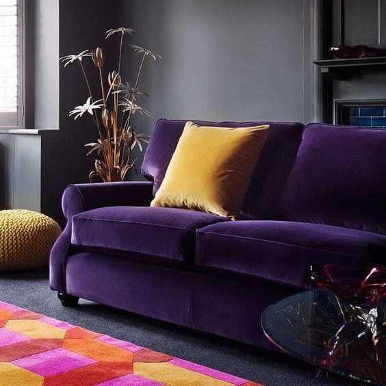
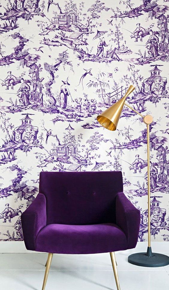
Now, if you are thinking "I'm not sure I am brave enough to invest a whole piece to violet", it could be an expensive thing to remedy - how about using violet on the inside of a cupboard like Claudia Pelizzari did in this shot. Its genius as creates a real statement piece without having to be on show the whole time. Definitely a conversation starter! 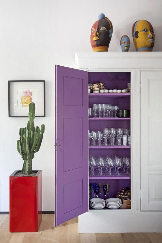 Violet cupboard interior by C. Pelizzari Now if you are feeling braver yet - why not going bold... and doing a fully purple space. Go super dark for that luxe moody room or zingy for that playful whimsical look.
So! Are you feeling inspired yet? Whats your favourite image? Is purple SOOO the colour for you now? Or will you swear off it for ever!? Let me know in a comment below!
Moving on the colour series to probably the most powerful colours out there. Red. The colour of passion, love, blood, rage and drama.
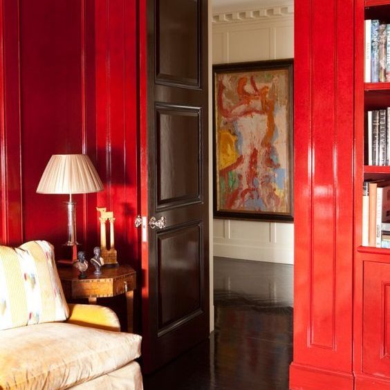
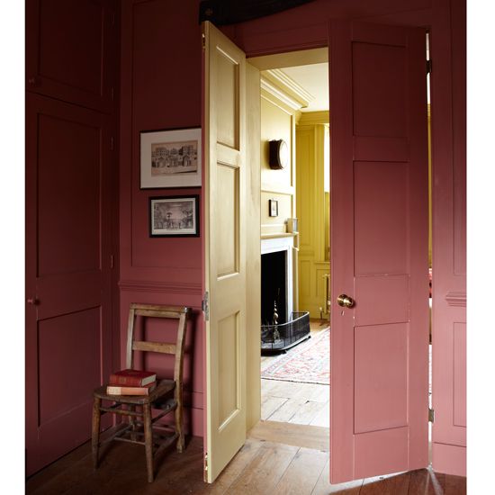
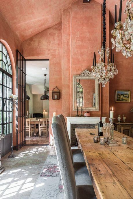
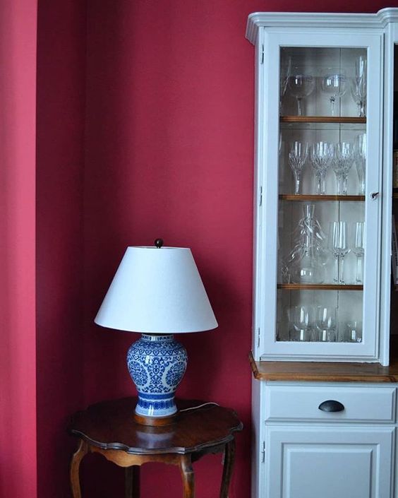
From the deepest darkest red, through the terracottas to the softest shade of pink it has been used in interiors for years. Red is a royal colour that has such a richness to it. That is why its called the "red carpet". Using it smartly can really make an impact. It is a very strong colour so use it in spaces, that need an injection of drama and spectacle. Pair it with lighter colours for a classic look or with darker colours for a moodier sophisticated look. It immediately injects warmth and that "cosy" feel. With smart advertising it has now become ubiquitous with Christmas. It is also the traditional colour of good luck and happiness in China, and the traditional colour of Indian wedding dresses. Here are some great examples of its use in design.
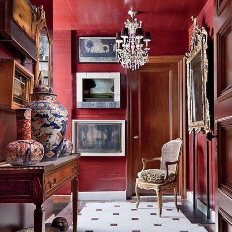
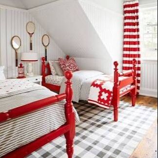
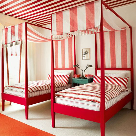
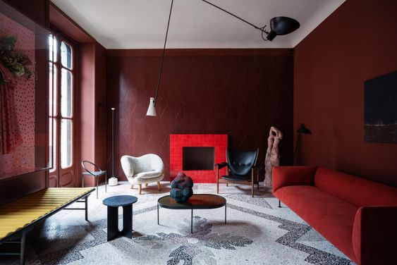
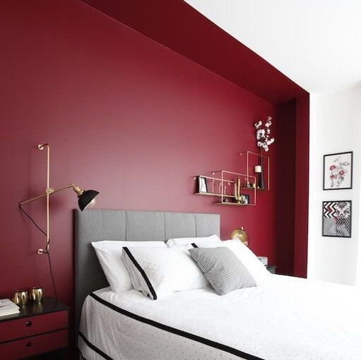
Going for a more scarlet red but it with darker colours for a ramped up playful luxe look. 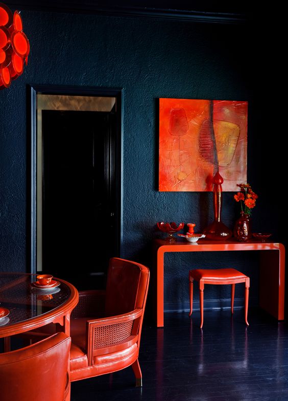 Incredible dining room with red accents from Tamara Honey For a more saturated colour, get closer to the primary colour itself, do it in gloss to make it shine. You can use it sparingly as an accent colour such as in this bright white twin bedroom, or really go for it and use it all over.
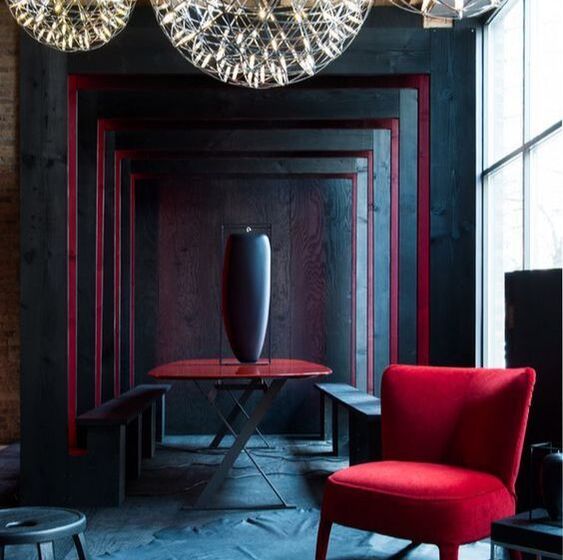
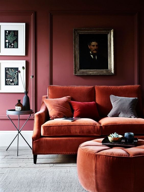
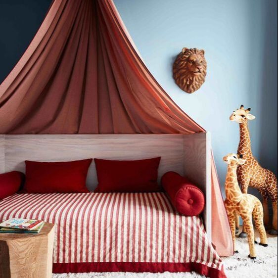
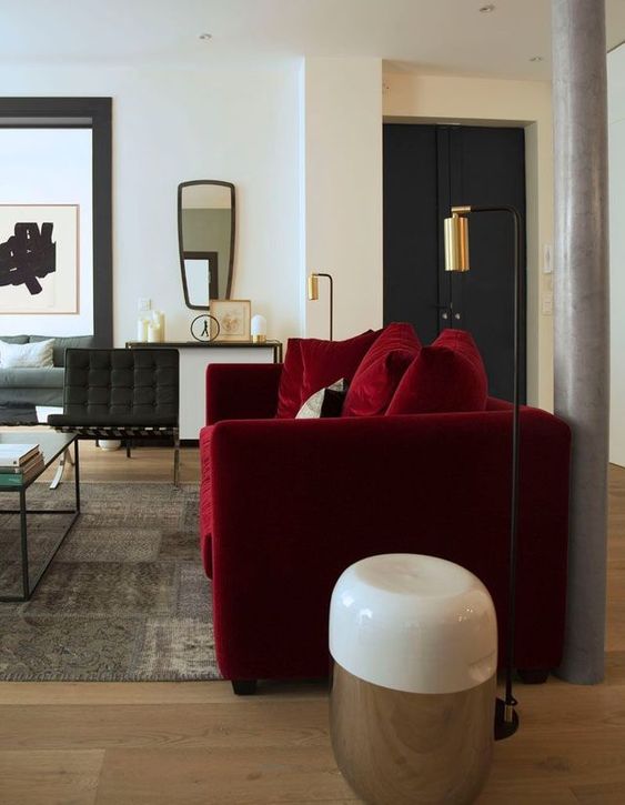
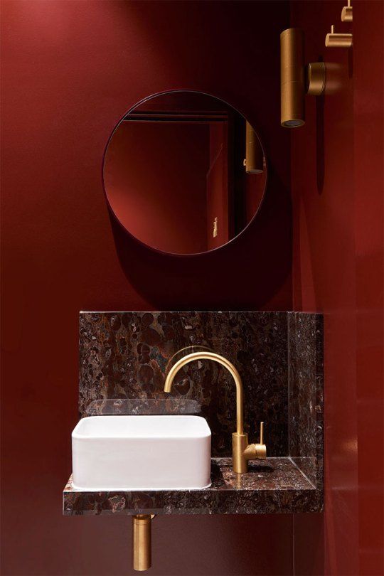
Go for a darker crimson red, closer to raspberry to really up the drama. Again in a single piece such as this stunning red velvet sofa, or as an immersive red to really make a statement of a small space. Bluer reds that verge towards the purple spectrum have a really soft cosy energy, its almost like having a great big cup of coco watching the snow fall on a winters day.
How do you feel about the reds in your home? Its one of the most expensive colours to create (according to the inside scoop from paint companies) but the least purchased! Go on treat yo self to some drama!
|
Categories
All
|

 RSS Feed

|
|
|
|

|

|
|

|
|
|
Award winning Interior Design & Styling - Cheshire, UK
Copyright © 2022