THE SPACEMAKER - INTERIORS BY PETER GRECH
  • Home
  • Portfolio
    • The Art House, Hale, Cheshire
    • Heath House, Alsager, Cheshire
    • Casacoppa, Liverpool
    • Worldly Loft, Ancoats, Manchester
    • Georgian Townhouse, Cheshire
    • Artistic Edwardians, Hale
  • About
  • Services
  • Contact

The Sapphire room

4/7/2019

1 Comment

 
Hello Everyone! I am so excited to show you my latest room revamp! My client wanted a beautiful nesting space, and this south facing bedroom with a gorgeous woodland view was the perfect place to create such a retreat. I encouraged my client to go bold and dark, creating a beautiful intimate space that is cosy and feminine.
 
Our kick off inspiration image was the following. We loved the layered look, the inky walls and the softer pinks and colours that inject energy into the room with the brass and gold details. Lovely right!? I cant seem to find the original designer of this space, so if anyone knows who it is please let me know. They clearly deserve all the credit.
 
inspirational shot of a dark blue bedroom with gold and pink accents
Now you need to see how the room was before we started this process. So it was a very neutral magnolia with some mismatched furniture handed down from previous homes and spaces. As you can see we had already bought the tester pot and were checking the colour in the room to make sure we were happy. We checked it against the fabrics that we were thinking of using and it sat so beautifully. 
colour samples of dark blue, off white and pink velvet
a pre-renovation shot of a messy bedroom with colour swatches on the walls
Our mood board started off like this with a gradual evolution finding the correct pieces for the space and a few re-considerations. We moved on from the plain curtains to introduce some pattern. Also leapfrogged over the white sheets for something a little bolder. I am so happy that we went dark and bold, as is my client. She had always gone for pale colours and neutrals in her previous homes, out of fear of making a mistake, but as soon as this colour went on the tester sheet she was in love and with it all the way around the room it is like a big cosy hug. She says its so hard to get out of her favourite room in the morning as she just wants to stay there and linger just that little bit longer. 
Mood board for a dark blue bedroom with gold accessories and pink highlights
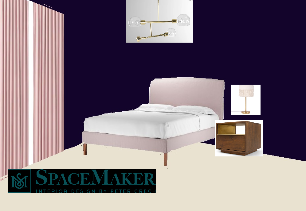
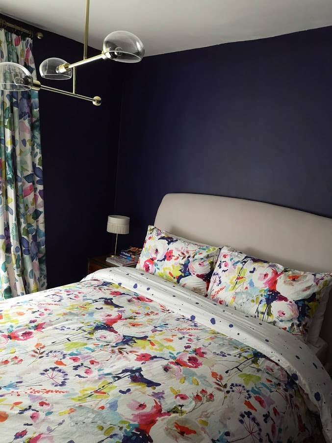
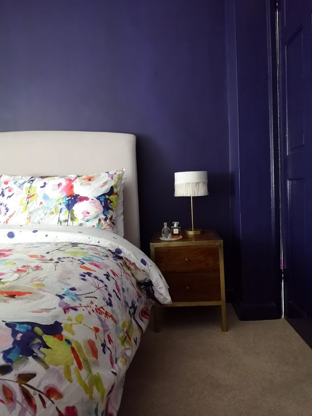
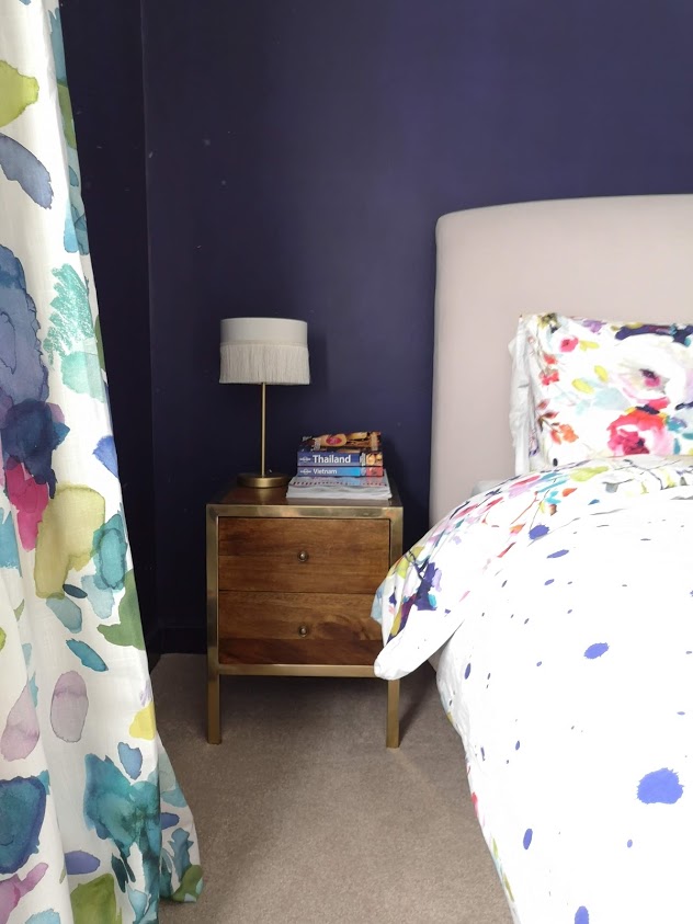
​Here are some snaps I took from the finished project. Let me know what you think.
Dark blue bedroom with floral bed sheets and gold accessories and details
Head here to see more of this fun filled apartment in London. If you would like some help creating your own retreat, get in touch via my contact page.
1 Comment

Bathroom Makeover with Topps Tiles

13/5/2019

6 Comments

 
Hello everyone! I am super excited to show you my latest bathroom refurbishment using Topps Tiles. My client came to me with the desire to create a fresh and bright space in her main bathroom. The apartment had a slightly odd layout with a loo in the separate room which, due to reasons beyond our control, couldn't be incorporated into the main bathroom space, so we focused on creating an oasis of calm in this small but crucial space.
pre-renovation shot of a problem bathroom with old tiles, no storage and dark setting
Pre-renovation shot of the problem bathroom with old tiles, no storage and dark setting
pre-renovation shot of a problem bathroom with old tiles, no storage and dark setting
So we worked on the layout, as the staircase  headroom came up through this bathroom we had to think creatively to find a solution for turning this challenge into a positive aspect of the space.  We decided to include built in storage above the sloping wall to make the space work for my client and also make it a beautiful feature of the room.  As we didn't want it encroaching too far into the room we only used a small section of the slope at its highest point. At the lower end of the slope we later built a foot rest, perfect for a pedicure and grooming. 


Mid renovation of a bathroom this photo describes how the sloping floor was used to incoroporate a storage boxed system above it
Mid renovation of the bathroom: The sloping floor was Incorporated into a boxed storage system above it. A small foot rest was built over the remaining slope.
Another challenge was where one can have a mirror in the bathroom as the sink was directly in front of a mirror there wasn't any obvious wall space, which is when I was inspired by a photo on my Pinterest (see below) to have the mirror suspended in front of the window! It makes perfect sense as you still get the natural light allowing you to use the mirror without a silhouette effect and  it doesn't obstruct too much light coming into the room
Picture
Our inspiration image for the mirror dilemma as featured on House and Garden
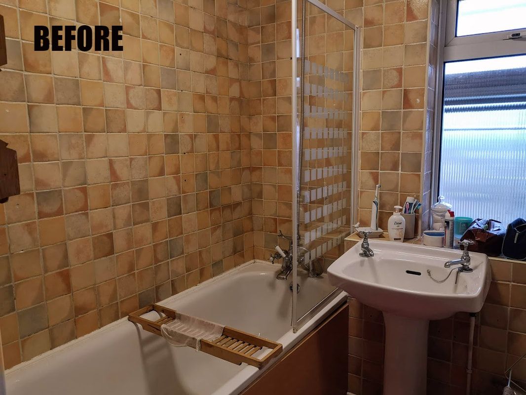
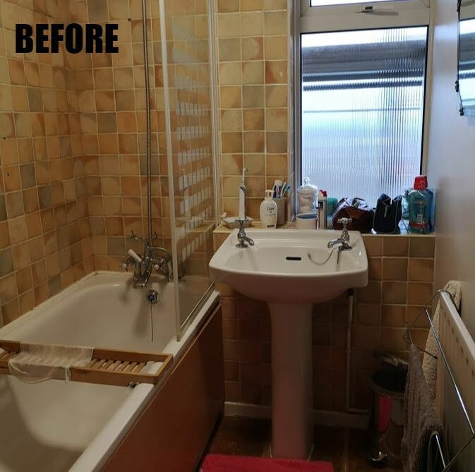
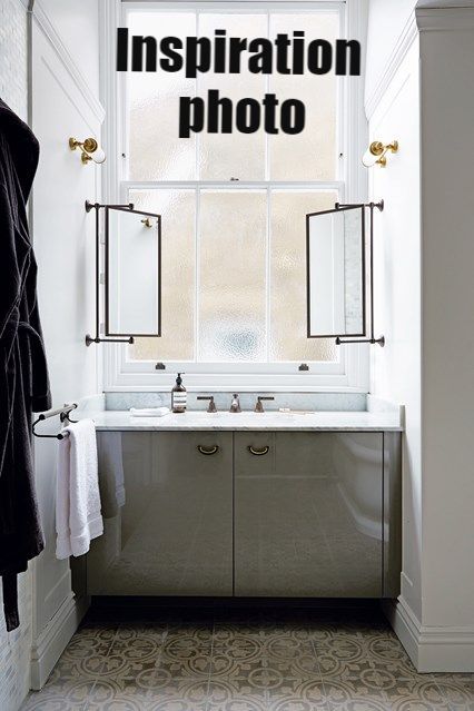
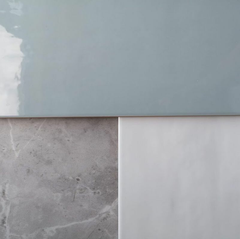
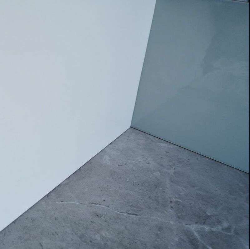
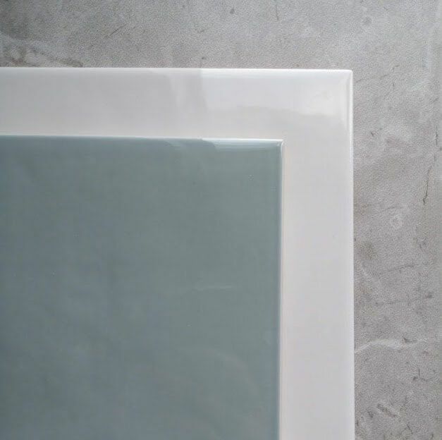
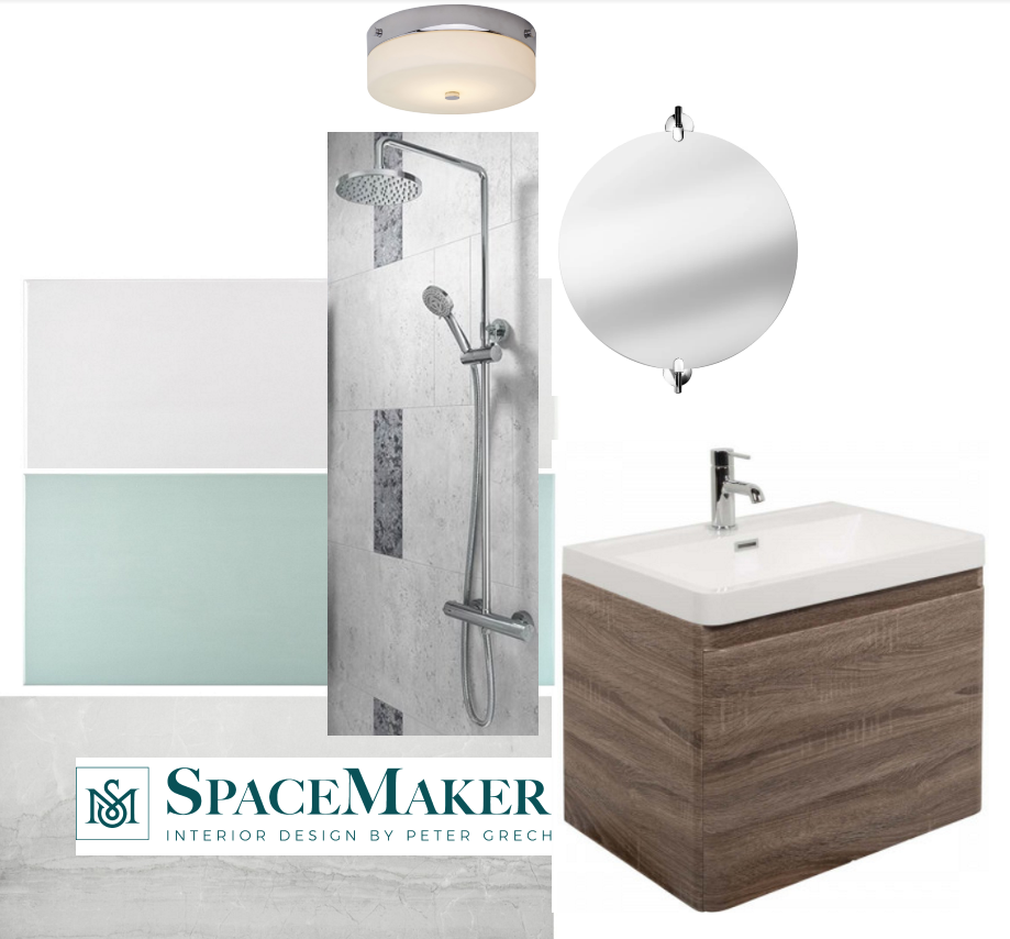
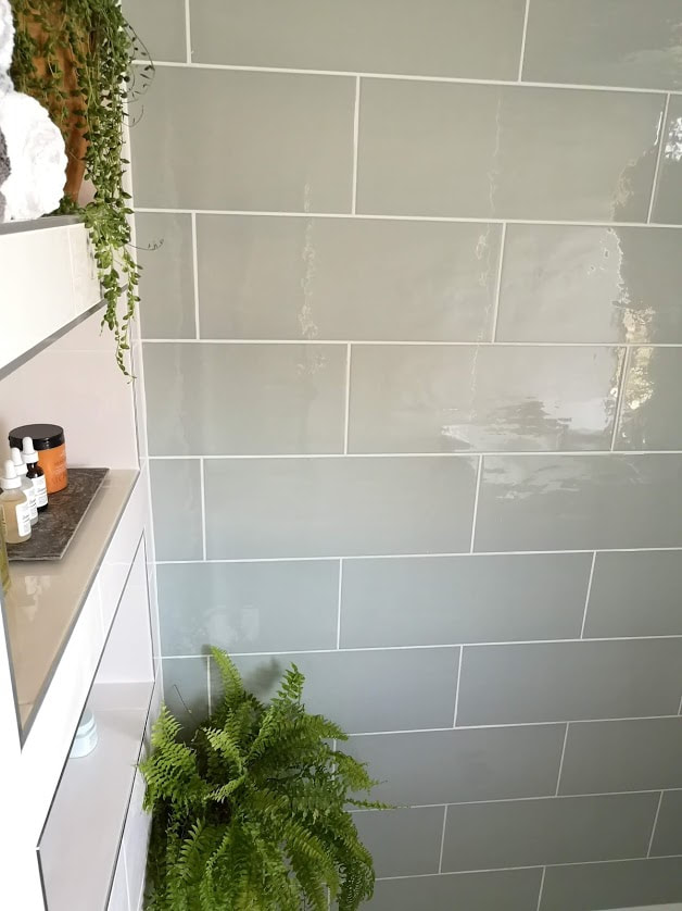
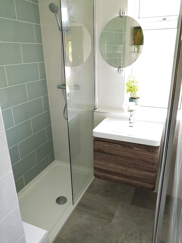
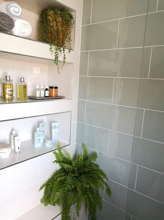
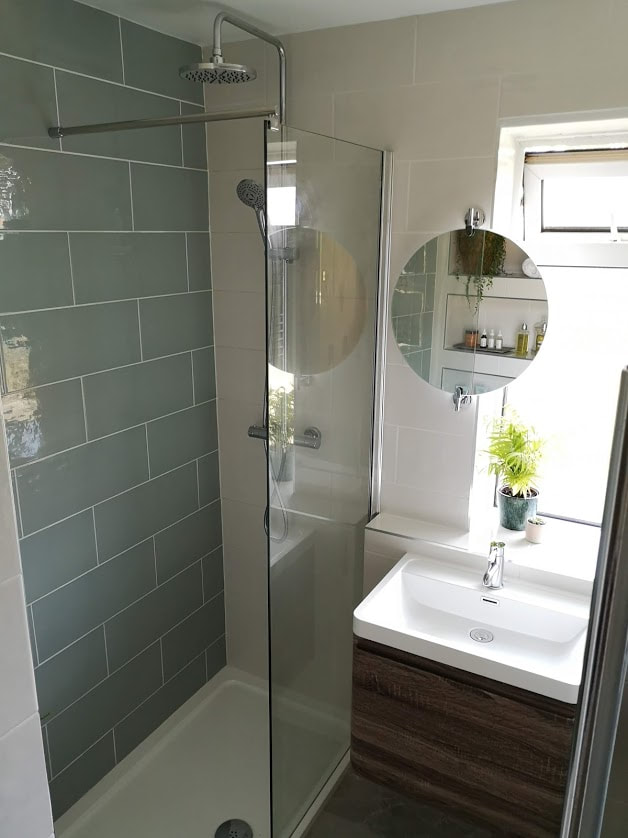
Next we went tile shopping! This was the exciting part of the process as we went to our local Topps Tiles showroom and picked out three tiles that we loved the most. It was so easy to place them next to each other and be sure that they all worked harmoniously with our scheme.  For the floor tile we went for the Variato Tile, which is a porcelain tile which has a natural stone look. The other two tiles we used were both from the Wild Blossom collection. We used the plain tiles in two colourways, the Milk tile and the Sea Grass tile. The milk tile has a soft, off-white colour, and the sea grass is a muted or greyed/sage green, both with a very subtle ripple finish. We chose the green tile as a feature tile across the shower wall to create another interesting feature for you to look at and discover while within the space. It isn't overwhelming despite being a large wall due to its mellow colouring and being the same size as the other wall tiles. 
green, white and grey tile samples
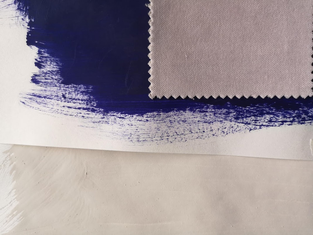
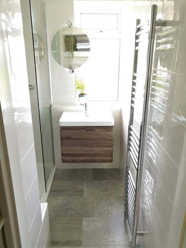
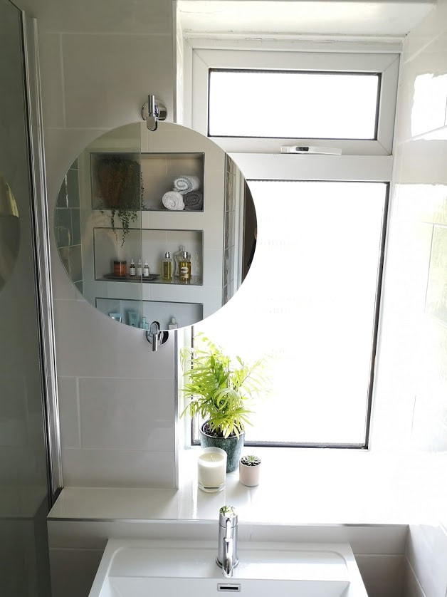
I always recommend buying a sample so you can refer back to it at a later stage when developing your scheme and also to look at it within the light context that you will be placing the tile. Here you can see how the colours, despite being the same 3 tiles, can look different in different lighting conditions. 
We also included more storage by changing the pedestal sink into a vanity unit that has a hidden drawer and a full  drawer. The front of the sink is clad in a wood veneer which injects a warm and natural element into the space that would otherwise have mainly hard surfaces and cool colours. 
moodboard of the grey, white and green bathroom
Mood Board for the bathroom
So our mood board was developing nicely and I created a 3D image the space to help the client and bathroom fitter visualise the space and for us all to be singing from the same hymn sheet. Have a look at the video and then the final photos below and see how with a bit of elbow grease and good design planning we managed to create this space. Have a look at the photos below and let me know your favourite bits in the comments below.
Picture
Picture
Picture
Picture
Picture
Picture
6 Comments

The Polka headboard project

8/4/2019

0 Comments

 
Our attic bedroom has become our own little hide away from the world. The walls in peignoir by Farrow and Ball and the wardrobes in Moles Breath - we still needed a solution for the bed. I wanted a headboard with a statement, but didn't have the budget to buy one from my favourite store. So I decided to make one, and when I saw this headboard by Bianca Hall aka frenchforpinapple I fell head over heels in love. 
I got in touch with Linwood fabrics who operate a family run fabric company based in Hampshire. I had heard and seen their fabrics before and knew there would be a perfect one for my project here. After selecting a few samples I decided on their Tango collection, specifically their polka design in midnight blue. The gorgeous pattern and its detail I thought would highlight the curves I wanted to get in my headboard beautifully yet still being practical and robust.


Bianca hall upholstered headboard in grey marbled fabric
linwood fabric polka midnight
After a speedy delivery from Linwood, I set about creating the headboard, for which I got in touch with my friend Jil at Upholstery bee. She was so gracious to help me out with this project and her skills were invaluable.


Here is a step by step process on the creation of the Polka Headboard. You will need someone to help with this process as each section rolls and  can be a bit unruly to control. 
Step 1 - Measure and calculate it all out.

​Here is a list of what we got:
  • 4 boards cut to our length of 195 cm (width of our bed)
  • 4 semi-circular foam pieces (we chose a 15 cm diameter)
  • Wadding in plenty supply
  • Fabric. We got 15 cm  extra length on each end to allow for the depth of the foam and the board it sits on.
  • You will also need a pneumatic nail gun and some sharp scissors. 
setting up for upholstery. Wooden boards, rolls of fabric and foam
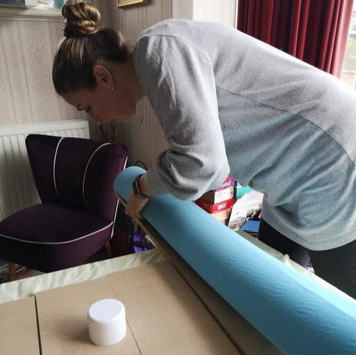
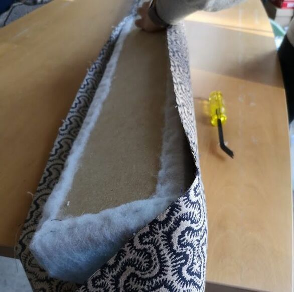
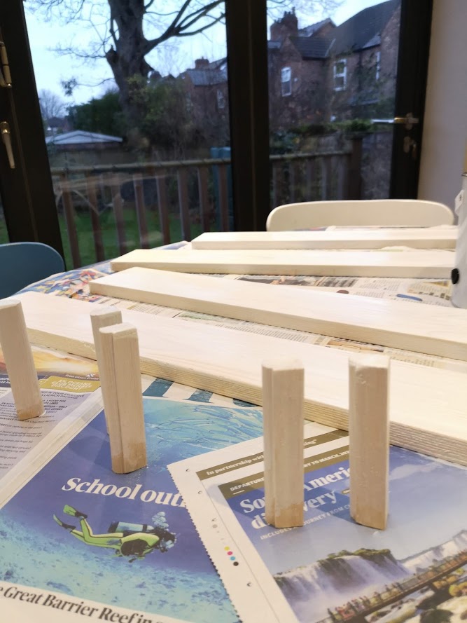
Step 2 - Glue on the foam to the wood planks.  

​We used spray adhesive and then gently lowered the long piece of foam onto the plank of wood. Its useful to have two people when doing this to hold the foam up and you will need to work quickly as the spray adhesive dries quickly.
upholstery bee applying the foam to the backboard carefully
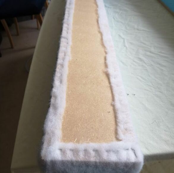
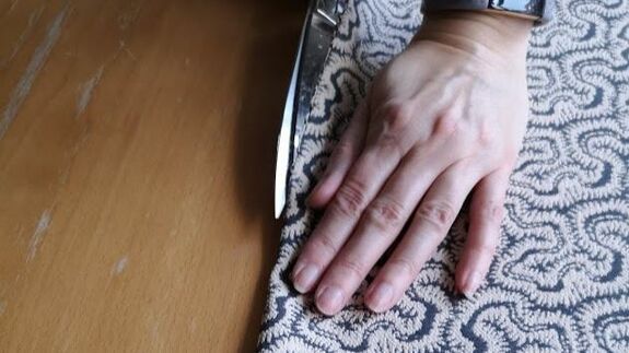
Step 3 - Apply the wadding and staple in place.  

​Try and place the staples in a straight line and make sure that the overlap isnt too large as you will need to cover the wadding with the fabric ideally. 
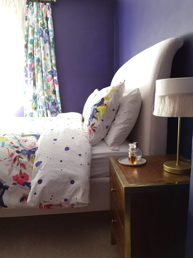
the wadding stapled in place ready for fabric
 ​Step 4 - Cut the fabric

​Cut into strips that will cover the foam and wadding with enough overlap to upholster comfortably. We managed to get 4 strips from our width of fabric. There is a rule in upholstery that fabric, even though your friend, too much of it can ruin a piece. So measure many times before you cut. 
Upholstery Bee cutting the upholstery fabric into strips ready to be fitted
Step 5 - Fix the fabric
​

Get the fabric orientation right and start fixing from the centre  outwards, keeping taught. The corners are particularly tricky due to the amount of fabric that gathers so getting a neat edge is crucial. This is why I got the fabulous Upholstery Bee to work her magic! It is quite a large piece and due to the semicircular front it rocks and rolls (obviously) so I was on hand to help keep things steady. 

You will need to repeat all of the above steps till all 4 of your pieces are upholstered and sit happily.  I transported the pieces individually home as  they wouldn't have fit in my car otherwise and then continued the process at home. 
upholstering carefully, upholstery bee is working from the centre outwards
Step 6 - Creating one headboard
​

Fix all 4 upholstered semi-circular pieces together using a bracket. I couldn't find a bracket long enough in my local hardware store so I got multiple shorter ones which I used to attach the boards together. 
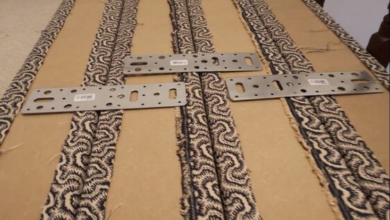
brackets used to fit the headboards together
Step 7 - Hanging the headboard
​

Fix the headboard to the bed or to the wall. I initially used a French cleat but our walls are as soft as cheese so this couldn't take the weight so I ended up fixing it directly to the base bed using some back supports. 
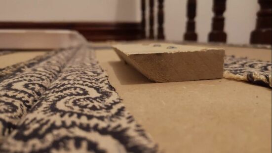
french cleat used to hold the headboard up
Step 8 - Enjoy!
upholstered superking headboard in linwood fabric
finished headboard and the bedroom styled up
upholstered superking headboard in linwood fabric.
detail of upholstered fabric headborad by upholstery bee using linwood fabric
I would like to thank Linwood fabrics for giving me a gracious discount on the fabric and also to Upholstery bee whose magic created these headboards. 
side shot of the headboard made by upholstery bee using linwood fabrics
0 Comments

Doorway Bookshelf

3/1/2019

4 Comments

 
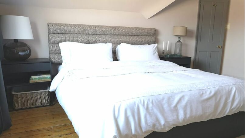
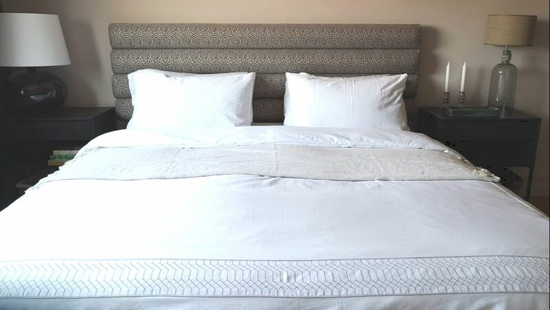
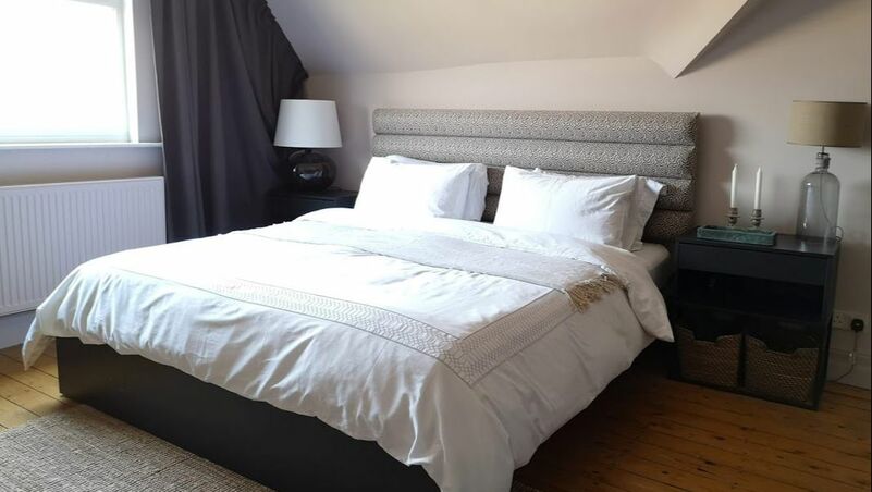
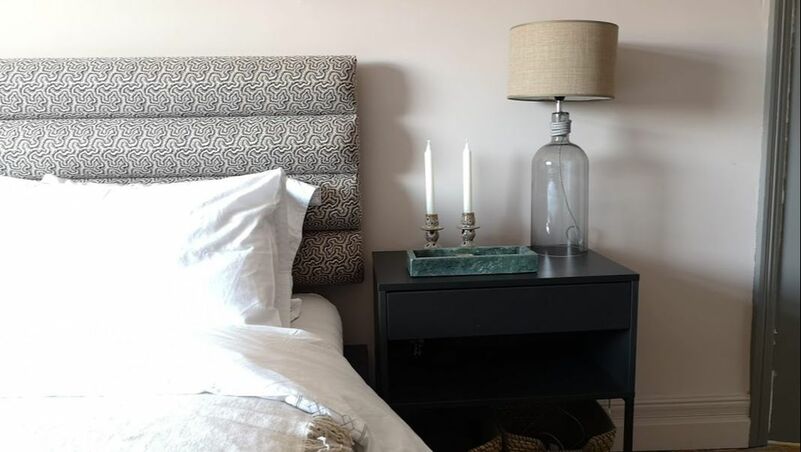
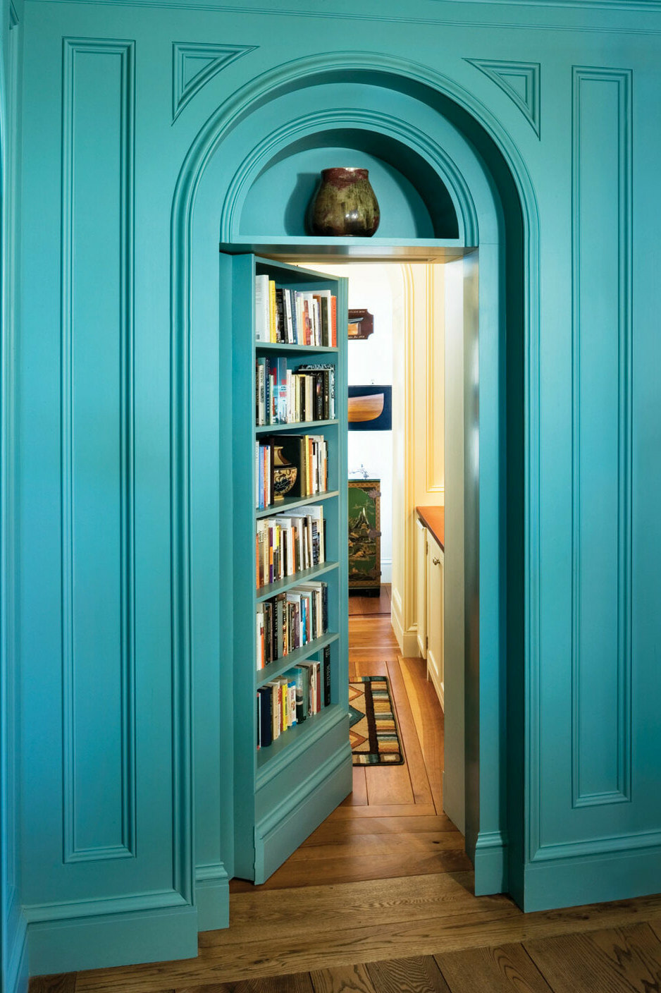
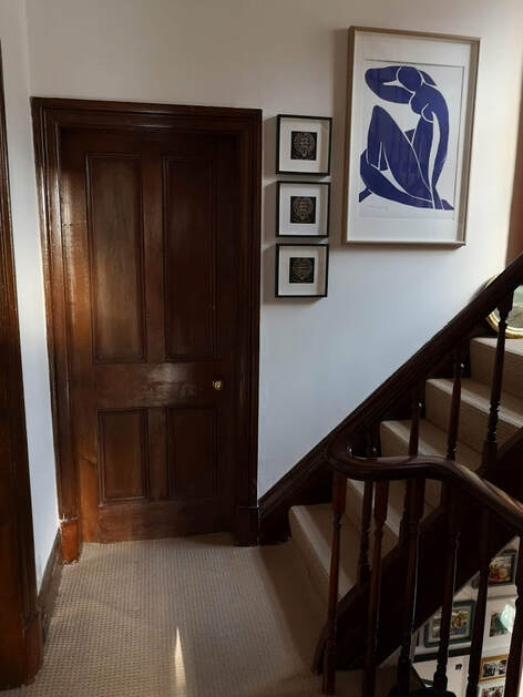
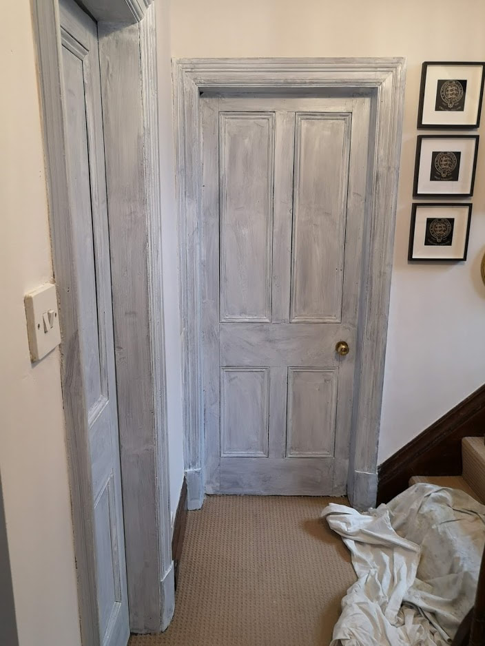
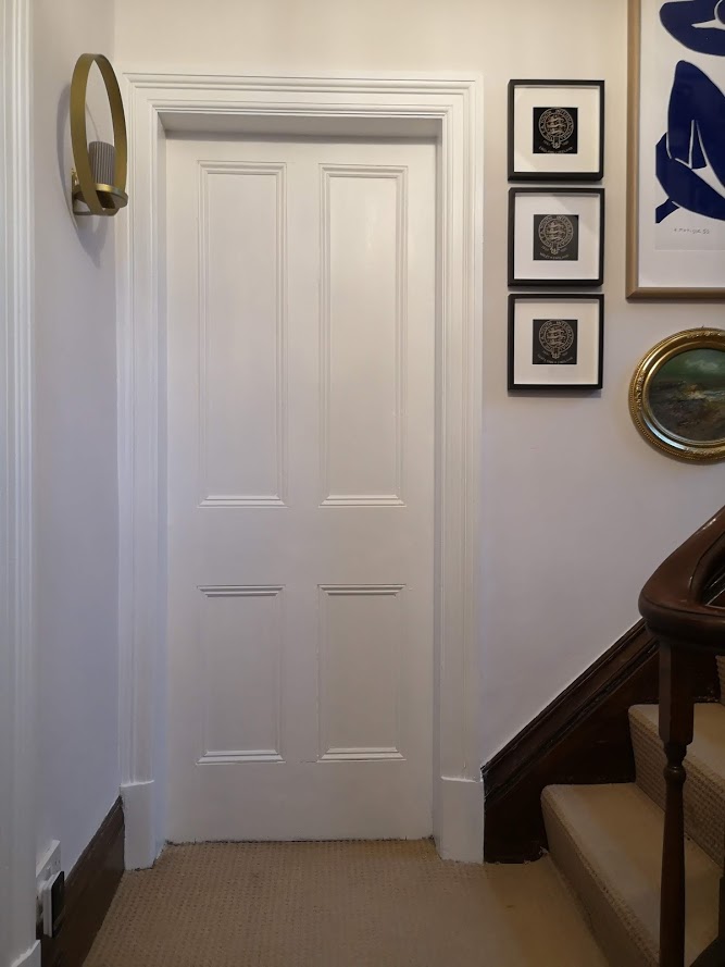
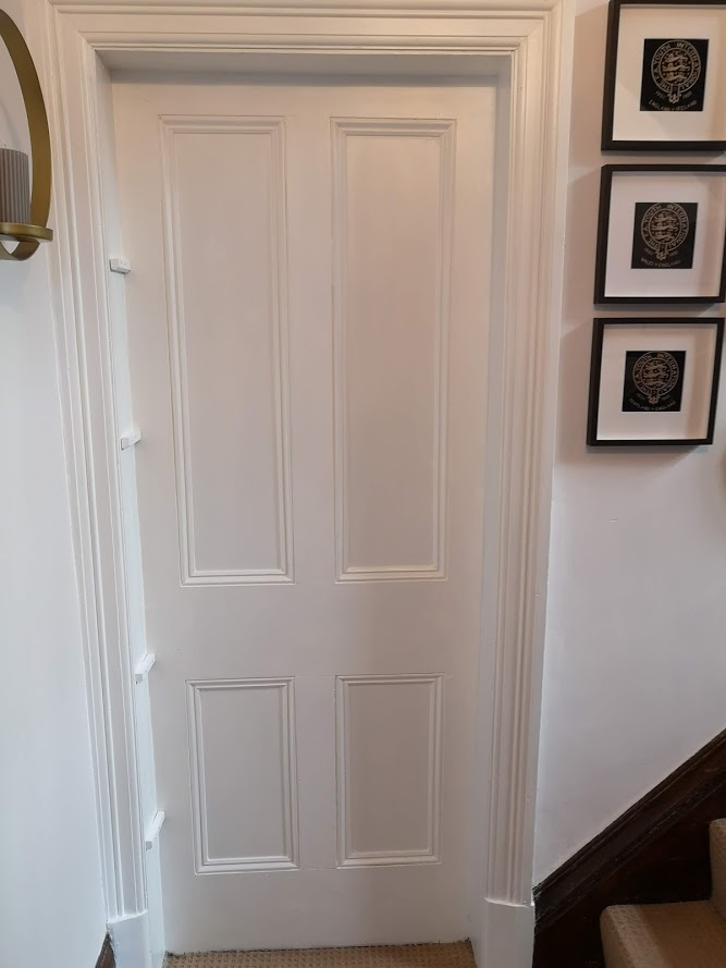
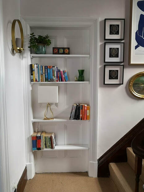
 I have always been fascinated by older houses and their history. Every new owner changes something and these are passed onto the next people living in the space. Our house is not any different. The grand staircase going up the centre of the house has many doors leading off into various rooms, but one of these doors is a fake!

The original house used to have a separate bathroom and water-closet (WC), but a few owners ago this layout was changed and the two rooms were knocked through to create a spacious en suite for one of the bedrooms, and the bathroom was moved into one of the bedrooms (Link to see this space). This left two redundant doors in the hallway, as the access to this room was though a new doorway directly into the bedroom. A while ago one of the owners decided to get rid of one of the door ways and leave the other (who knows why!), but this created the perfect opportunity for my project! I have always wanted to create a doorway bookshelf. I believe that storing books in a redundant doorway has a magical, naria-esque, romance to it. The  mystery of where that door lead to, is mirrored in the mysteries held amongst the pages of those books held within it. 
Picture
Picture
The above photos show some of the inspirational shots you can also see on my staircase board on Pinterest. With these I wanted to freshen up our space. Our door doesn't open or needed to be walked through like the blue one above (although these doors are super cool and some amazing IG folk have got these beauties - see below). So the process was relatively simple! 
Picture
Here is the doorway before, tricks you into believing there is a room to be explored though it, but no! So what we did was:
  1. Take the handle off and prime and paint the door
  2. Measure out the distances on the internal aspect of the door frame (beware as in old houses like mine, these dimensions change by a few millimetres depending on where in the door frame you measure)
  3. Take into consideration the depth of the frame, ours was around 11cm so  only very narrow books or objects would be placed here. 
  4. Make some sort of bracket to keep the shelf up, you can drill the shelf directly into the frame, use metal brackets or do what we did - which was use thick beading nailed into the frame. 
  5. Cut wood to the size of the shelves - prime and paint. 
  6. Measure where you want the shelves to be and place the brackets level to eachother and rest the shelves above it. It is recommended that you fix the shelves to the bracket to prevent them from slipping forward if someone holds onto them 
Picture
Last thing to do, is style it with your favourite pieces. We chose travel books and story books for adults and children so that on our way to bed we get inspired to delve into a fantasy, be it travel or fiction. 

Hope you like how it has turned out, we couldn't be more chuffed with the end result! And yes that lamp is the PERFECT size for the space and gives a gorgeous glow at night when you do not want the main lights on. 

Please leave comments and feedback below. xoxo
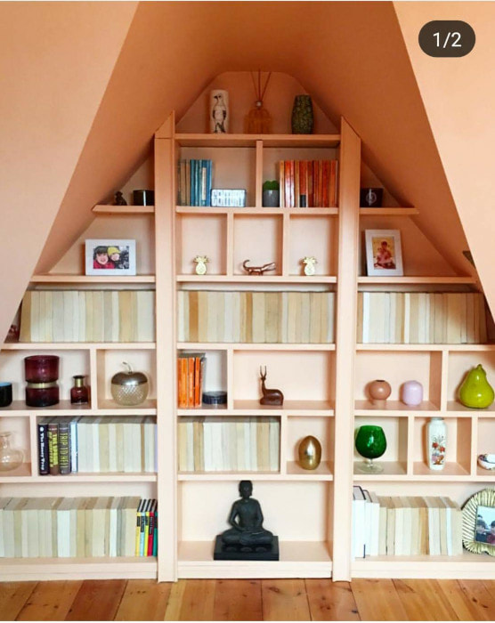
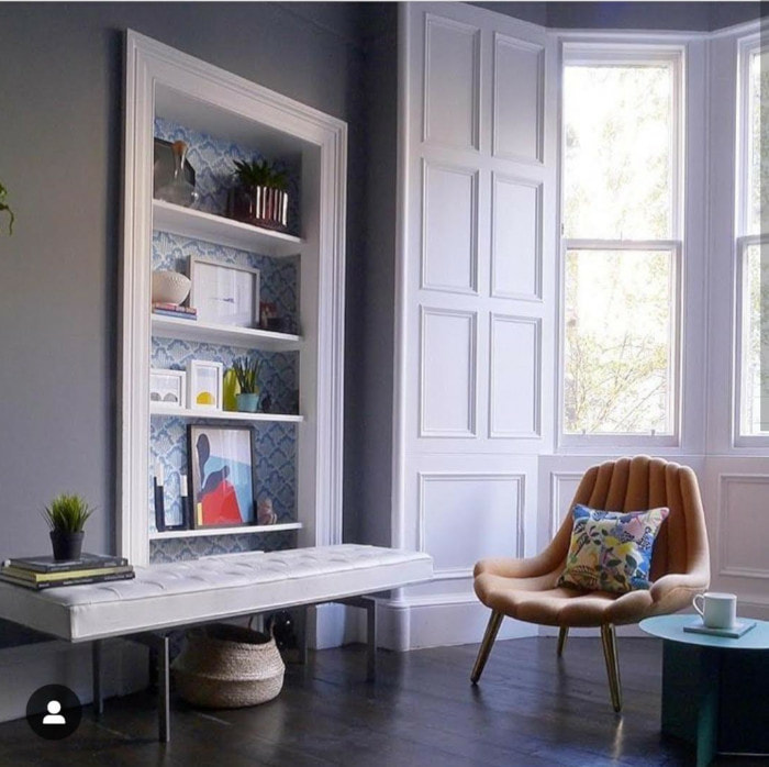
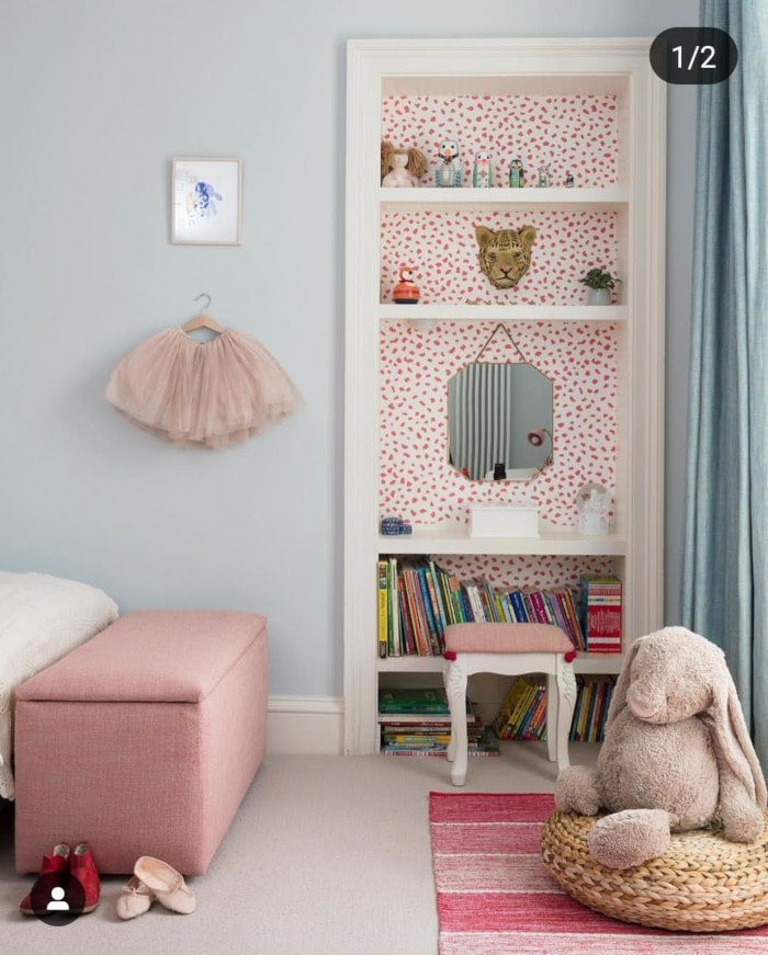
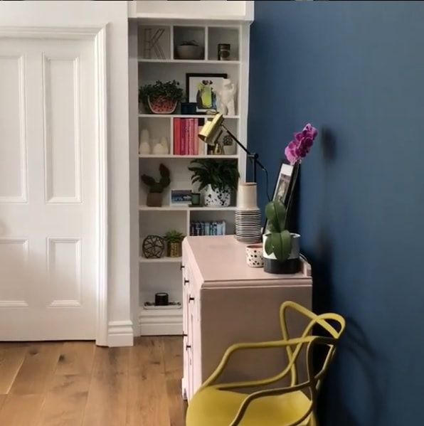
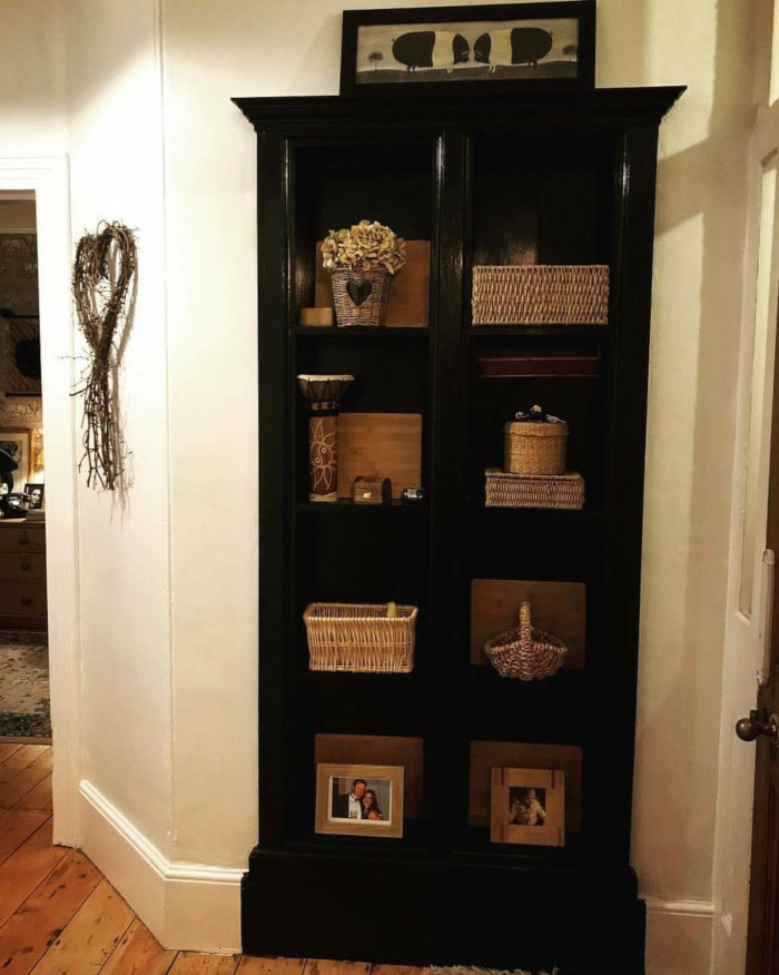
, Btw as mentioned above, here are some other beautiful doorway bookshelves from some real homes in the UK! ​If you know of any others please send them to me!
Picture
Charlotte Williams - @crayvilla
Picture
Liz Nylon - @liznylon
Picture
Emily Smoor - @miss_fantoush
Picture
Katie Woods -@comedowntothewoods
Picture
@thevictorianschoolhouse
Picture
Liz Nylon - @liznylon
Picture
Charlie - @charlie_central
4 Comments

Attic bedroom makeover

5/11/2018

5 Comments

 
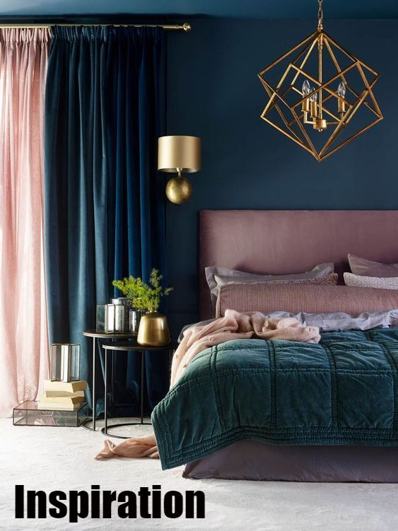
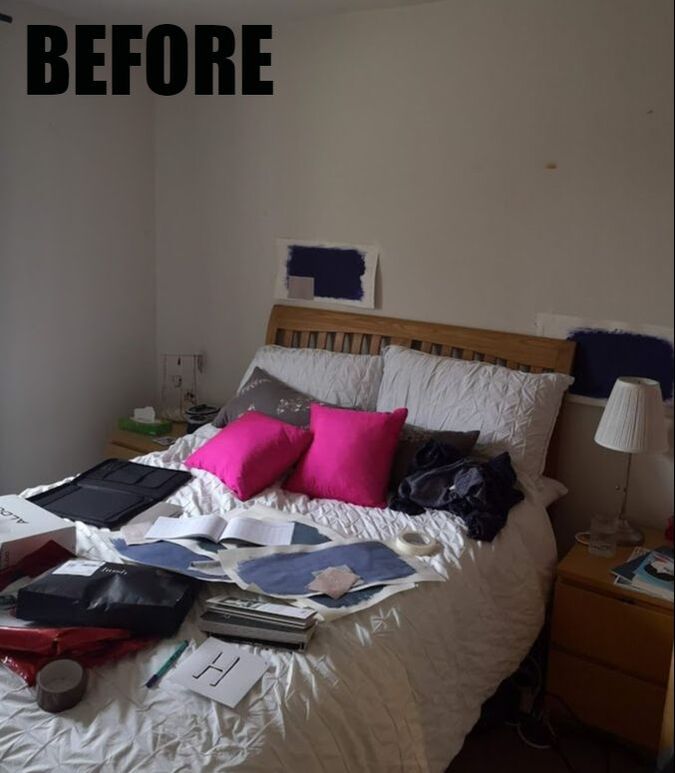
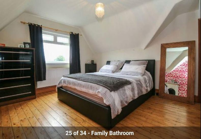
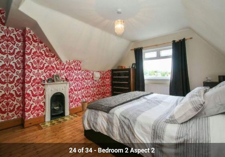
Hey folks, I realise its been way too long since I last posted but if you have been keeping up to date with my Instagram we have been working really hard at finishing off the attic bedroom which is now nearly complete. This is the biggest bedroom in the house and we stayed in it for the first few months and had it re-plastered over the summer which meant its been ready for a makeover for a while but we distracted by the staircase (see my previous post), but now we finally did it. 

My design process with this room is that I wanted to create something calming and serene at the top of the house, somewhere to escape to. We wanted this room to be versatile as a guest bedroom with two twin beds that can be joined up to make a super king sized bed. We also wanted the design to be warm and modern but still layered, characterful and cosy. It posed its own challenges which I shall discuss below but here are a few before photos. The first two are the estate agents photos, and the panorama shot is when we moved in.
Picture
Picture
Picture
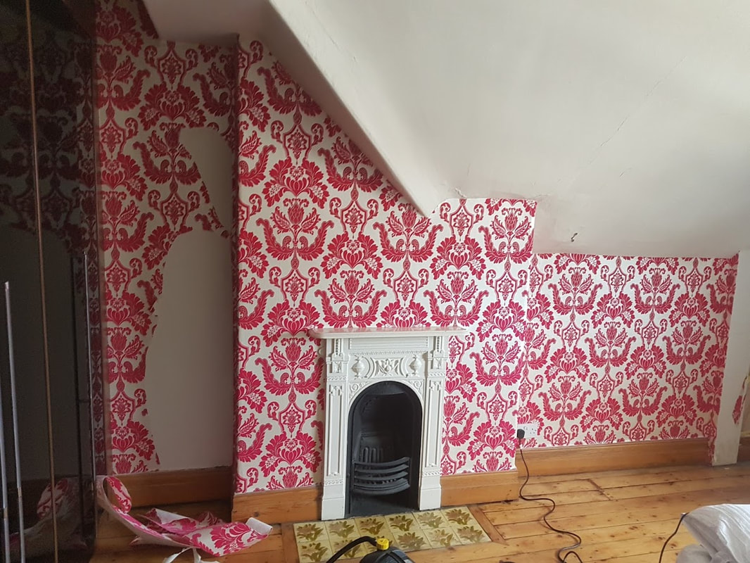
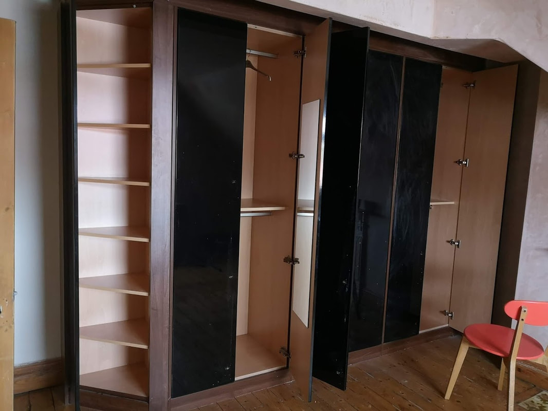
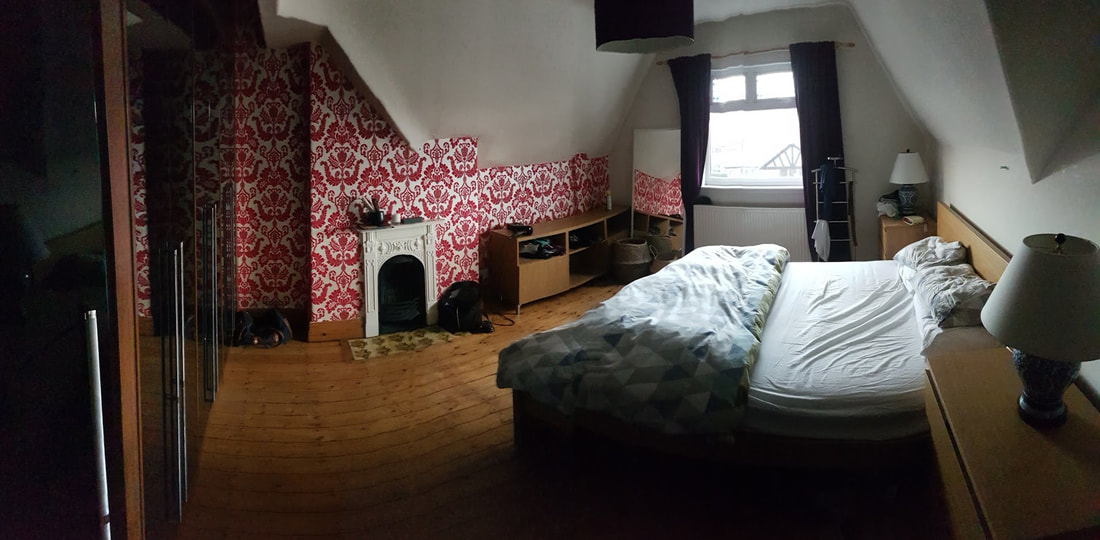
I think its safe to say that I absolutely hated this room. I hated the migraine inducing wallpaper in a velvety damask and bright pink/red. I hated the black high gloss wardrobe fronts and I hated the cracked plaster work. It was not a very relaxing room but we stayed in it as it had built in wardrobes and good storage. I'm still surprised that I didn't at least paint over that awful wallpaper which caused me such upset. Once we moved out of this room we got our revenge though. 
Picture
Picture
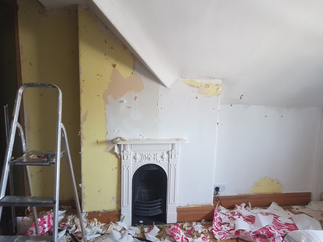
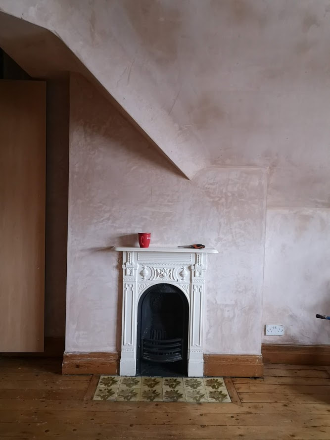
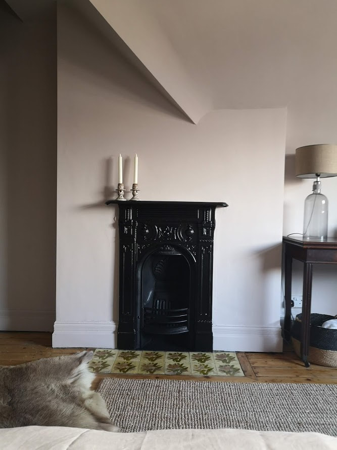
Ripping off that wallpaper (and the 4 layers of paper below it) was so satisfying. From the pictures above you can already see how much more calming that room became without a wall screaming out at you. The other thing that struck me about this room is the lines. So many lines! The pitch of the ceiling, the joists, the chimney breasts, all at different slants to each other joined with a combination of sharp angles and soft curves. Our plasterer got to work on this room, and its fair to say that he did not enjoy it at all and one day once he finished I found him sat down looking particularly broken and said that he was going to retire as he didn't enjoy these complex projects any more!!!! oopsie!
Anyway with the walls plastered you can start appreciating the shapes in this room. I wanted to celebrate these shapes but still keep the room calm and not overwhelming. I was inspired by this picture of the unpainted walls and ceiling and thought, what if i just pained the whole thing including ceiling the same colour. t would create a cocooning effect and still allow the shapes of the room to be appreciated. This lead me down to choose the colours I eventually went for. Pegnoir by Farrow and Ball for the walls was a natural choice. Its slightly greyed pink colour was perfect for the modern vibe I wanted this room to have with a calming colour which would look warm despite the north facing aspect. In some lights it can almost seem lilac. I took the colour over the skirting boards to increase the sensation of height in this room despite it having 2.5m ceilings. 
Picture
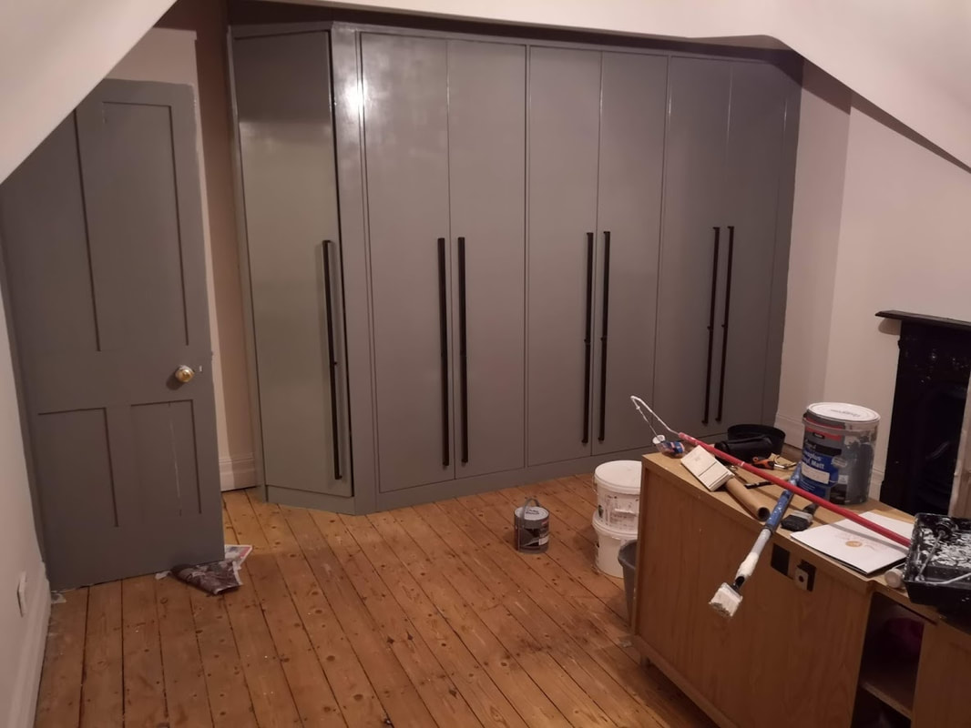
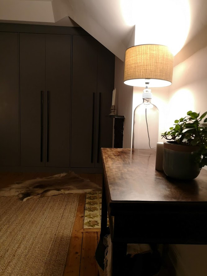
The next thing to tackle was the wardrobes. I debated ripping them out for all of 3 seconds, I just hated their colour and finish, but they were solidly built and did use the space very well, so I would only be replacing them with something very similar. The other alternative was to change the doors, but unfortunately these doors are a custom height which uses as much space as possible which is great from a storage point of view but not so great from ease of change. We did find some companies online that did offer custom doors but the cost was higher than I had budgeted for so we went for the simplest option. Paint!
So after removing the handles, I sanded the doors and the body of the wardrobes ready for painting in an all surface primer. I tinted the primer by adding some of the top colour paint to the original primer (I saw this online once and thought it was a good idea, but probably wouldn't do this again next time). Two coats of Moles breath later we had new wardrobes! I spray painted the handles matt black with this and the look was transformed. I used the same spray paint on the fireplace.
Picture
Picture
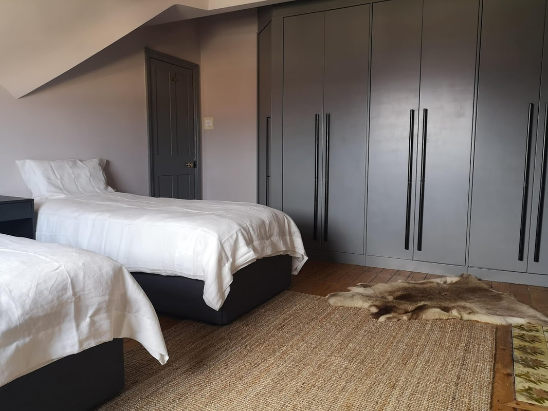
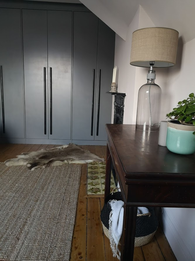
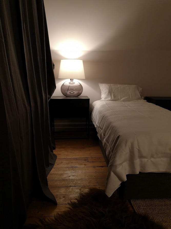
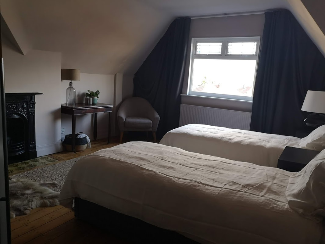
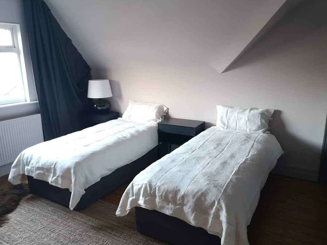
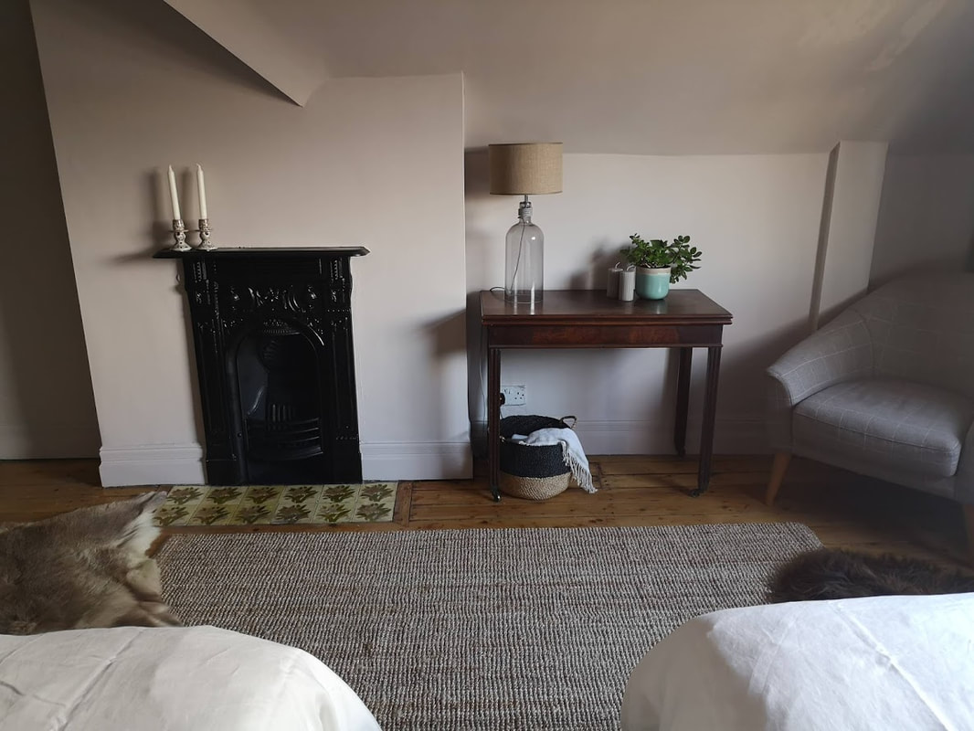
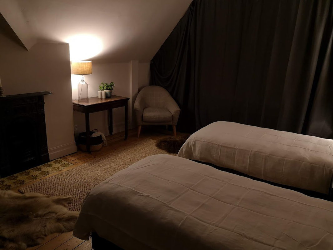
Now that the painting was all finished we had to get down to dressing the room! I wanted to again create more drama in this room by creating an apex curtain across the whole wall where the window was. The idea behind this was to create a cosier feel in the room with texture and add to the insulation of the thin outer wall. To create the whole wall of curtain I fixed tracks as close to the ceiling along the whole end wall of the room. The centre portion have a draw string to allow them to be opened easily, and the two end diagonal tracks were fixed and would never really be opened or drawn (as you can see there is only wall behind them). I used dark grey Ikea curtains which are also black out and textured to compliment the look of the room. The end panels didn't really hang straight down as I had imagined they would, so I gathered the fabric in the end panels to fill out the space properly. I might live with it for a bit and see if it bothers me, in which case some inventive sewing will be in order (I have never sewn anything in my life, apart from a button, hence the fear).
Picture
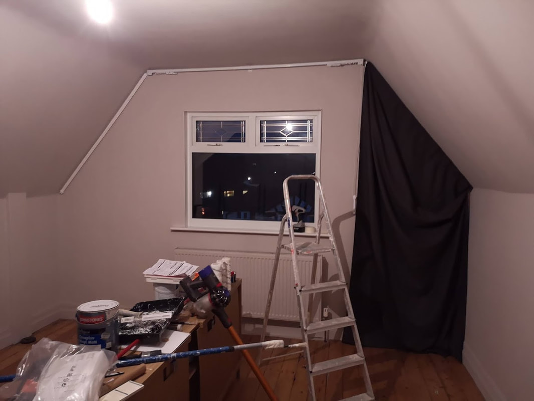
After an evening on my knees with Allen keys we got the beds and bedside tables up. The room came together super quickly after that with a few lamps I already had and some cosy throws and rugs we ended up with the nearly finished room below!
Picture
Picture
Picture
Picture
Picture
Picture
Picture
Picture
Picture
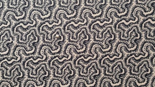
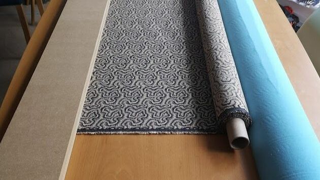
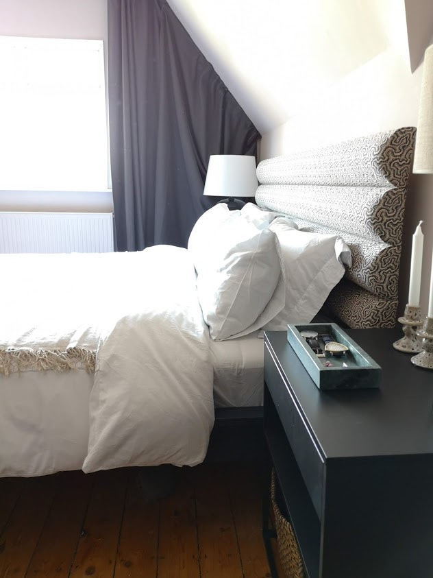
I hope you like the room as I am super chuffed with it. The only thing left is to create a headboard that allows the beds to be used as a twins and also as a super king. I have been mega inspired by the fabulous headboard over at frenchforpinapple (insta) which is pretty epic and would be great in this space and would stretch the whole length of the wall behind the beds and bedside tables. So I just need to find the correct fabric now... watch this space. If you want to see the whole process in video format, have a look at my Attic Bedroom Highlight on my Instagram page.

Lots more projects coming your way soon so stay tuned. 

BTW I know there might be some comments about the fur throw in the bedroom, but this is farmed reindeer from Norway, they are farmed for their meat a cows are in this country, and skinned the same way sheep skins are used in this country (there is also a sheep skin in this room near the arm chair). I bought this when I was 16 and travelling in Scandinavia. 
5 Comments
<<Previous

    Categories

    All
    Bathroom
    Bedroom
    Budget Friendly Interiors
    Colourful Interiors
    Colour Series
    Design
    Dining Room
    Hallway
    High Street Sourcing
    Home Office
    Interior Design Inspiration
    Interior Design Rules
    Interior Makeover
    Interiors Interview
    Interior Styling Tips
    Lighting
    Living Room
    Outdoor Living
    Seasonal Decor

    RSS Feed

Picture

    Join our mailing list

Subscribe

Home

Portfolio

About and press

Services

Contact

Articles

Styling Guides
Design Tips
Room Inspiration
Terms of use
Privacy
Picture
Picture
Picture
Peter Grech in Altrincham, Cheshire, UK on Houzz
Picture
Peter Grech in Altrincham, Cheshire, UK on Houzz
Award winning Interior Design  & Styling -  Cheshire, UK
Copyright © 2025
  • Home
  • Portfolio
    • The Art House, Hale, Cheshire
    • Heath House, Alsager, Cheshire
    • Casacoppa, Liverpool
    • Worldly Loft, Ancoats, Manchester
    • Georgian Townhouse, Cheshire
    • Artistic Edwardians, Hale
  • About
  • Services
  • Contact