THE SPACEMAKER - INTERIORS BY PETER GRECH
  • Home
  • Portfolio
    • The Art House, Hale, Cheshire
    • Heath House, Alsager, Cheshire
    • Casacoppa, Liverpool
    • Worldly Loft, Ancoats, Manchester
    • Georgian Townhouse, Cheshire
    • Artistic Edwardians, Hale
  • About
  • Services
  • Contact

In conversation with ... Pandora Maxton

22/5/2020

2 Comments

 
Today we speak to one of our tastemakers - Pandora Maxton (@pandora.maxton). On a lovely sunny afternoon, we join Pandora by the terrace doors in her living room looking out onto her gorgeous garden. With nearly 50k followers on Instagram, she is well known for her eclectic and maximalist style and is focusing on celebrating country living and lifestyle. We delve into some of her tips on maximalist décor and she reveals the top three things that her space must have!
headshot of Pandora Maxton

When did you realise your passion for interior design?

I studied fine arts and printmaking and initially I used to make abstract art for office spaces. Then did a degree in Interior design and worked with Nobilis (the high-end fabric and wall coverings company) as a sales rep in the North of the UK. I would see Interior designers working and thought I would love to get creative but I never really wanted to work as an interior designer for others. I guess it was when I started using Instagram that it really started expressing my creativity. I love doing styling work and working on building more of a lifestyle brand including outdoor living and food.
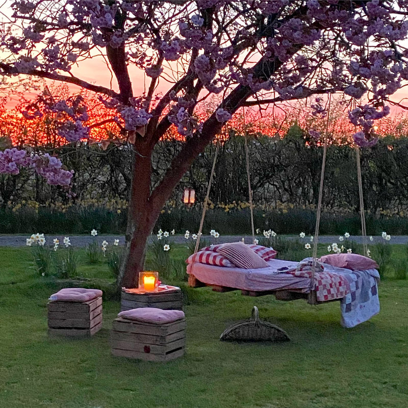
Outdoor sofa swing made of scrap wood.

​How would you describe your aesthetic?

​I would describe it as eclectic and maximalist with a homely vibe. Everything inside my home has a personal sentiment. I'm not afraid to use colour boldly and to mix styles. No-one would be able to re-create my home space exactly the same as it is so personal to me.

What are your tips on creating a maximalist space?

​There is definitely a knack to maximalist interiors. My first tip would be to keep an eye on the colours that you use and make sure they are cohesive and work well together, but also that things aren't TOO matchy-matchy as it quickly becomes boring. I usually have a warmer element within my spaces even if it is just the glow of a lamp or some fairy lights. A second tip would be to use a dark colour as a base colour to tie all the other colours together, something like Downpipe from Farrow and Ball works really well instead of having a white/off white. Lastly, I would also suggest that you mix different styles together including mid-century, antiques and rustic elements. Try to overcome the fear and risk making a mistake - but this always something you can learn and improve on. I am constantly turning spaces within my home around, it keeps things fresh and interesting. Just before speaking to you, I moved my dining table around and it just gives the space a new perspective.
Maximalist eclecitc bedroom with reclaimed bed and black wall.

​Have you ever heard or given any advice that you think is golden?

​Give your space a soul. Make sure there is something within the space that really sings. Even if you are a fan of minimalist interiors, it could be something as simple as a massive fireplace with a gorgeous armchair and one sprig of eucalyptus. The space just has personality and reflects the people within it.  Try not to copy other spaces that you see online or in magazines piece for piece, but try and adapt it to your own space and make it unique to you.

​What do you find the most inspiring?

​I am not impressed by expensive interiors. I think if we all had the money we could all go and spend 15K on a sofa. But what really impresses me is people who are innovative with their interiors and come up with solutions to their design dilemmas that really push the boat out. Someone making a beautiful piece of furniture with some scrap wood or upcycled furniture - that really inspires me.
Cherry blossom with suspended outdoor sofa.

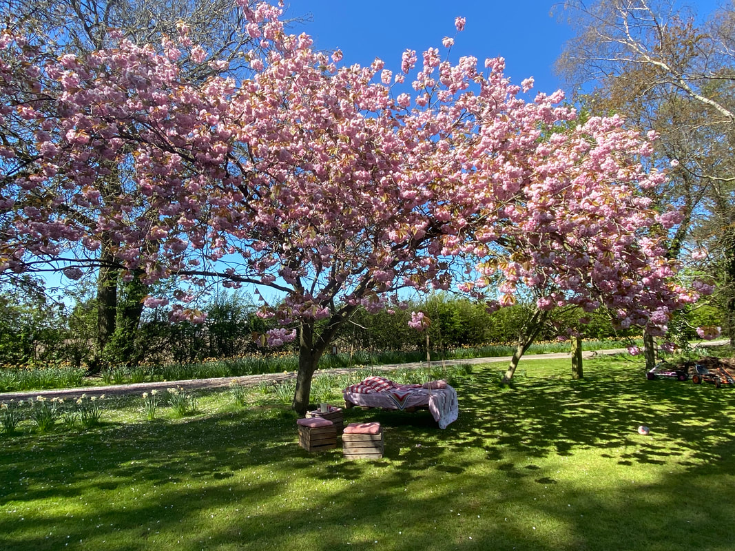
My ideal space has to have these three things:

I would say a massive fireplace cos I love fire! It's so cosy and warm regardless of the time of year. I love lamps - again these really help create that atmosphere when the sunlight fades. Finally, plants, they just give life to a space. Overall obviously light is the most important element in a space.

What is your pet peeve inside your home?

​Must there only be one?? I am so frustrated with the lack of natural light inside our kitchen. I would love to have the opportunity to re-do it and glaze a whole side. We spend so much time in the kitchen and its quite gloomy but I appreciate that we are lucky to have an already beautiful kitchen, so it is not a priority but will get to it eventually.
Dark blue country kitchen with slate flooring and a red aga stove

​What is your favourite space in your home?

I love our pergola! It's such a great outside space that we use all the time from Spring till Early Autumn. I wish we could glaze it and use it more throughout the year. But currently, we're loving having all our meals out there and I'm making my kids sit outside in their coats cos I just love using that space.
Outdoor sofa made from palettes. Monochrome and mustard tones with a firepit

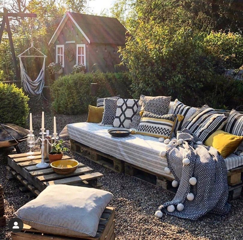
​One design trend that you love and one that you hate.

I love anything boho and eclectic with a layered look. I don't really hate any specific trends, I don't think I'm a fan of French faux rustic look that is a bit too perfect, it just can seem a bit try-hard.

How do you think social media has changed the way people interact with or delve into interiors?

​I think platforms such as Instagram has been great at providing people with an outlet for something they are interested in such as interiors and also, its lovely receiving feedback from people, other than my family, saying how much they loved a revamped space I worked on. But it can be quite noisy, sometimes all you see are massive accounts which don't necessarily have what you are looking for, and miss some incredible small accounts who are really inspiring. The other thing that can frustrate is seeing people playing the game and it seems very strategized. But I guess it's about finding people that really inspire you and trying to give them as much support as possible.
2 Comments

How to make a no-sew Roman Blind

7/10/2019

1 Comment

 
Hello Everyone! When I was working on a clients study space we were discussing window treatment for her guest bedroom/study. The layout that we came up with had a floating dropleaf desk that went out of the way when she had guests staying allowing it to also function as a headboard! Smart right? Well that meant that you cannot have any curtains unless they are short ones (this is a bit of a NoNo in my honest opinion). So I proposed a roman blind that still adds pattern and a focal point to the room but would help filter out the light. She loved this option  and after hunting for the right fabric we landed on this gorgeous pattern from IKEA. Its called SKUGGBRÄCKA (try saying that while chewing fudge!). They had another stunning fabric with more of a structured pattern but considering the width of the blind this pattern worked better. Read all the way to the bottom for the things I would do differently in future. 
Monochrome black and white bold pattern fabric from ikea
Our fabric final for the blind
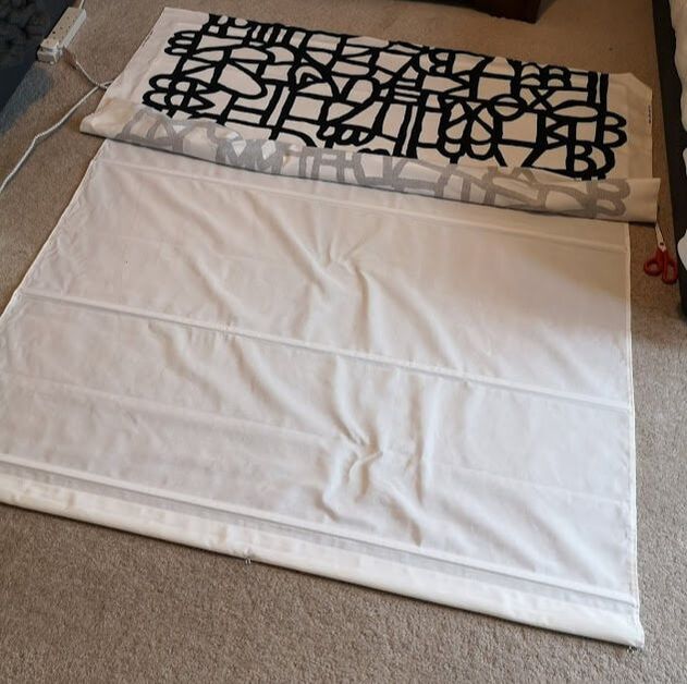
Now I won't lie, I cannot sew! And despite watching numerous you-tube videos and hunting down my curtain makers, the numbers just didn't add up and we wanted this installed in a matter of days. So I decided to try a no-sew approach. I must say this hasn't been endorsed by IKEA but we did end up using everything from there. So if you are a no-sew kind of guy/gal and you want to create something similar, this is what you need.

Materials:
  • Fabric - Make sure your fabric is an extra 10cm wider and longer than the full blind (this allows you 5cm on either side to fold over)
  • Blind - We used the clever magnetic blind from IKEA called RINGBLOMMA.
  • Iron on hemming strip - SY (you could use a glue gun if you prefer
  • Iron (obviously)

This took me around an hour from start to finish. So a super quick and easy project. (After you navigated the isles of IKEA)
Step 1:
Iron the fabric to make sure all the creases are out. Its easier to do this at the start. 

Step 2:
Lay the blind down on a large area and centre the fabric above it. If you have any pattern or repeats make sure that they are perpendicular to the blind (which is why I chose an abstract pattern as these repeats are concealed)

Step 3: 
I started at the bottom of the blind but you can do it the other way around if you so wish. Roll back the fabric, lay down the SY strip, and carfeully replace the fabric over it. Double check that the SY iron-on hemming strip is positioned properly and sandwiched between the fabric and the blind before moving onto the next. 

Step 4:
Iron on the strip. Make sure the temperature is hot enough to melt the glue but wont burn the fabric (Keep it moving) and check that the SY tape is melting and adhering. ​​

making a no sew roman blind using ikea products
TOP TIP: Working you way up or down the blind. Keep the remaining fabric rolled so it doesn't crease or get in the way.
how to get the fabric to stick to the blind using SY iron on hemming strip
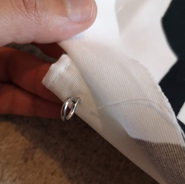
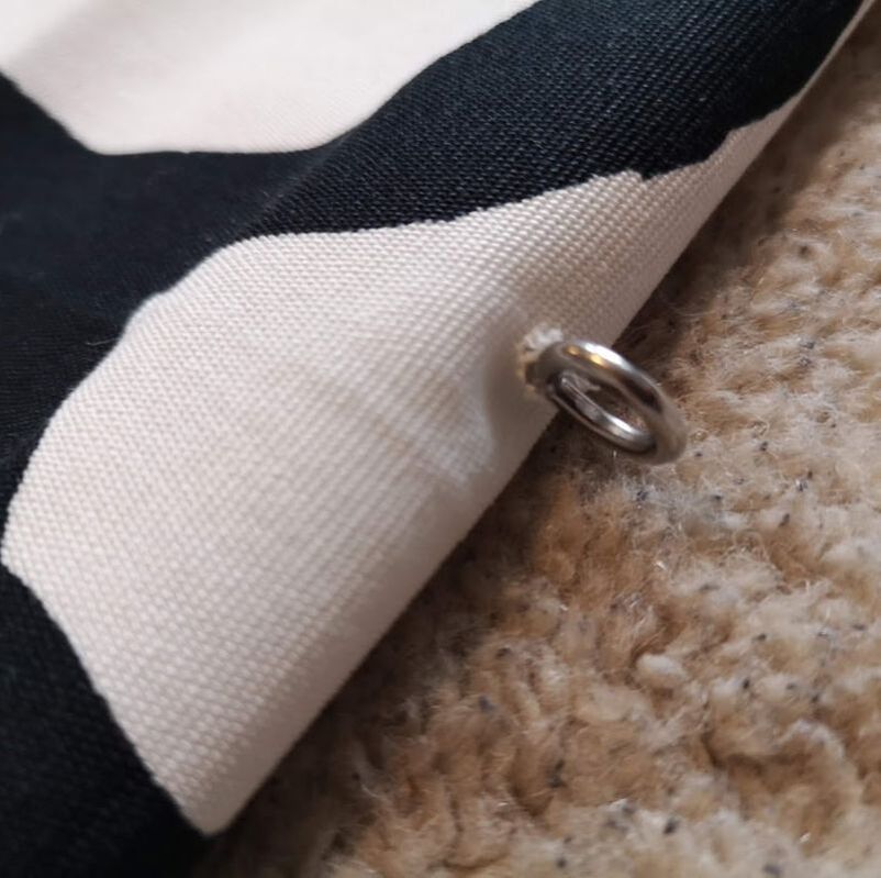
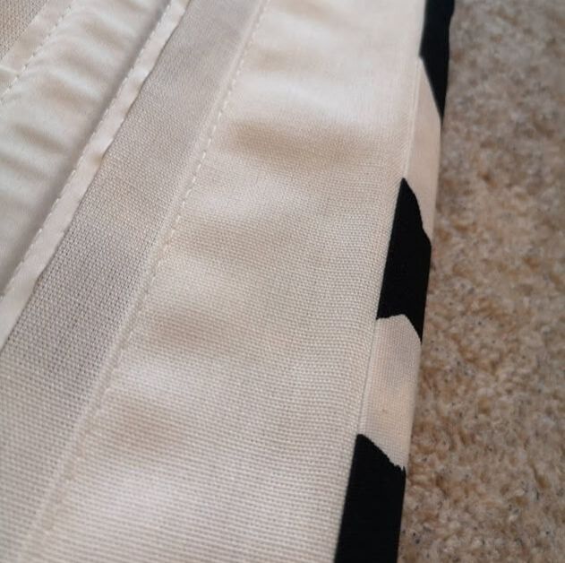
Align the SY tape to where you definitely want the fabric to be (as close to the edge in my case) and hold it in place while you sandwich it between the blind and the fabric. Proceed to iron it to activate the glue.
Step 5:
Work your way down the blind. I would suggest keeping the fabric (yet to be adhered), rolled up as it prevents it from getting creased or in your way. I applied a SY strip at every baton on the blind, This made sure that the fabric was definitely attached at these points. You could also consider using upholstery spray glue on the rest of the blind, but I was concerned regarding staining, and keeping the fabric supple so I avoided this. Make sure that your fabric is flat the way through before ironing on.

Step 6:
At the top of the blind there are little metal loops that the blind hangs from. To get the fabric over and around these, make little cuts in the fabric at the point where it would fold over and slide the head of the loop through. Make the cut as little as possible as you do not want the fabric to start fraying. 
top of the no sew roman bind hoop before
Keeping your fabric taught, make a small cut at the place where the base of the loop will be on the fabric.
top of the blind no sew roman blind hoop after
Pop the loop through. Remember to make a small hole as the base is narrower and you don't want the fabric to start fraying.
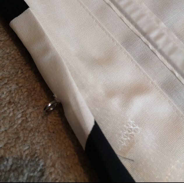
​Step 7:
Once you are done on the front of the blind, flip it over so the fabric is face down and the blind back is facing up. Now its time to hem the edges. I started with the sides as the fabric had a neat edge here and it was an easy win. Next move to the top and bottom. Fold the cut edge of the fabric so that the end was tucked in, then apply the SY strip and while holding the fabric in place iron it down. You will need to work on smaller sections at a time ensuring that the fabric is flat, neat and taught before ironing. 
how to make a neat hem on a no sew roman blind before
Folding the cut edge of fabric in and applying the SY strip you can work along to create a neat hem.
neat hem on a no-sew roman blind
The finished edge at the top should look neat like this.
Step 8:
Finally at the corners, by folding in the corners of the fabric and using the same way we did at the top and bottom, make a neat hem. 
making neat corner details on a no sew roman blind
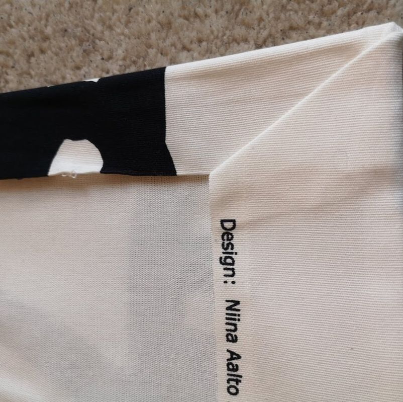
TOP TIP: Creating a neat back of the blind is super important as any flaws will be highlighted when light shines through the blind, revealing all!
Step 9:
Making sure that all the SY has set, you are ready to hang you blind!
no sew roman blind in a study in london
detail of the no sew roman blind
no sew roman blind in a study in london
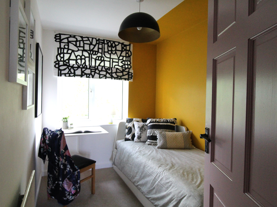
Some things I learned while on this no-sew roman blind project;
  • SY tape is basically dry glue so if you have a glue gun that could work just as well. 
  • Choose a light weight fabric as the magnets of the ringblomma that hold it up are not the strongest and any added weight in the fabric will compromise their strength. 
  • We used the widest blind as wanted it to sit in front of the window. The ringblomma blinds cannot be cut down to size if you wanted them to fit inside the window. 

So if you are also a no-sew kind of person, and want to create a beautiful, affordable blind for your space try this method out. Let me know how you get on by commenting below. Also if you want to keep up to date with any of my how-to's then subscribe to my newsletter at the bottom of the page and follow me on Instagram
1 Comment

How to DIY panel your walls

7/8/2019

1 Comment

 
Our guest bedroom in our Victorian home had all its original features taken out prior to us moving in. So everything from the fireplace, the coving, picture rails, and even the skirting board were all gone! Most people who live in newer homes might say, well what's the big deal? The issue is that the room had lost all its character and didn't feel as connected to the rest of the house. Also it had some massive built in cupboards put into the alcoves on either side of the chimney breast put in. I have been very tempted to rip these out, but what would I achieve? So I tried thinking of alternative ways to use them within the room and allow me to re-introduce character. This is where the panelling idea came forward. I thought that if I could create a panelled wall all the way around the room, keeping the proportions similar to those used on the doors of the wardrobe, it would tie the space together.
bedroom showing dull grey and featureless built in cupboards
Before the transformation began the space was uninspiring and bleak.
panelling in a bistro in dark blue with tan leather upholstery
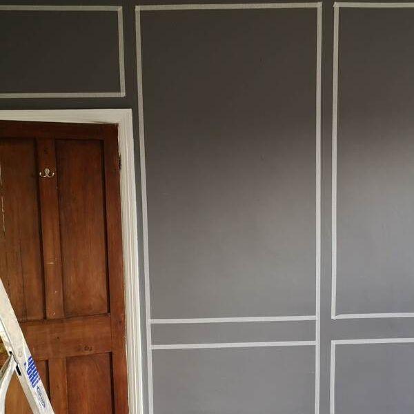
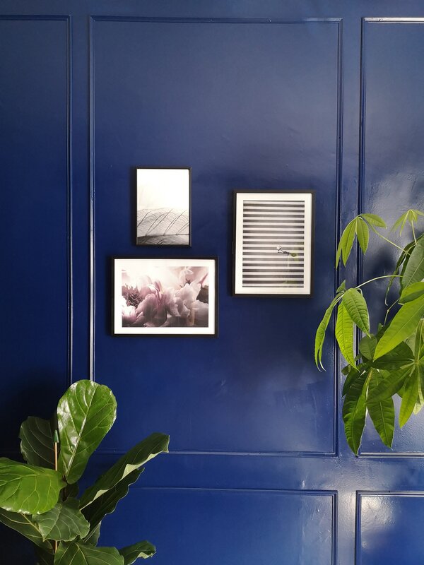
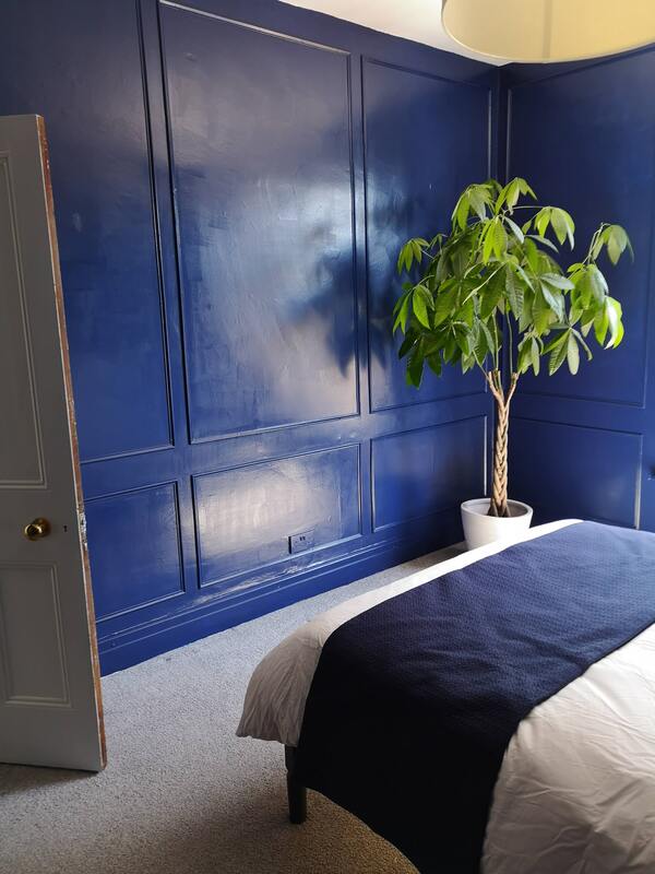
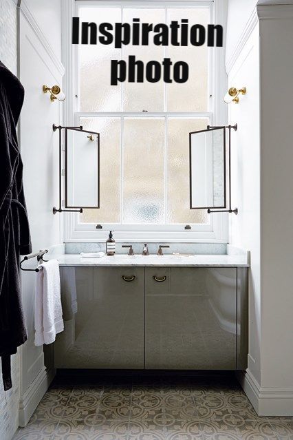
My inspiration photo by Warings Furniture
​So I got to work measuring out the walls and the spaces available to start my panelling adventure.  It is really important to note details such as where plugs and switches are, or where your radiator is fitted. If you  don't consider these you could end up with a proportion of your panel distorted by the radiator - whereas if you consider it, then you can design around it making it a more considered look.
​I used the panels on the wardrobe as my proportion points, keeping the same line all the way around the room created a wholistic look, as though those panels and wardrobes were designed at the same time. I used masking tape to mark where the panels would go, and this allowed me to play around with shapes and proportions . The tape also helped in  determining the thickness that my panel beading should be. It would be a lot easier to use a lazer level that can project a horizontal line along the whole room, but I  did it the old school way. Also as all the walls in this old house are wonky, the organic approach seemed to work. 
using tape when creating panelling
Using tape on the walls to give an outline to the panelling
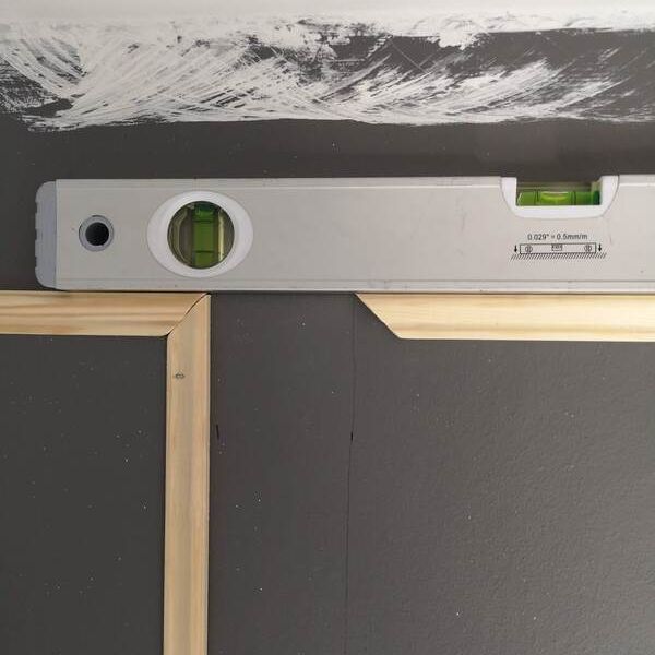
​After I was happy with the provisional panel layouts and how the room would look, I got to a second measurement. This ensured that I had the correct lengths and knew how many of each I needed. It might sound completely daft but make sure that you measure from fixed points, and measure from the outside of each panel. 
decorative pine moulding used as panelling beading
I used the thickness of the tape I used in the room to guide how wide the beading should be.
online order of decorative pine moulding
I did my order online as the store didn't have enough in stock.
mitred cut to create a bevelled edge on the beading
Give the cut ends a light sanding
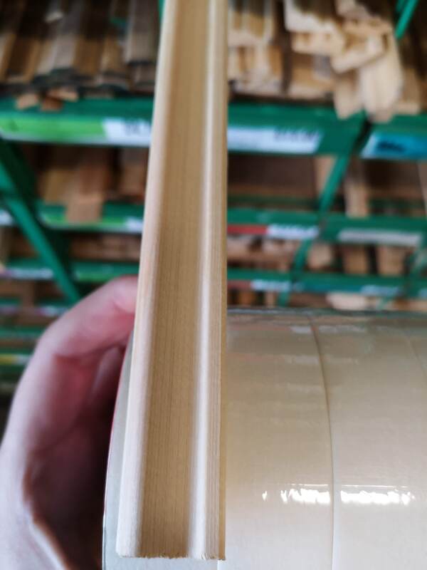
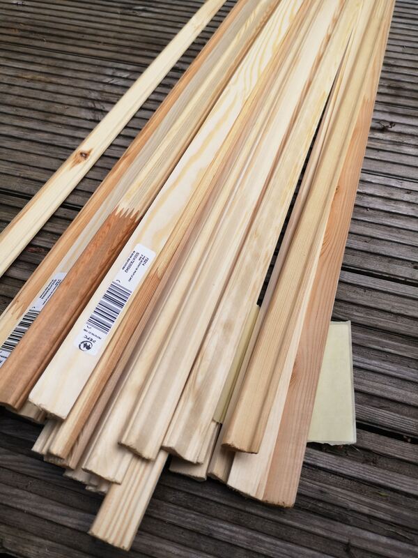
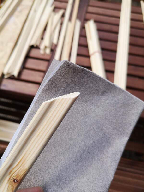
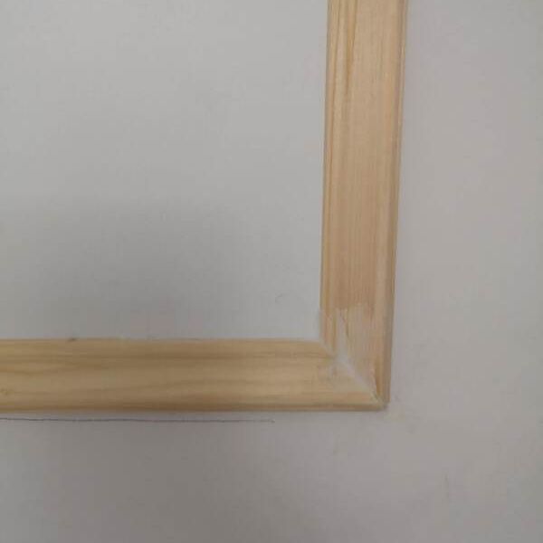
After that check your local timber yard or DIY store for the right type of beading to use. I ordered mine online as I knew I needed a lot. I did some maths to calculate which is the best way to cut the pieces out of the pre-cut lengths that are delivered. Lets say a piece of beading is 2m long, you might be able to get two lengths of 80cm and one of 40cm out of it if you cut it carefully. Its unfortunately not as easy as adding up all the lengths you need, as you will want to have as few joints as possible, and therefore keeping them to the corners as much as you can. Lightly sand the cut edges and I would also write in pencil on the back of them the lengths that they are, its so easy to get confused and spend ages re-measuring.
Once you have all your pieces, you will need a ladder, a level, and a nail gun (trust me you don't want to be doing this with a simple nail and hammer, it will take you years). Some people advocate gluing them to the wall first before nailing them in. I skipped this bit and opted to just nail them in as I had a pneumatic nail gun which packed a punch.
I would start from the smallest panel and do two adjoining sides first, this makes it easier to triangulate the remaining two sides so you get a whole square/rectangle.
using a spirit level to get panelling levelled
Get everything in line with a spirit level
​Work your way around the area you want to panel. Making sure you keep things level and neat. Once all the pieces are up, congratulate yourself on finishing one of the biggest puzzles of your life! I would suggest using caulk to fill in any gaps, holes or uneven joins. A light sand, and you are ready to paint.
caulking the joints between the panelling
Caulk the joints to keep it smooth, and then sand it down lightly.
panelling in a bedroom
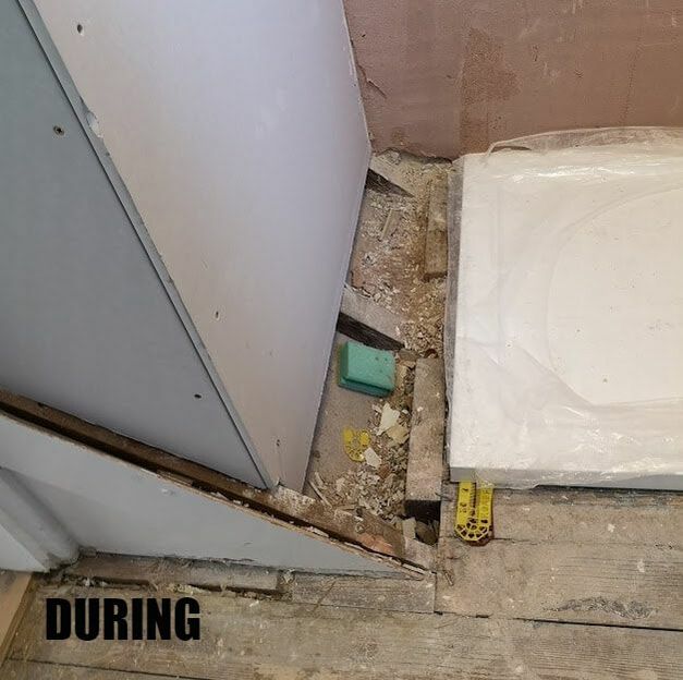
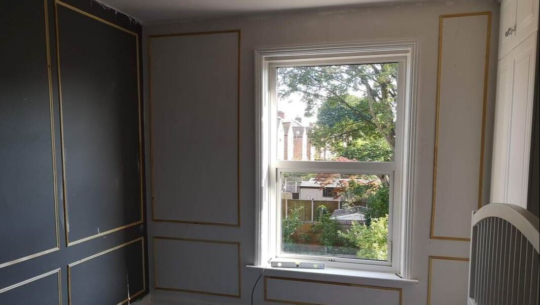
After all the caulking is done and the panels up you can start seeing how the room is going to be transformed.
dark blue panelling in an eggshell finish
dark blue panelling contrasting against the green
dark blue bedroom with yellow accessories in velvet
1 Comment

Bathroom Makeover with Topps Tiles

13/5/2019

6 Comments

 
Hello everyone! I am super excited to show you my latest bathroom refurbishment using Topps Tiles. My client came to me with the desire to create a fresh and bright space in her main bathroom. The apartment had a slightly odd layout with a loo in the separate room which, due to reasons beyond our control, couldn't be incorporated into the main bathroom space, so we focused on creating an oasis of calm in this small but crucial space.
pre-renovation shot of a problem bathroom with old tiles, no storage and dark setting
Pre-renovation shot of the problem bathroom with old tiles, no storage and dark setting
pre-renovation shot of a problem bathroom with old tiles, no storage and dark setting
So we worked on the layout, as the staircase  headroom came up through this bathroom we had to think creatively to find a solution for turning this challenge into a positive aspect of the space.  We decided to include built in storage above the sloping wall to make the space work for my client and also make it a beautiful feature of the room.  As we didn't want it encroaching too far into the room we only used a small section of the slope at its highest point. At the lower end of the slope we later built a foot rest, perfect for a pedicure and grooming. 


Mid renovation of a bathroom this photo describes how the sloping floor was used to incoroporate a storage boxed system above it
Mid renovation of the bathroom: The sloping floor was Incorporated into a boxed storage system above it. A small foot rest was built over the remaining slope.
Another challenge was where one can have a mirror in the bathroom as the sink was directly in front of a mirror there wasn't any obvious wall space, which is when I was inspired by a photo on my Pinterest (see below) to have the mirror suspended in front of the window! It makes perfect sense as you still get the natural light allowing you to use the mirror without a silhouette effect and  it doesn't obstruct too much light coming into the room
Picture
Our inspiration image for the mirror dilemma as featured on House and Garden
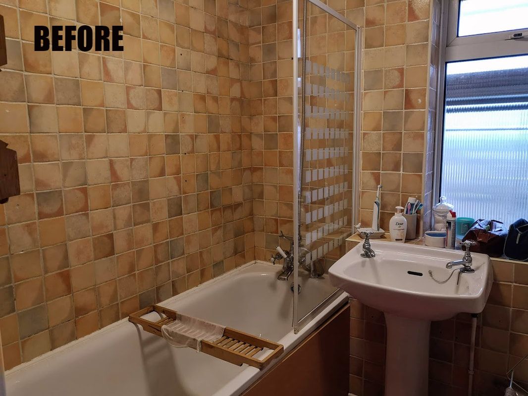
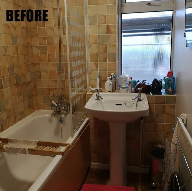
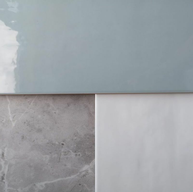
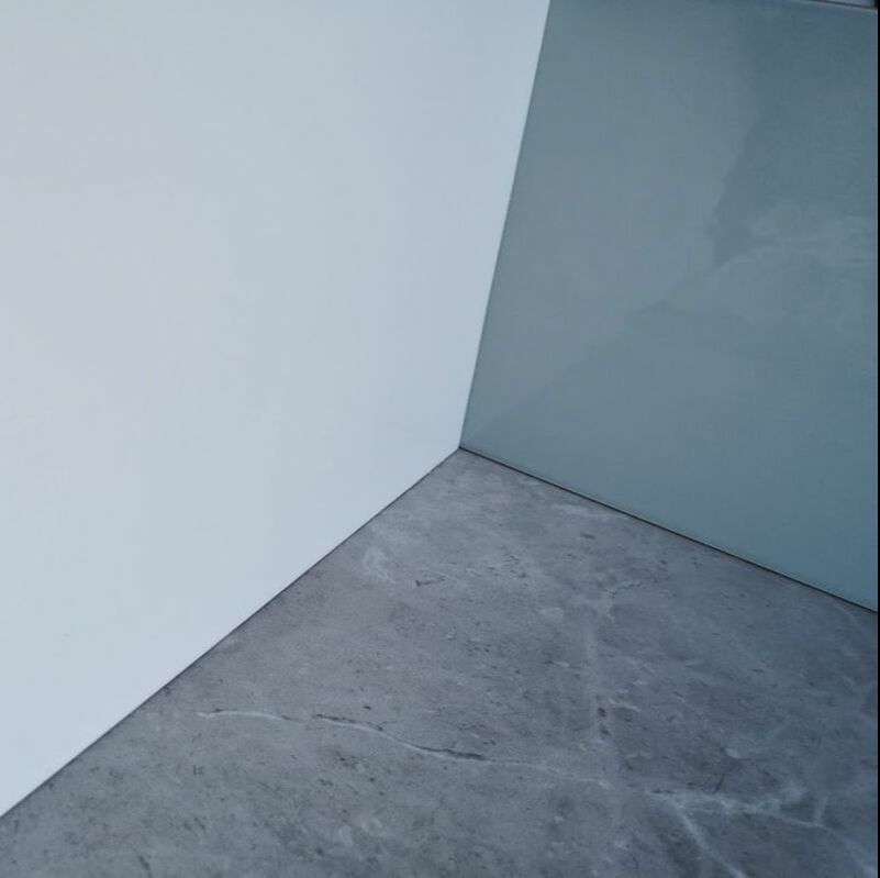
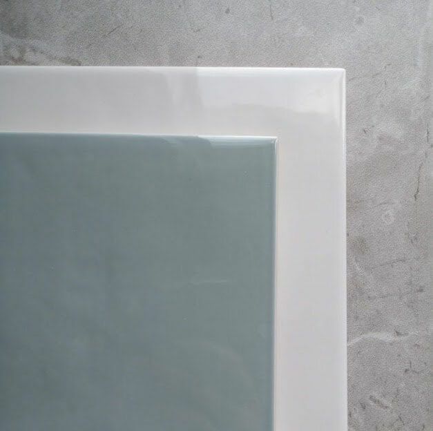
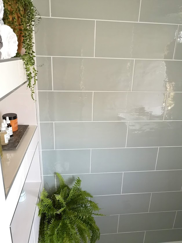
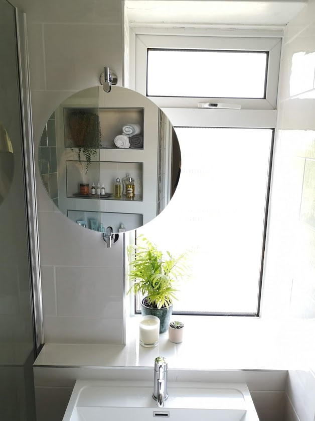
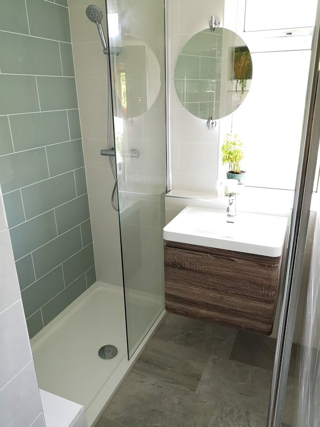
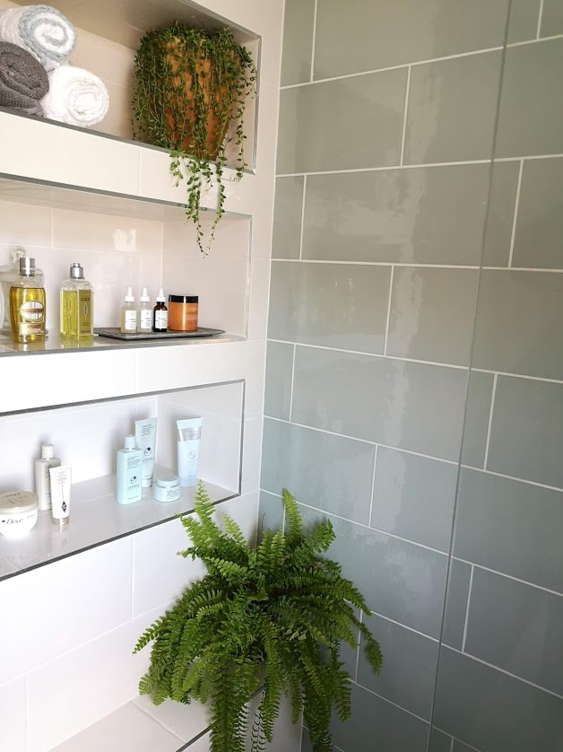
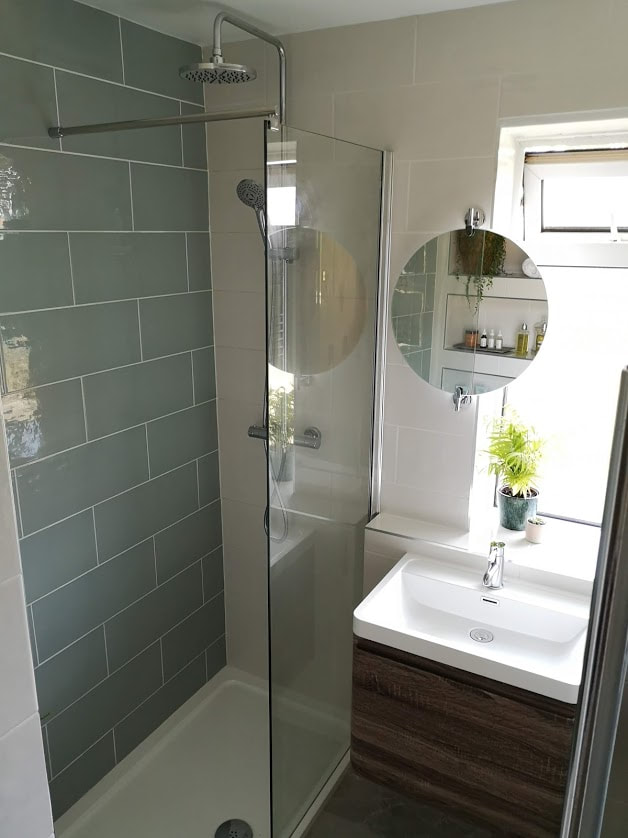
Next we went tile shopping! This was the exciting part of the process as we went to our local Topps Tiles showroom and picked out three tiles that we loved the most. It was so easy to place them next to each other and be sure that they all worked harmoniously with our scheme.  For the floor tile we went for the Variato Tile, which is a porcelain tile which has a natural stone look. The other two tiles we used were both from the Wild Blossom collection. We used the plain tiles in two colourways, the Milk tile and the Sea Grass tile. The milk tile has a soft, off-white colour, and the sea grass is a muted or greyed/sage green, both with a very subtle ripple finish. We chose the green tile as a feature tile across the shower wall to create another interesting feature for you to look at and discover while within the space. It isn't overwhelming despite being a large wall due to its mellow colouring and being the same size as the other wall tiles. 
green, white and grey tile samples
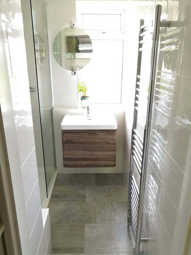
I always recommend buying a sample so you can refer back to it at a later stage when developing your scheme and also to look at it within the light context that you will be placing the tile. Here you can see how the colours, despite being the same 3 tiles, can look different in different lighting conditions. 
We also included more storage by changing the pedestal sink into a vanity unit that has a hidden drawer and a full  drawer. The front of the sink is clad in a wood veneer which injects a warm and natural element into the space that would otherwise have mainly hard surfaces and cool colours. 
moodboard of the grey, white and green bathroom
Mood Board for the bathroom
So our mood board was developing nicely and I created a 3D image the space to help the client and bathroom fitter visualise the space and for us all to be singing from the same hymn sheet. Have a look at the video and then the final photos below and see how with a bit of elbow grease and good design planning we managed to create this space. Have a look at the photos below and let me know your favourite bits in the comments below.
Picture
Picture
Picture
Picture
Picture
Picture
6 Comments

Walls and their coverings

6/2/2019

16 Comments

 
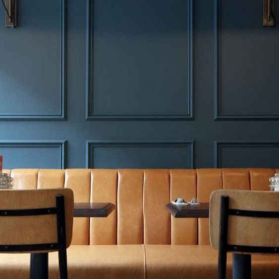
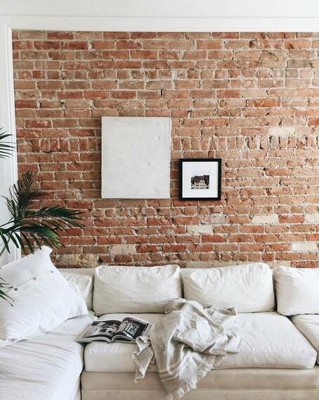
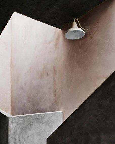
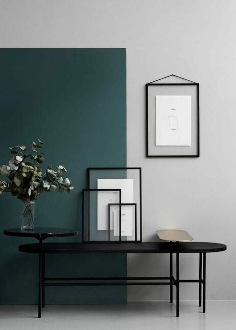
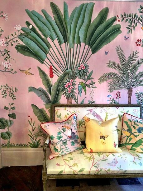
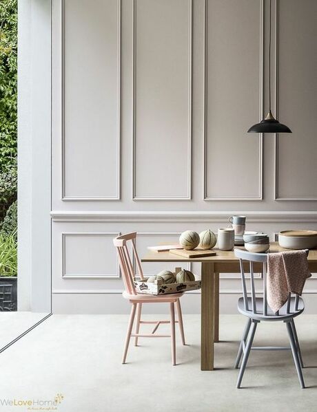
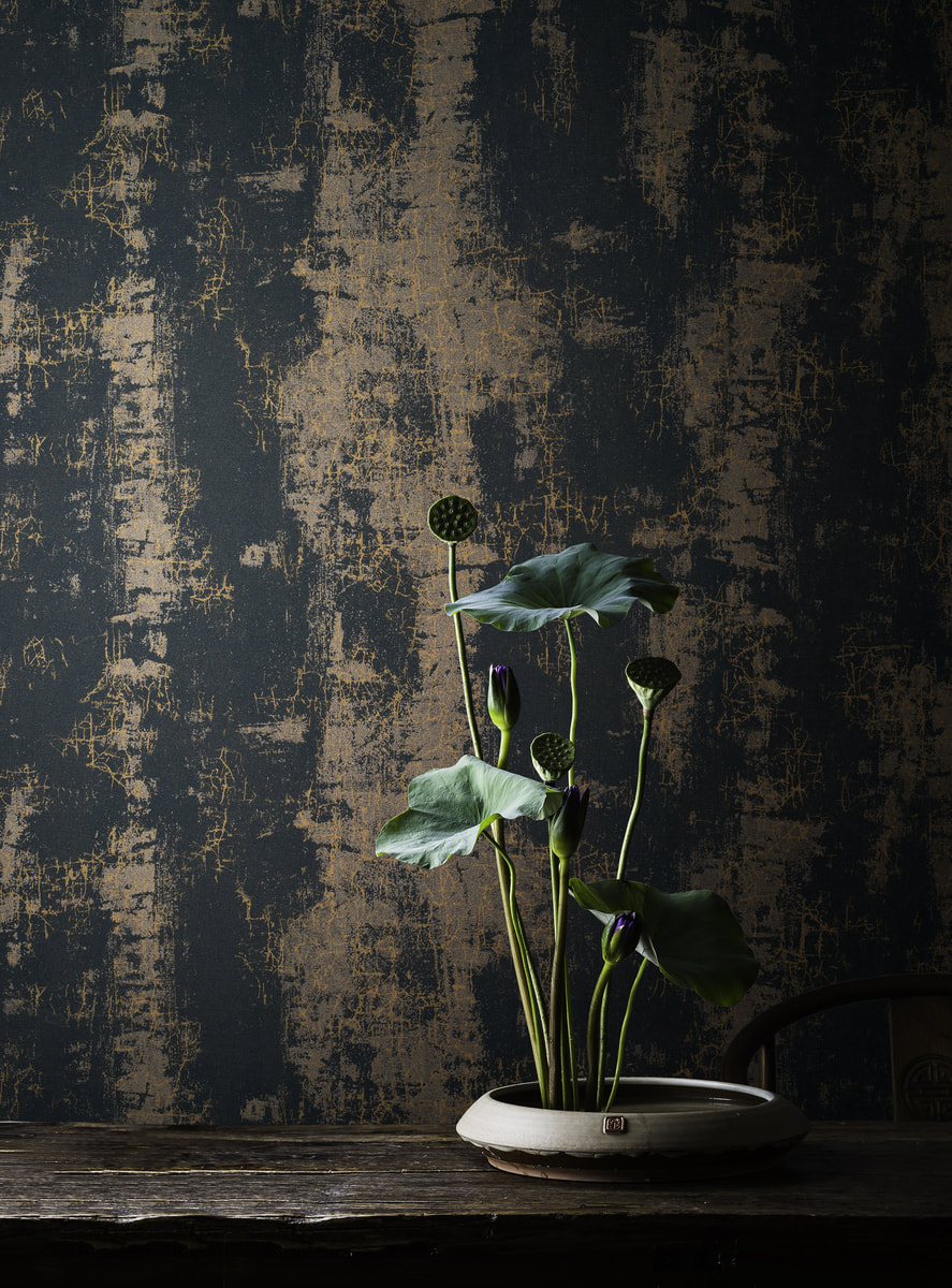
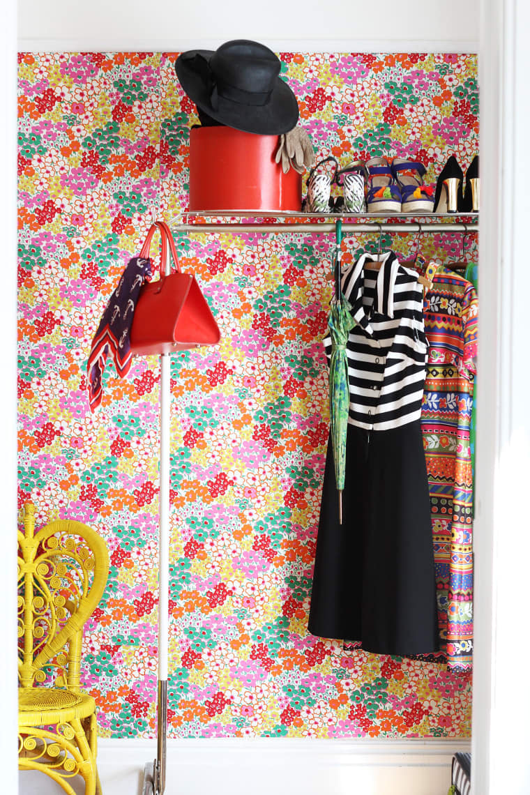
Hey There!

Today I want to talk about wallcovering choices. This links into an Instalive I did with Michael from @melville_house. If you head over to his page you can see his real love for bold and varied wall papers. My experience with wall coverings is quite different, having grown up in Malta where most houses were built with a porous sandstone, wallpapering wasn't common at all. But before we discuss covering your walls, I just want a mention towards the beauty of bare surfaces.
Picture
Bare Brick: I adore this look, its quite easy to come by this in industrial buildings or in older houses. They add great amounts of texture and colour to a space. Unfortunately there is no guarantee that your brick wall will be pretty as it depends on how the wall was built. even in the picture here you can see there are some bricks put in a different orientation to the others. But overall this can add to the character of the space. You can leave this bare (just make sure you seal the exposed bricks), or you can paint it with masonry paint if you wanted to mute down the colours or create something more artistic. 

Cons: Need to really think about insulation if this is an external wall.

​Photo: Cape Cod Collegiate 
Picture
Bare Plaster: This is another high texture finish for internal walls. The plaster usually dries in a soft pink finish with beautiful natural variations in the colour intensity and finish. I was very tempted to leave bare plaster in one of our bedrooms as it was he perfect colour of soft pink that I wanted! This surface can be sealed and left bare. It reflects a warm light off it into the space.

Cons: Any marks in the plaster will forever be on show, so be sure that the plasterer does good work quickly as any joint lines can affect the look. 

​Photo: VOGUE Australia 
Picture
Painted walls: This the easiest way and is a default for most people. I wont discuss colour choices as that is for a different blog but I encourage you to look at painting walls and their features from a different perspective.
  • Does the whole wall need to be the same colour?
  • What about the skirting?
  • What about the picture rail?
  • What about the coving or corncing? 
  • How about horizontal dividing line along the wall?
  • Why not a diagonal line?
  • Can you zone an area of a room or a corner with a different colour?
  • How does this colour relate to the floors and the ceiling?
  • Does the paint need to be matt? What would a glossy or satin finish wall look like?

Cons: if you have an old house, plaster can move and crack and show up in your paintwork. 
Photo: Domino
Picture
Wallpapers and Wall Murals: Now this is where things can get really exciting. There is a gigantic selection of wall papers on the market, from subtle to more out there designs, like this stunning example from De Gournay . Its a super quick way of updating the feel of a space. Its important to consider scale, colour and finish with wallpapers. Here are some pointers:
  • Get samples before you put in your order, sometimes metallic finishes aren't well translated though online purchases.
  • Make sure its from the same batch, as there is a strong possibility of having a completely different colour if you get a different batch. This mightn't sit well with the original wallpaper.
  • If you are matching paints to the paper, wait until you get your paper in, as the batch from the sample might be different. 
  • In high traffic areas consider a matt varnish on top to protect them.
​Cons: More costly than paint, and can be tricky to hang properly
Picture
Panelling: This is a beautiful way to add structural interest to your walls. It can be formal and elegant like shown here on the side, more rustic with a tongue and groove look, or individual and artistic with a Hex wall like used by KarenAnita. It is relatively uncomplicated to do simple patterns yourself. For more complex patterns and details I would involve the professionals. Some points to remember
  • Always use a spirit level
  • Make sure your walls are straight
  • Consider the height of your furniture
  • Caulk is your friend

Cons: Can be very expensive if you don't DIY.

​Photo: Modernfloorlamps.net
Picture
Vinyl: These are a lot more resilient than standard wall paper and paint. You are more likely to see these in commercial spaces but they have become a lot more exciting than they sound. They can be pure vinyl with printed patterns, or vinyl backed paper or fabric. The choice in these is growing daily and the example on the side by  Textura shows their beautiful "Endo" collection which has a stone underlay with a crackle finish above.

Keep this option in mind if you have a high traffic area that you want something more robust for.
Picture
Fabric: Now I hear you say, What on earth! but yes you can use beautiful fabrics to cover your walls There are many methods that can be considered. 
  • If you are using a light weight fabric you can use starch to apply it to the wall. Its also a great solution for renters as it comes off super easy.
  • If you are using a heavier fabric, you can drape it like a curtain or use it to create fabric over panels that cover the whole wall. Create one big panel or many smaller ones with the same or various different fabrics to mix up the look.
Some of you might be thinking that this will be very expensve to do, but in reality, some light weight fabrics can be a lot cheaper than high end wallpaper. 
Here is a blog post on Apartment Therapy about how to starch a light weight fabric to the wall as shown with the beautifully colourful fabric here. 

Cons: Can be a bit messy and tricky to get it all aligned. I would advise to stay away from very structured patterns on the fabric if its your first time.
There you have it folks! A collection of inspiring ways to cover the walls in your space. I cant wait to use some of these in my own spaces! If you think of any that I have missed, or have used some of these methods in your own spaces let me know below!

xoxo Pete
16 Comments
<<Previous

    Categories

    All
    Bathroom
    Bedroom
    Budget Friendly Interiors
    Colourful Interiors
    Colour Series
    Design
    Dining Room
    Hallway
    High Street Sourcing
    Home Office
    Interior Design Inspiration
    Interior Design Rules
    Interior Makeover
    Interiors Interview
    Interior Styling Tips
    Lighting
    Living Room
    Outdoor Living
    Seasonal Decor

    RSS Feed

Picture

    Join our mailing list

Subscribe

Home

Portfolio

About and press

Services

Contact

Articles

Styling Guides
Design Tips
Room Inspiration
Terms of use
Privacy
Picture
Picture
Picture
Peter Grech in Altrincham, Cheshire, UK on Houzz
Picture
Peter Grech in Altrincham, Cheshire, UK on Houzz
Award winning Interior Design  & Styling -  Cheshire, UK
Copyright © 2025
  • Home
  • Portfolio
    • The Art House, Hale, Cheshire
    • Heath House, Alsager, Cheshire
    • Casacoppa, Liverpool
    • Worldly Loft, Ancoats, Manchester
    • Georgian Townhouse, Cheshire
    • Artistic Edwardians, Hale
  • About
  • Services
  • Contact