THE SPACEMAKER - INTERIORS BY PETER GRECH
  • Home
  • Portfolio
    • Space to grow, Wimbledon, London
    • Modern Victoriana - Altrincham, Cheshire
    • Georgian Townhouse, Cheshire
    • Modernist Mid-century, Malta
    • Playful apartment - Honour Oak, London
    • Classic in white - Sale, Manchester
    • Softened industrial bathroom
  • Services
  • Blog
  • About & Press
    • Interior Design Masters
    • The Cheshire Magazine feature
    • Real homes Editorial
    • Cheshire life Advertorial
  • Shop
  • Contact

Orange

21/8/2019

0 Comments

 
​Another bright colour here! Orange is midway between red and yellow. This is a bit of a marmite colour - you either love it or hate it. I think this comes from its vibrancy and how loud it can be. It is used in advertising a lot and demands a lot of attention. It definitely has a lot of energy and warmth. Think of the setting sun, citrus fruits and food in general. It can also have autumnal associations with fading leaves and pumpkin season. The less saturated hues can seem almost peachy. Taking this to an extreme can give you a very warm neutral which can be great if you need that bit of warmth from white - but don't want it to be yellowish. On he contrary making it a dark orange can bring you into the gorgeous terracotta territory and towards the warm blacks. In Japanese culture, torii are those orange gateways that demarcate entrances to a shrine. They were originally painted a vermillion colour which fades into a deep orange. The most famous of these is the Fushimi Inari-taisha shrine, which I was lucky enough to visit in 2016. There is 4km of sequential torii creating a really immersive and impressive experience. 
Orange selection by valspar
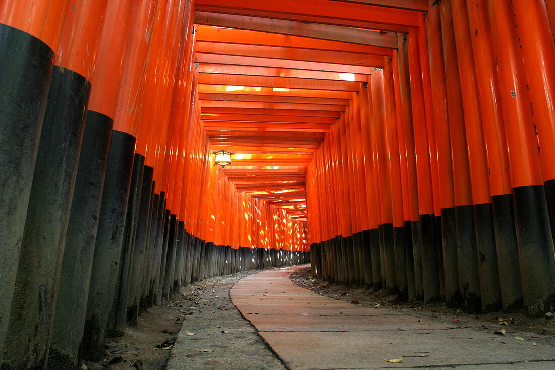
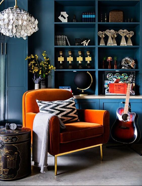
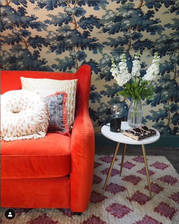
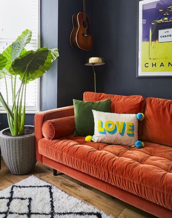
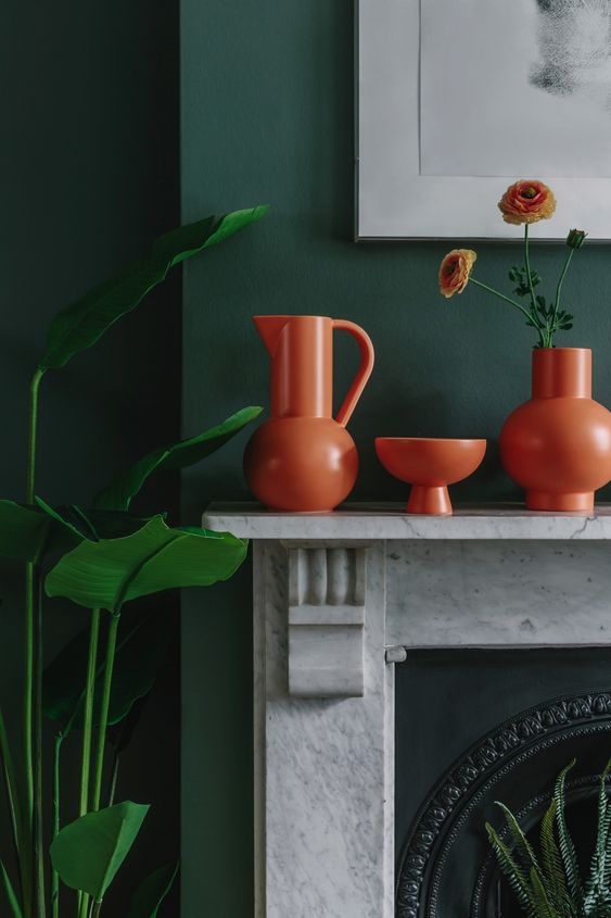
Fushimi Inari-taisha shrine - Japan
Bringing it back to interiors - Similarly to yellow, pairing orange with dark colours grounds its a bit and  keeps it as a feature colour. Your eye is drawn to it but not overwhelmed by it. This space below by Pei Lau shows how the dark blue cabinetry calms the bright orange soft furniture in front of it. This colour combination of dark blue and orange work really well. If you wanted to you could go one step further and introduce a fabulous pattern such as this room by Sandra Baker (@the_idle_hands) where she used a burnt orange sofa contrasted with an intricate dark blue wallpaper. 
Orange velvet armchair in front of the dark blue cabinetry - by Peti Lau
Sandra has used the Raphaël dark blue wallpaper as a beautiful back drop to this gorgeous burnt orange sofa bed by Made.com
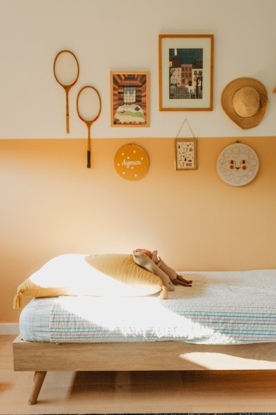
​Equally pairing orange with a plain lighter colour can still feel quite calm as long as its a slightly softer orange. Here in a space captured by Nicoe Franzen, you can see how the faded pumpkin colour adds warmth without overpowering the space. 
Picture
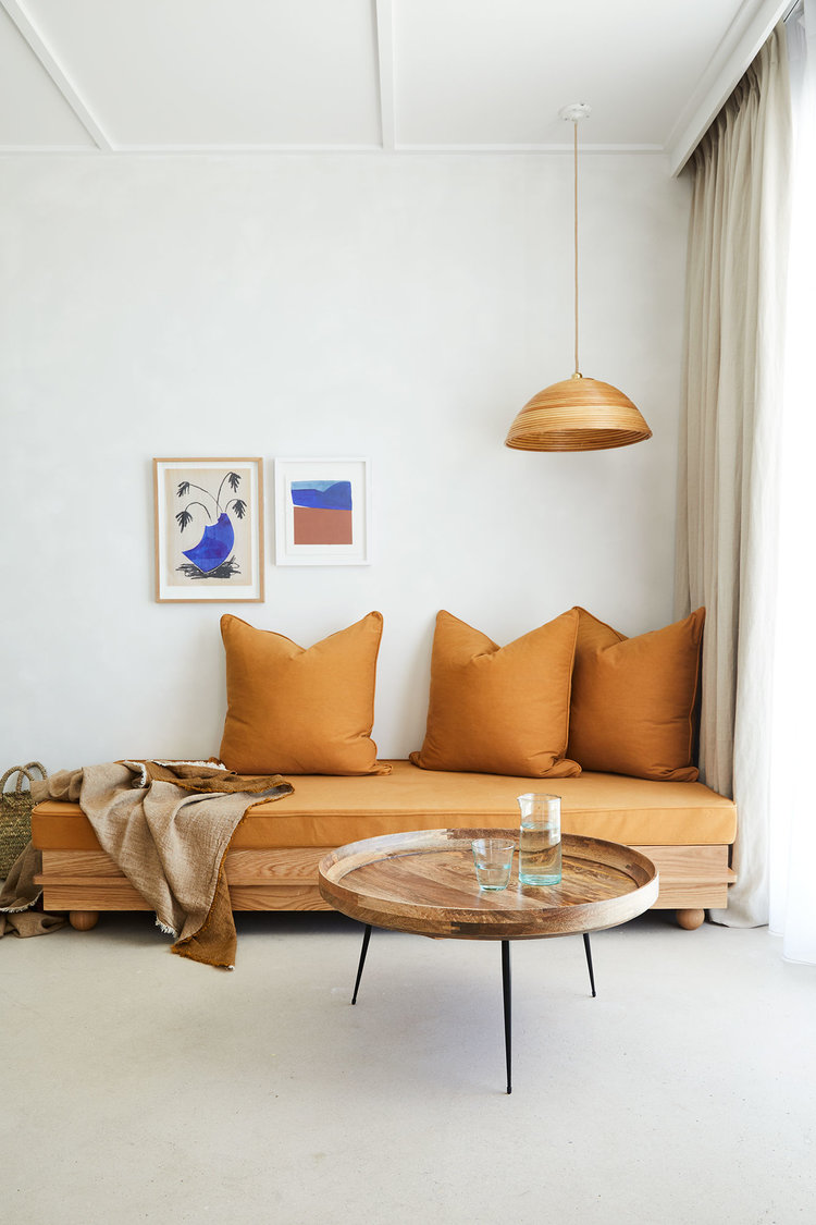
Muted orange day bed - captured by Nicole Franzen
​Equally genius is this space in France designed by Yasmine Boheas where a soft peachy-almost-tangerine-but-not-quite orange is used on the walls to zone the daybed. She carries this colour through her home with touches of soft furnishings such as this outside terrace. 
burnt and sun bleached oranges in this cosy outside space by Yasmine Boheas
Picture
Using a soft peachy-almost-tangerine-but-not-quite orange on above this daybed creates a warm inviting space.
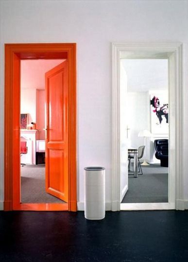
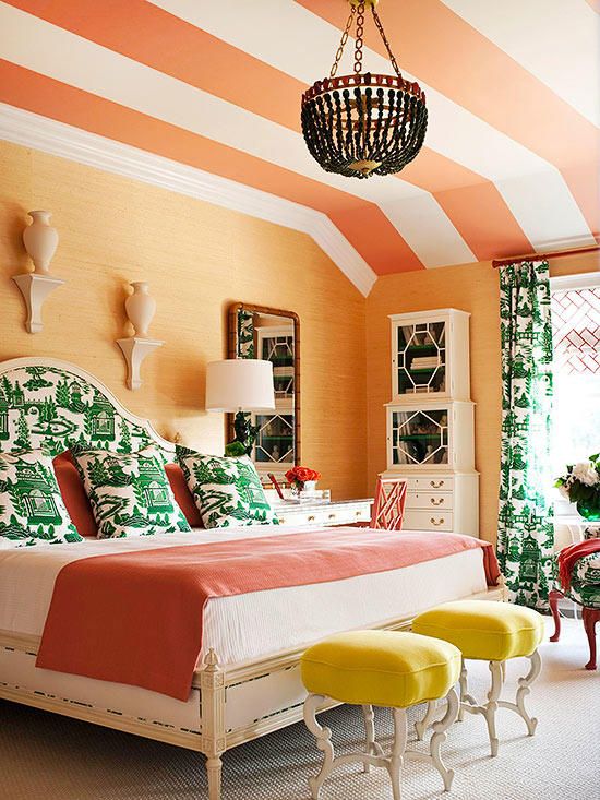
If you are a brave and want to create a high energy space, go for it! Orange panelling can really highlight dark artwork or also be used smartly to highlight a feature such as a door or reading nook. See how by changing the balance and the way it is used can create a different feeling ?
Picture
A glossy orange door and frame can highlight a room or feature. Easier to give directions for sure!
Striped orange ceiling imitates a tent like feel in this beautifully bright bedroom featured on bhg.com
Picture
The infamous Made.com sofa featured here by @meganellaby
Picture
A similar vase to what I recomended in my yellow page - these geometric orange accessories sit so nicely in front of this rich green wall. Photo by W.A. Green
0 Comments


Leave a Reply.

    Categories

    All
    Bathroom
    Bedroom
    Budget Friendly Interiors
    Colourful Interiors
    Colour Series
    Design
    Dining Room
    Hallway
    High Street Sourcing
    Home Office
    Interior Design Inspiration
    Interior Design Rules
    Interior Makeover
    Interiors Interview
    Interior Styling Tips
    Lighting
    Living Room
    Outdoor Living
    Seasonal Decor

    RSS Feed

Picture
Peter Grech in Altrincham, Cheshire, UK on Houzz

    Keep up to date with all that is happening by signing up to our newsletter. 

Subscribe
Home
Portfolio
Services
BLOG
About & Press
shop
Contact
Interior Design  & Styling -  Cheshire, UK
Copyright © 2020
  • Home
  • Portfolio
    • Space to grow, Wimbledon, London
    • Modern Victoriana - Altrincham, Cheshire
    • Georgian Townhouse, Cheshire
    • Modernist Mid-century, Malta
    • Playful apartment - Honour Oak, London
    • Classic in white - Sale, Manchester
    • Softened industrial bathroom
  • Services
  • Blog
  • About & Press
    • Interior Design Masters
    • The Cheshire Magazine feature
    • Real homes Editorial
    • Cheshire life Advertorial
  • Shop
  • Contact