THE SPACEMAKER - INTERIORS BY PETER GRECH
  • Home
  • Portfolio
    • Heath House, Alsager, Cheshire
    • Casacoppa, Liverpool
    • Worldly Loft, Ancoats, Manchester
    • Space to grow, Wimbledon, London
    • Modern Victoriana - Altrincham, Cheshire
    • Georgian Townhouse, Cheshire
    • Modernist Mid-century, Malta
    • Playful apartment - Honour Oak, London
    • Classic in white - Sale, Manchester
    • Softened industrial bathroom
  • About
  • Services
  • Contact

Indigo

23/9/2019

0 Comments

 
​Hello my fellow colourphiles! Welcome back to my colour series. In this series I want to delve deeper into each colour of the rainbow and pick out exciting and inspiring new ways to use it. I wanted to do this to challenge myself from always going back to the same, safe colours that I know and love and develop a wider pallete to be able to deliver more exciting design to my clients and their spaces.  We have already done yellow, orange, red and violet interiors so head to those for more inspiration. Today we are going to talk about indigo! This is the colour between blue and violet in the spectrum and has a very saturated tone. I must say this is one of my favourites! Its such a great and easy colour to work with and can be used as either a dominant or accent colour easily. Also I think it is a favourite with a lot of people and therefore can help make a scheme easier to take on and allow you to go bolder. 
Picture
Some people will ask - what is the difference between indigo and blue?! Well technically indigo is a pigment extracted from a plant called Indigofera and has been in use since antiquity. The colour has a very saturated hue and is a blue with quite a bit of red purple undertones - if you see where it lies in the colour spectrum this makes a lot of sense.
So now how should one use it in their interiors. In its essence it is a dark saturated colour so I want to show you the best ways I think it can be used ranging from lighter interiors to darker spaces. You can have it faded or bleached or with greyer undertones added to soften the colour. 
neutral interior with indigo accessories.
Indigo bedding styled to perfection Image source: Soul of Gerringong
indigo cupboard with styled vases and flowers above
A gorgeous vintage cupboard painted a deep indigo colour. Image source: VTwonen
indigo blue wallpaper by 2LG studio
Felt tip indigio blue wallpaper by 2LG studio for Graham & Brown
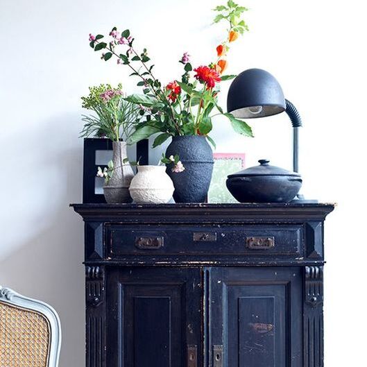
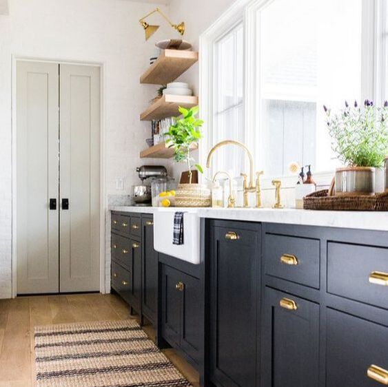
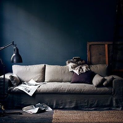
So first and foremost - using indigo as an accent colour is brilliant. It immediately adds drama and depth to any interior. Its so easy to combine it with neutrals and it fits in easily in classic and modern interiors equally. Using light and airy neutrals with such a deep colour has a nice grounding effect and keeps the space balanced between the light and darker colours. See how it is used above, sparingly on soft furnishings to add interest or as an accent colour piece of furniture. A really smart tool used here is keeping the same colour but implementing it in different patterns and textures such as the block indigo as the throw but different prints in the cushions. Equally on the cupboard, the black pieces above it have blue undertones that really tie in neatly. 
indigo blue kitchen by McGee and Co with pale walls and marble counter tops
Kitchen by McGee & Co
Saphire blue walls in a soft cosy bedroom
Indigo walls in my clients bedroom. We used Little Greene's Thai Sapphire paint to achieve this.
Go a bit bolder and choose it as a main kitchen colour as done here by the incredible team at McGee & Co. Its timelessness  means that you wont ever get bored of it and using it just on the bottom cabinets means you keep a light and airy feel. I love how they used more neutrals ad brass elements in this space to give it a very classic feel without being heavy or predictable. 

I have used indigo in my owns paces and my clients spaces to create both dark and cosy spaces, also bright and airy spaces. It all depends on the proportions that you use. 
indigo blue walls with framed crochet
I used indigo in my family bathroom to create a classic but bold look.
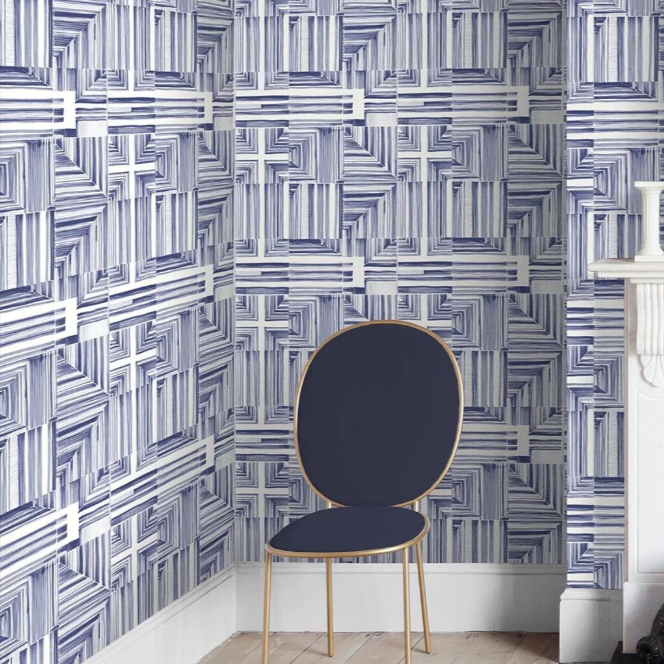
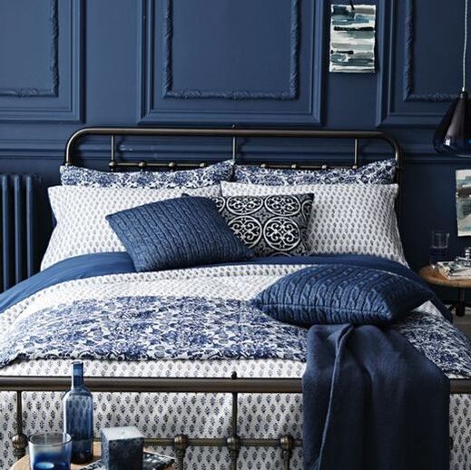
For more drama, go crazy with indigo. Paint nearly everything in it to create a moody sophisticated look, or add even more depth with panelling. Always add some neutrals and warm woods to contrast. 
Indigo living room with styled vintage furniture and palms
Inky indigo walls and perfect vintage styling by Rockett St George
indigo walls and a pale beige sofa
Gorgeous indigo walls Photo by Pia Ulin
indigo panelling and bedding and home accessories
Indigo interior accessories perfectly complementing eachother. Image by Sainsburys
I absolutely love this colour! I could go on and on, but let me know how you would use it by commenting below. Or if you want to find out more about what we are up to follow us on social media (buttons below) and subscribe to my newsletter. 
0 Comments

Violet

16/9/2019

2 Comments

 
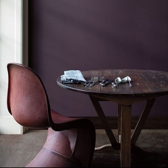
Slipping into these deep gorgeous colours now with violets. It can be a bit of a marmite colour but its a strong favourite with some brands and reflects stability and nobility. Think of a chocolate bar with the purple wrapper - you know exactly what I'm talking about. This colour was quite popular to use historically and also in the 80s and has fallen out of favour in mainstream interiors but I know there are a few of you out there who absolutely love this colour, and why not its deep and luscious and feels like a big hug, no wonder it was the Pantone colour of the year 2018. So here are a few examples of some great purple rooms.
Picture
Pegnoir - a great dose of soft lilac/greyed-pink
Starting off in a very soft way, violets are the base colour for a lot of warm greys and taupes. It adds that depth and warmth to a grey which is so needed in the British light. Colours like Pegnoir and Elephants breath have undertones of violet in them which give them their great qualities and offer them so much versatility. 
Picture
Elephants breath - a violet neutral.
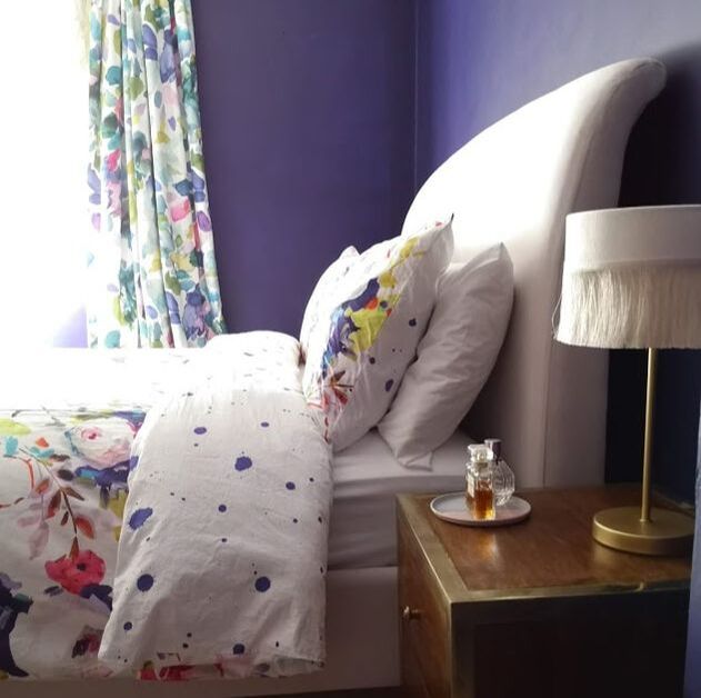
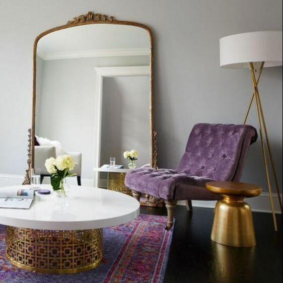
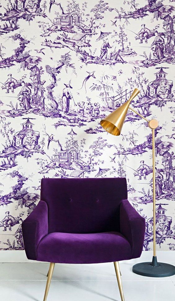
If you are braver and want to have a more saturated hue, but dont want the room to be violet dominant - use it as an accent. Such as in a beautiful chair - remember that the different fabric qualities also contribute to how the colour will look. Therefore a velvet is more likely to look very saturated as opposed to a linen. Its a great way to highlight a favourite reading spot. You can also use it in temporary soft furnishings, such as a beautiful throw that injects some colour into an otherwise monochrome room. 
violet purple accent chair with gold accessories
A purple accent chair in this gorgeous Chicago home by Ashlina Kaposta aka TheDecorista
Picture
A gorgeously dark and moody space with a lush violet sofa
Picture
Introducing a temporary colour injection into an otherwise neutral space can bring the whole room together.
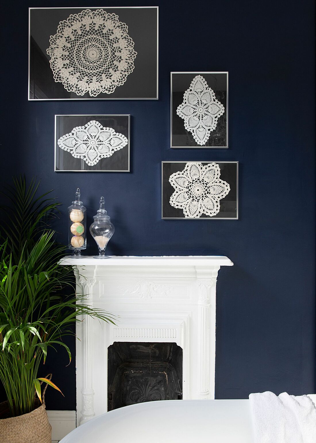
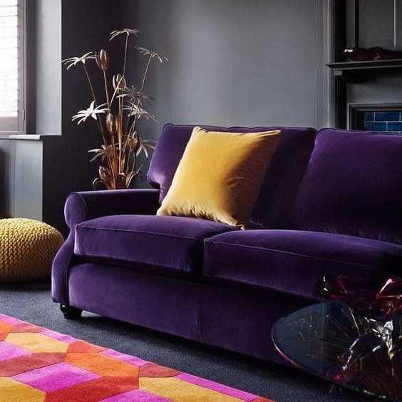
Now, if you are thinking "I'm not sure I am brave enough to invest a whole piece to violet", it could be an expensive thing to remedy - how about using violet on the inside of a cupboard like Claudia Pelizzari did in this shot. Its genius as creates a real statement piece without having to be on show the whole time. Definitely a conversation starter!
Picture
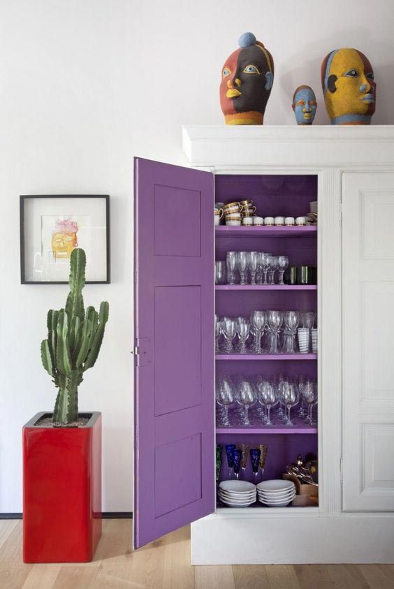
Violet cupboard interior by C. Pelizzari
Now if you are feeling braver yet - why not going bold... and doing a fully purple space. Go super dark for that luxe moody room or zingy for that  playful whimsical look.
purple cushions and dark panelling
Plummy purple in this H&M shot
Picture
This luscious colour by Benjamin Moore
purple violet chinoisery wallpaper with gold accents and velvet chair
Chinoisery/Toile wallpaper perfectly sets the scene for this delicious velvet armchair and gold lamp - Wallpaper by F. Schumacher
So! Are you feeling inspired yet? Whats your favourite image? Is purple SOOO the colour for you now? Or will you swear off it for ever!? Let me know in a comment below!
2 Comments

Red

3/9/2019

1 Comment

 
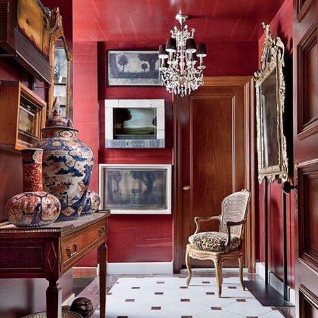
Moving on the colour series to probably the most powerful colours out there. Red. The colour of passion, love, blood, rage and drama. 
glossy red living room with panelling
Red study by Luis Bastimente
modern black and red japanese scheme
Modern use of red accents in this Japanese themed space
red hallway by john yunis filled with antiques
Stunning red hall featured in Architectural Digest by John Yunis
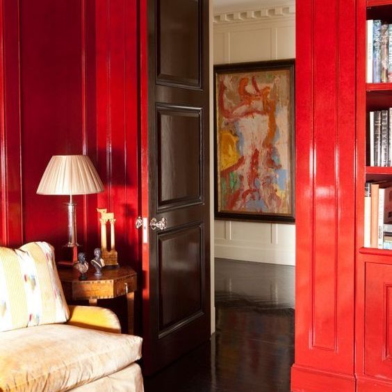
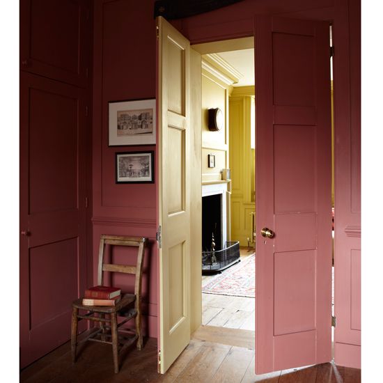
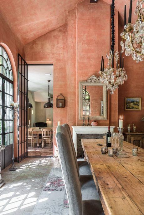
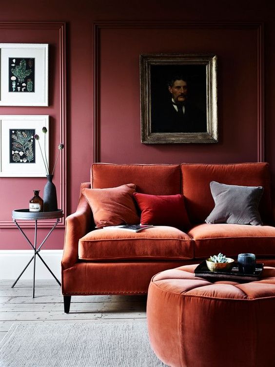
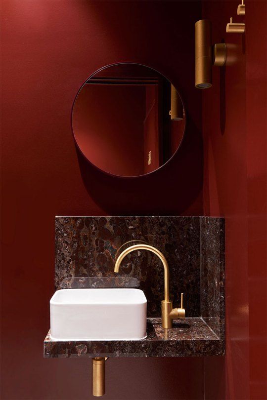
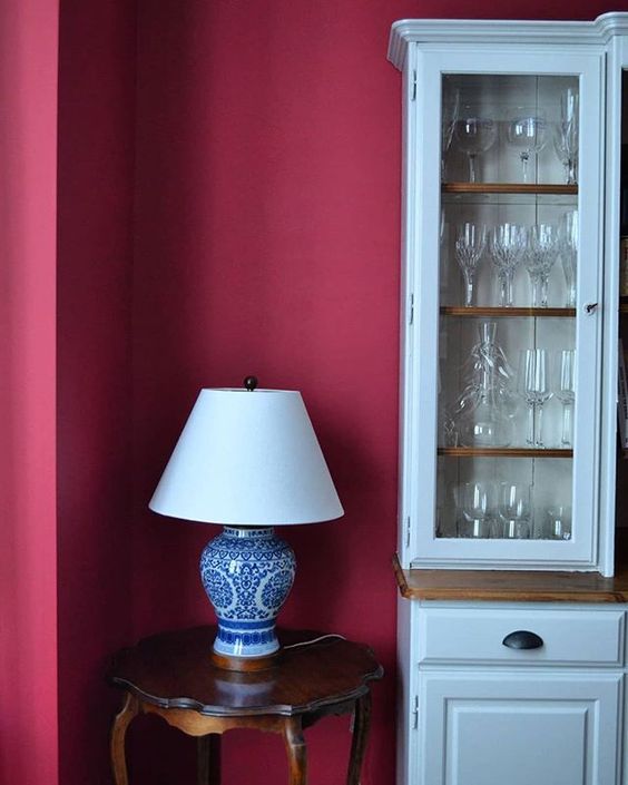
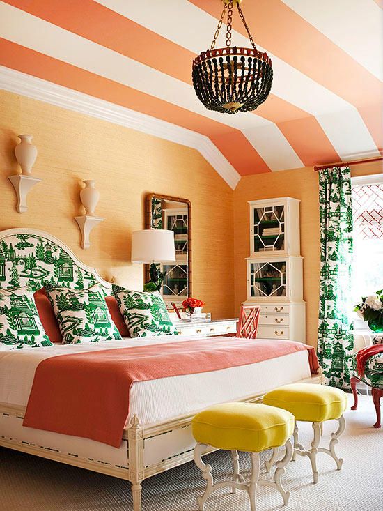
​From the deepest darkest red, through the terracottas to the softest shade of pink it has been used in interiors for years. Red is a royal colour that has such a richness to it. That is why its called the "red carpet". Using it smartly can really make an impact. It is a very strong colour so use it in spaces, that need an injection of drama and spectacle. Pair it with lighter colours for a classic look or with darker colours for a moodier sophisticated look. It immediately injects warmth and that "cosy" feel. With smart advertising it has now become ubiquitous with Christmas. It is also the traditional colour of good luck and happiness in China, and the traditional colour of Indian wedding dresses. ​Here are some great examples of its use in design. 
muted reds work in a more relaxed fasion
Farrow and ball - Book Room red
Relaxed terracotta dining room
Gorgeous terracotta room by Werner Fraters
​Paler and less saturated colours of red have a sophisticated yet relaxed feel about them. Choose colours such as Ashes of roses from Little Greene paints or Redcurrant glory from Dulux for something similar.
Slightly greyed off red panelled wall
Slightly greyed off red panelled wall - Photo by Neptune
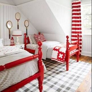
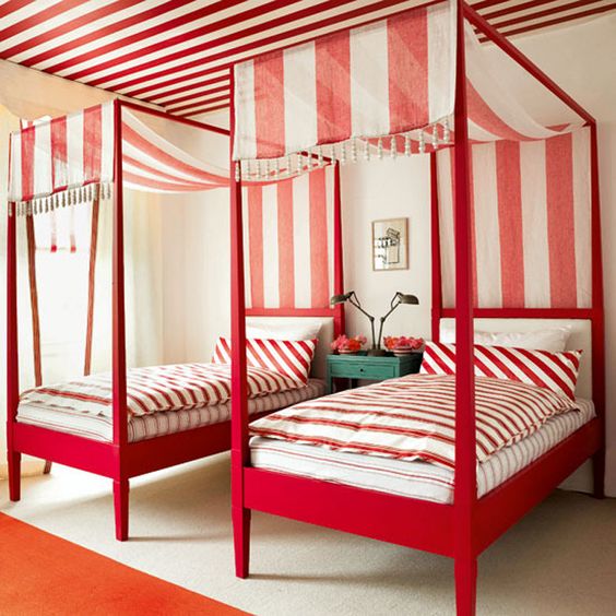
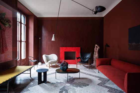
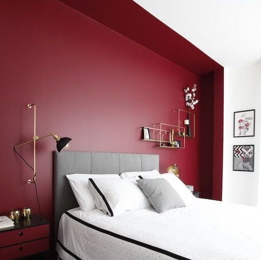
​Going for a more scarlet red but it with darker colours for a ramped up playful luxe look.
Dark blue dining room with bold red accessories
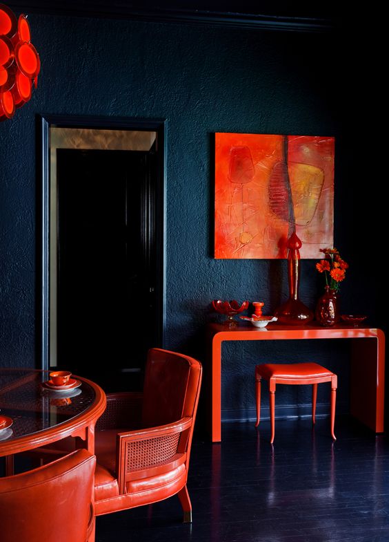
Incredible dining room with red accents from Tamara Honey
For a more saturated colour, get closer to the primary colour itself, do it in gloss to make it shine. You can use it sparingly as an accent colour such as in this bright white twin bedroom, or really go for it and use it all over. 
red and white childs bedroom
Red accents featured on Kidsinteriors.com
red and white childs bedroom with a red canopy
This gorgeous red canopy in a girls bedroom adds all the drama
red and white stipes in a twin bedroom
Keeping with the red accent, the striped theme has been taken over the ceiling.
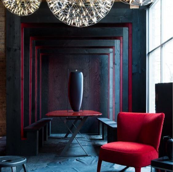
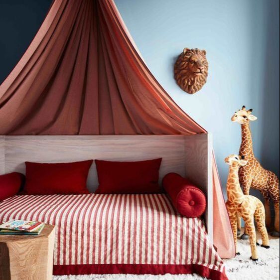
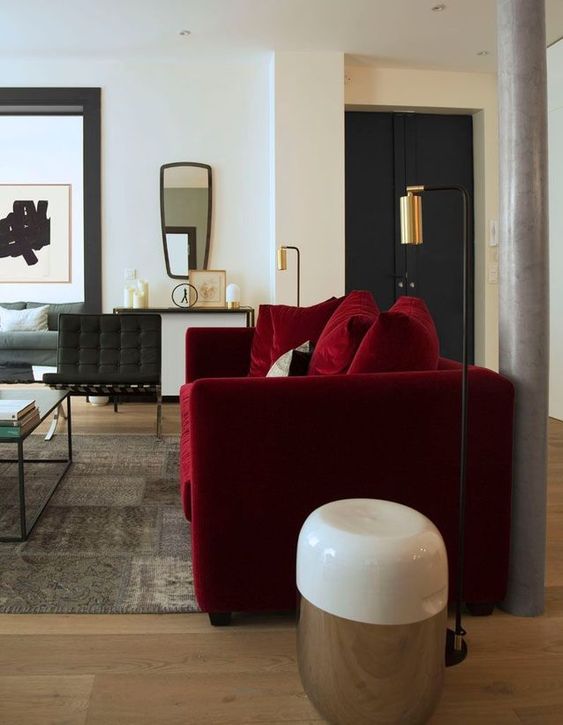
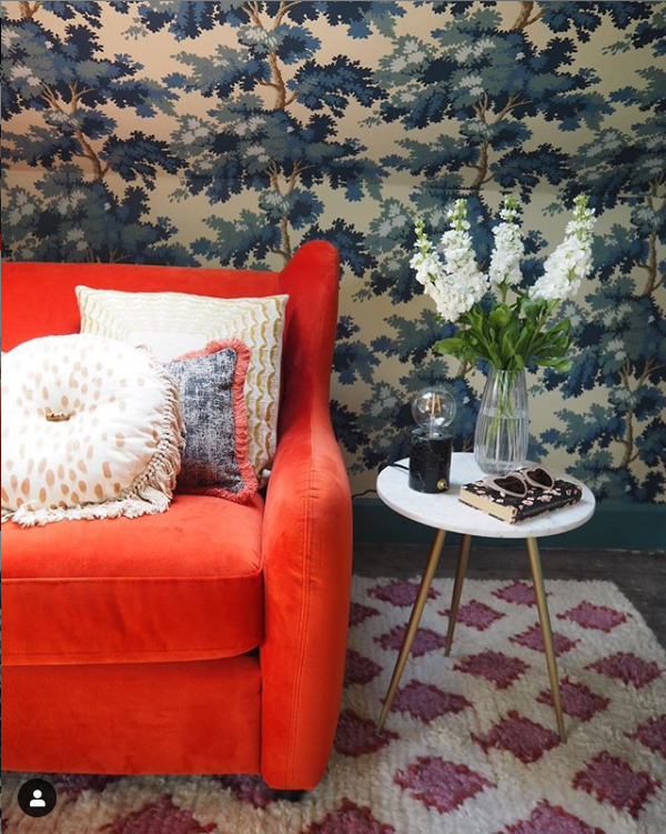
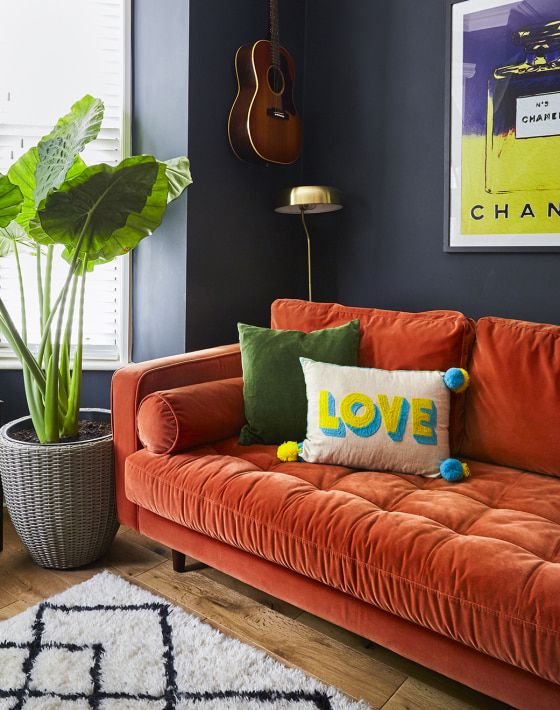
Go for a darker crimson red, closer to raspberry to really up the drama. Again in a single piece such as this stunning red velvet sofa, or as an immersive red to really make a statement of a small space. Bluer reds that verge towards the purple spectrum have a really soft cosy energy, its almost like having a great big cup of coco watching the snow fall on a winters day.
ruby red velvet sofa
This gorgeous red velvet sofa handpicked by Des Jeux Delaye
red walls in a gorgeous dark restaurant bathroom
Red Bathroom in a restaurant by StudioEsteta
Red dining room vigniette
Rectory red in my dining room
modern dark red living room
The incredible dark red living room by H&O Studio
cosy red alcove in a bedroom
Genius dark red painted alcove by Stephanie Guéritaud
How do you feel about the reds in your home? Its one of the most expensive colours to create (according to the inside scoop from paint companies) but the least purchased! Go on treat yo self to some drama!
1 Comment

Orange

21/8/2019

0 Comments

 
​Another bright colour here! Orange is midway between red and yellow. This is a bit of a marmite colour - you either love it or hate it. I think this comes from its vibrancy and how loud it can be. It is used in advertising a lot and demands a lot of attention. It definitely has a lot of energy and warmth. Think of the setting sun, citrus fruits and food in general. It can also have autumnal associations with fading leaves and pumpkin season. The less saturated hues can seem almost peachy. Taking this to an extreme can give you a very warm neutral which can be great if you need that bit of warmth from white - but don't want it to be yellowish. On he contrary making it a dark orange can bring you into the gorgeous terracotta territory and towards the warm blacks. In Japanese culture, torii are those orange gateways that demarcate entrances to a shrine. They were originally painted a vermillion colour which fades into a deep orange. The most famous of these is the Fushimi Inari-taisha shrine, which I was lucky enough to visit in 2016. There is 4km of sequential torii creating a really immersive and impressive experience. 
Orange selection by valspar
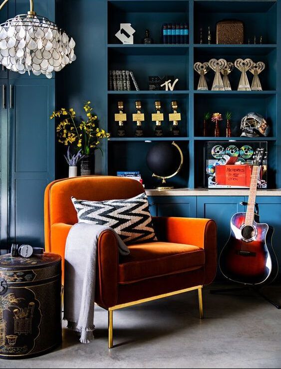
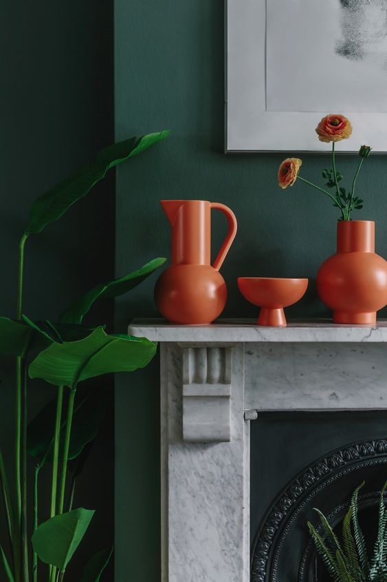
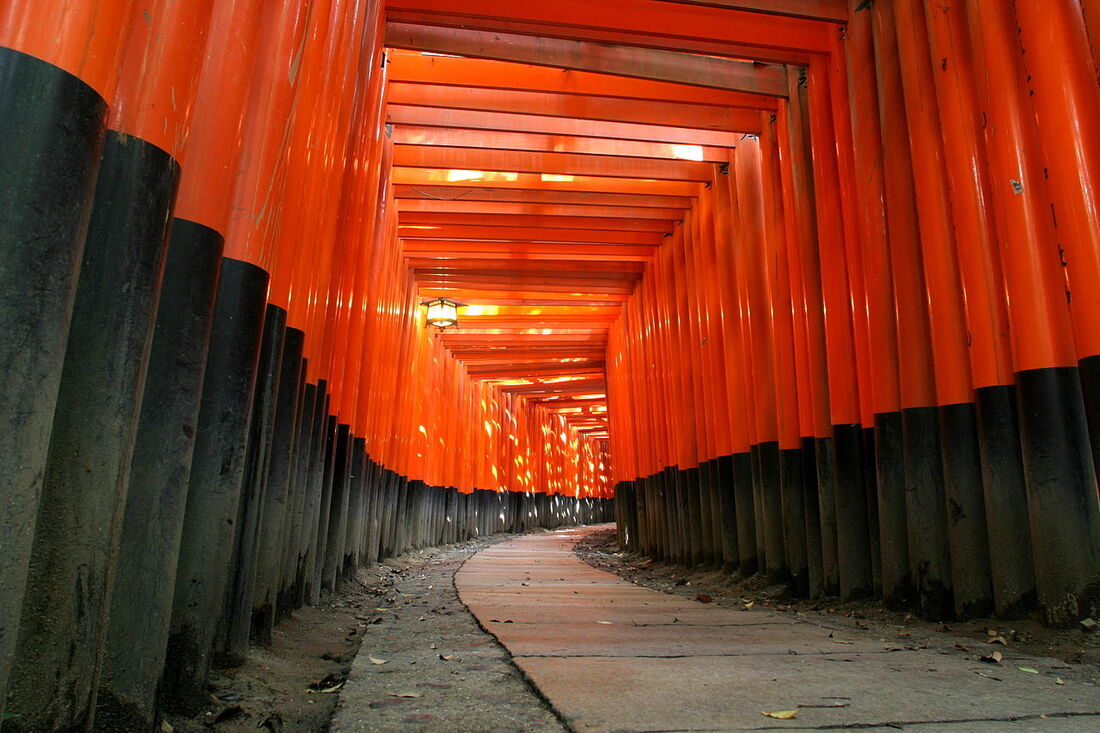
Fushimi Inari-taisha shrine - Japan
Bringing it back to interiors - Similarly to yellow, pairing orange with dark colours grounds its a bit and  keeps it as a feature colour. Your eye is drawn to it but not overwhelmed by it. This space below by Pei Lau shows how the dark blue cabinetry calms the bright orange soft furniture in front of it. This colour combination of dark blue and orange work really well. If you wanted to you could go one step further and introduce a fabulous pattern such as this room by Sandra Baker (@the_idle_hands) where she used a burnt orange sofa contrasted with an intricate dark blue wallpaper. 
Orange velvet armchair in front of the dark blue cabinetry - by Peti Lau
Sandra has used the Raphaël dark blue wallpaper as a beautiful back drop to this gorgeous burnt orange sofa bed by Made.com
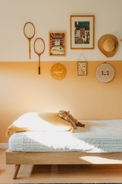
​Equally pairing orange with a plain lighter colour can still feel quite calm as long as its a slightly softer orange. Here in a space captured by Nicoe Franzen, you can see how the faded pumpkin colour adds warmth without overpowering the space. 
Picture
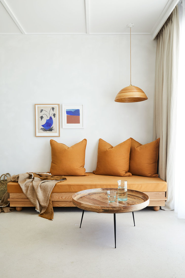
Muted orange day bed - captured by Nicole Franzen
​Equally genius is this space in France designed by Yasmine Boheas where a soft peachy-almost-tangerine-but-not-quite orange is used on the walls to zone the daybed. She carries this colour through her home with touches of soft furnishings such as this outside terrace. 
burnt and sun bleached oranges in this cosy outside space by Yasmine Boheas
Picture
Using a soft peachy-almost-tangerine-but-not-quite orange on above this daybed creates a warm inviting space.
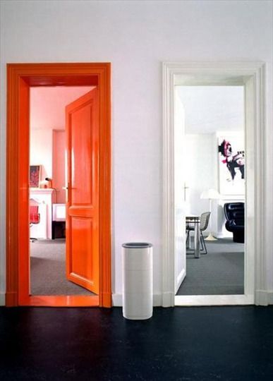
If you are a brave and want to create a high energy space, go for it! Orange panelling can really highlight dark artwork or also be used smartly to highlight a feature such as a door or reading nook. See how by changing the balance and the way it is used can create a different feeling ?
Picture
A glossy orange door and frame can highlight a room or feature. Easier to give directions for sure!
Striped orange ceiling imitates a tent like feel in this beautifully bright bedroom featured on bhg.com
Picture
The infamous Made.com sofa featured here by @meganellaby
Picture
A similar vase to what I recomended in my yellow page - these geometric orange accessories sit so nicely in front of this rich green wall. Photo by W.A. Green
0 Comments

Yellow

20/8/2019

0 Comments

 
Yellow! What a great colour to start on! The colour of energy and brightness. We always use this colour to depict the sun or the light bulb above someone's head. The very stimulating colour yellow has a definite energising effect on people. It is great to use for studies and morning spaces. It has a warmth to it and can fill a room with zing. As one can see the distinct shades have different tonal varieties. 
valspar yellow
Adding greens to a yellow can turn it muddy or even brown. Finding the correct shade is so important. I learnt this when using it for a clients study space recently where we tried 3 different yellows. Despite a south facing window, the light had a green element due to the large trees outside - this changed how the colour looked in different times of the day. Also I would advise seeing it on a large sample. This is definitely not the colour you want to get wrong. Get a big paper and paint it from edge to edge in your sample, as a solitary brush stroke will only look like a stain. ​
A yellow circle behind a simple light bulb creates a statement feature without expense
A yellow circle behind a simple light bulb creates a statement feature without significant expense.
Gorgeous yellow sofa over at Hilary and Flo, paired with a dark wall it makes the room feel really positive but grounded
The home of Tes Hash Davidson and her partner Daniel has a beautiful bright yellow SUNroom that links the kitchen and the guest room.
This gorgeous yellow velvet sofa at Medina Grillo shows how you can create a calm space with such a vibrant colour.
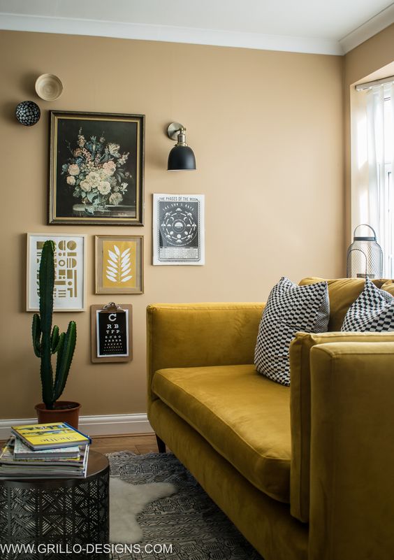
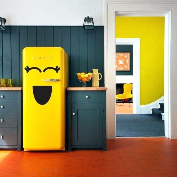
;The great thing about yellow is that, as it is such a strong colour it can be used as an accent in any space and highlight any feature you wish. Here are a few examples;
Picture
This incredible space by TA Architettura in Italy, used a muted yellow as the main colour in a central hallway. The doorways are in black giving it a dramatic vibe. And the solitary statement light fitting makes the space feel like it is clad in brass. Genius
Picture
Inversely here yellow is used to highlight the archway into this gorgeous kitchen space. Paints by Conran
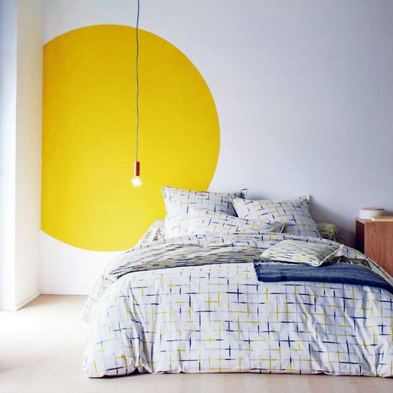
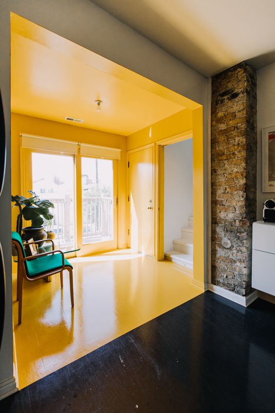
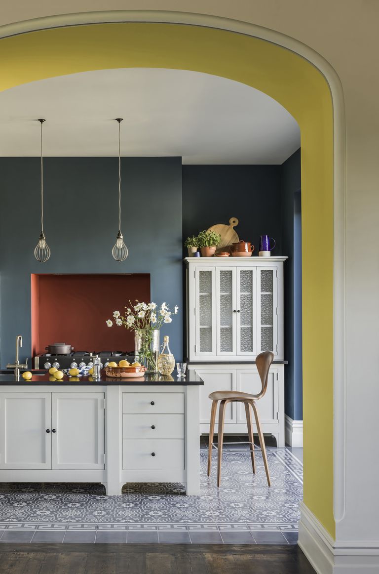
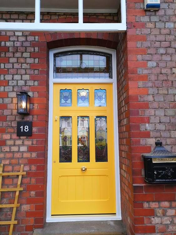
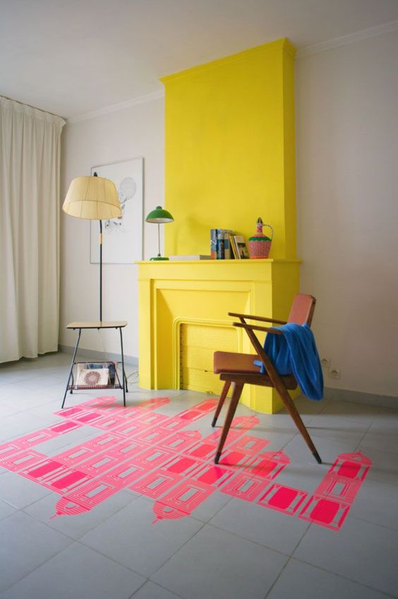
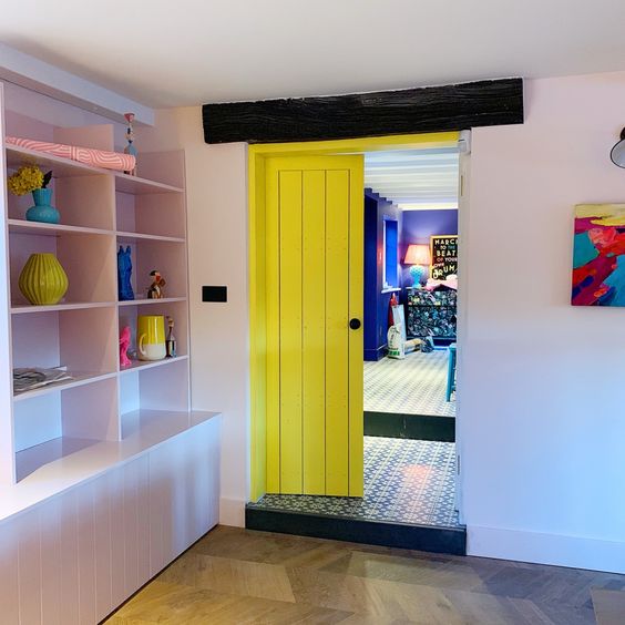
​Go bold and colour block a reading nook or even simply creating a yellow circle around a simple bulb hanging - genius.  It is a great front door colour (I am biased I know) but its like a ray of sunshine when you come home or greet guests. Nothing is better than a bright door and a welcoming smile!!
yellow front door
My own front door is a bright yellow ray of sunshine!
Picture
Look at that yellow fridge! You can't help but smile can you!
This is an incredibly simple way of highlighting a  relatively simple fireplace and chimney breast with a zingy yellow colour.
This is an incredibly simple way of highlighting a relatively simple fireplace and chimney breast with a zingy yellow colour.
yellow internal door
An internal door at Sophie Robinson's painted a citrus yellow for an enteric transition between rooms

Here are my top 5 must haves in Yellow!
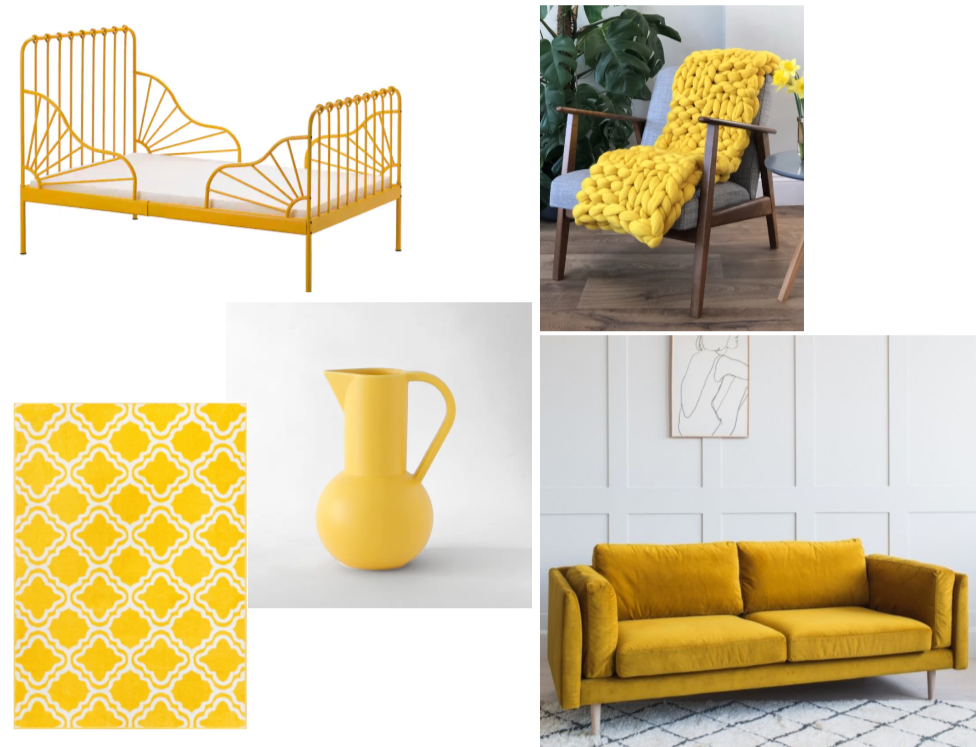
top 5 yellow must haves this season
Top Left Clockwise:
Minnen bed (IKEA), Giant basket weave merinio (MizzKnits), Dulwich sofa (Rose & Grey), Large yellow Strom jug (Trouva), Arbaaz star bright yellow rug (Latitude Vive)
0 Comments
<<Previous
Forward>>

    Categories

    All
    Bathroom
    Bedroom
    Budget Friendly Interiors
    Colourful Interiors
    Colour Series
    Design
    Dining Room
    Hallway
    High Street Sourcing
    Home Office
    Interior Design Inspiration
    Interior Design Rules
    Interior Makeover
    Interiors Interview
    Interior Styling Tips
    Lighting
    Living Room
    Outdoor Living
    Seasonal Decor

    RSS Feed

Picture

    Join our mailing list

Subscribe

Home

Portfolio

About and press

Services

Contact

Articles

Styling Guides
Design Tips
Room Inspiration
Terms of use
Privacy
Picture
Picture
Peter Grech in Altrincham, Cheshire, UK on Houzz
Picture
Peter Grech in Altrincham, Cheshire, UK on Houzz
Award winning Interior Design  & Styling -  Cheshire, UK
Copyright © 2022
  • Home
  • Portfolio
    • Heath House, Alsager, Cheshire
    • Casacoppa, Liverpool
    • Worldly Loft, Ancoats, Manchester
    • Space to grow, Wimbledon, London
    • Modern Victoriana - Altrincham, Cheshire
    • Georgian Townhouse, Cheshire
    • Modernist Mid-century, Malta
    • Playful apartment - Honour Oak, London
    • Classic in white - Sale, Manchester
    • Softened industrial bathroom
  • About
  • Services
  • Contact