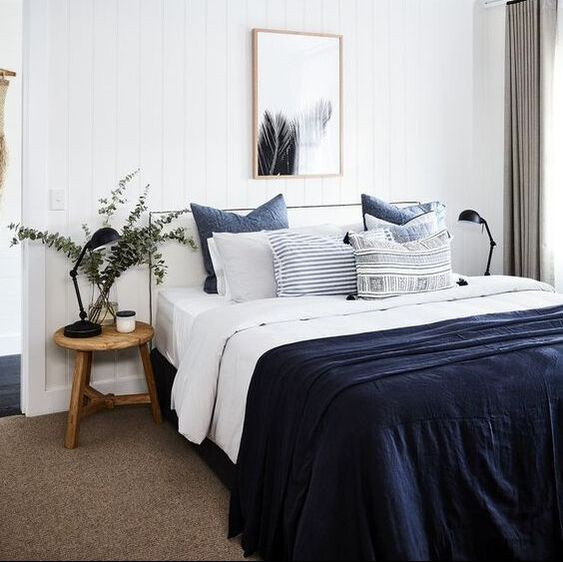
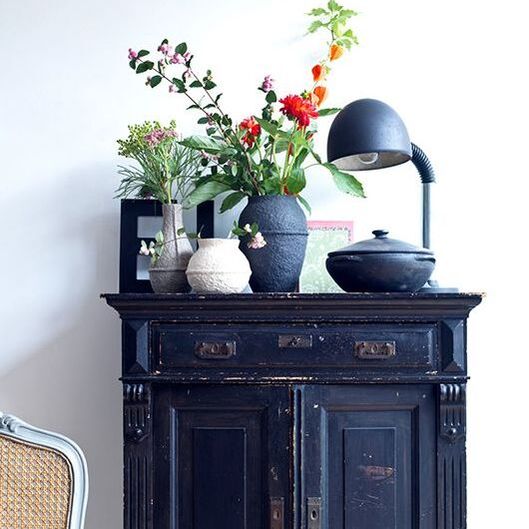
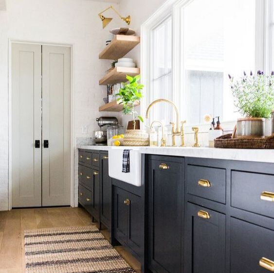
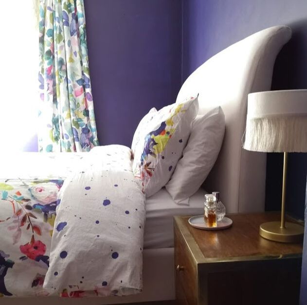
Some people will ask - what is the difference between indigo and blue?! Well technically indigo is a pigment extracted from a plant called Indigofera and has been in use since antiquity. The colour has a very saturated hue and is a blue with quite a bit of red purple undertones - if you see where it lies in the colour spectrum this makes a lot of sense. So now how should one use it in their interiors. In its essence it is a dark saturated colour so I want to show you the best ways I think it can be used ranging from lighter interiors to darker spaces. You can have it faded or bleached or with greyer undertones added to soften the colour. So first and foremost - using indigo as an accent colour is brilliant. It immediately adds drama and depth to any interior. Its so easy to combine it with neutrals and it fits in easily in classic and modern interiors equally. Using light and airy neutrals with such a deep colour has a nice grounding effect and keeps the space balanced between the light and darker colours. See how it is used above, sparingly on soft furnishings to add interest or as an accent colour piece of furniture. A really smart tool used here is keeping the same colour but implementing it in different patterns and textures such as the block indigo as the throw but different prints in the cushions. Equally on the cupboard, the black pieces above it have blue undertones that really tie in neatly.
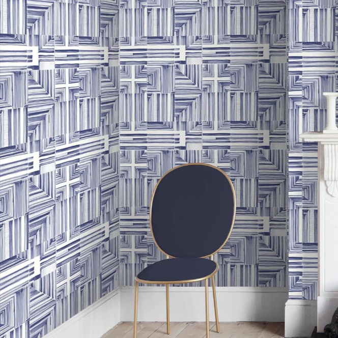
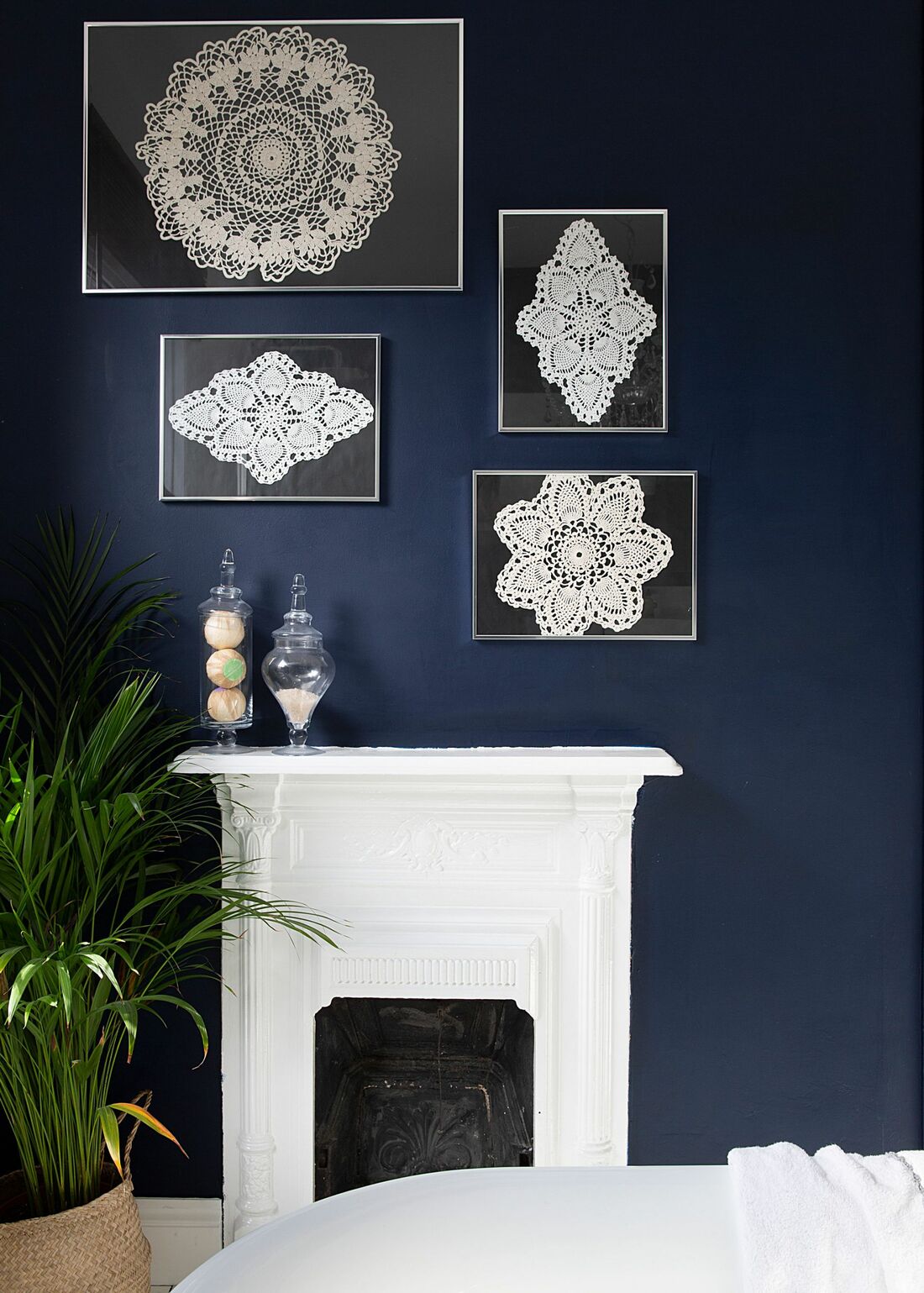
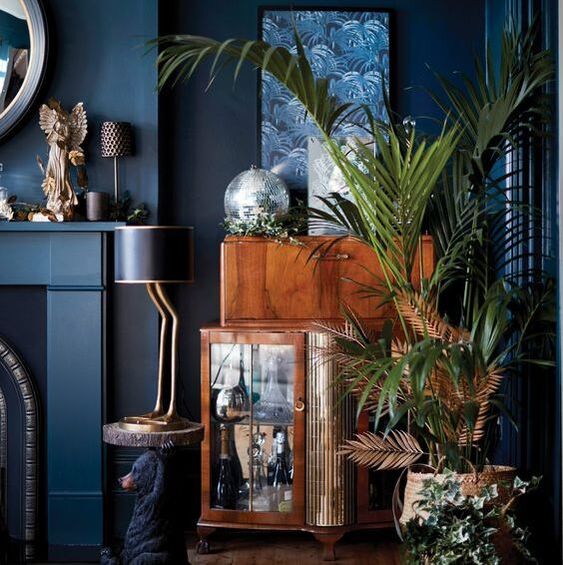
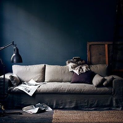
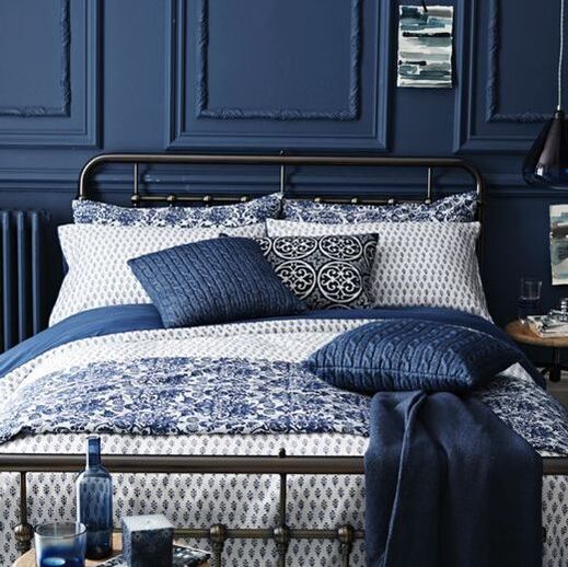
For more drama, go crazy with indigo. Paint nearly everything in it to create a moody sophisticated look, or add even more depth with panelling. Always add some neutrals and warm woods to contrast. I absolutely love this colour! I could go on and on, but let me know how you would use it by commenting below. Or if you want to find out more about what we are up to follow us on social media (buttons below) and subscribe to my newsletter.
0 Comments
Leave a Reply. |
Categories
All
|
Award winning Interior Design & Styling - Cheshire, UK
Copyright © 2022


 RSS Feed


